28K’s ‘EverGrid’ for Everbloom provides flexibility to the NFT creators and collectors it supports
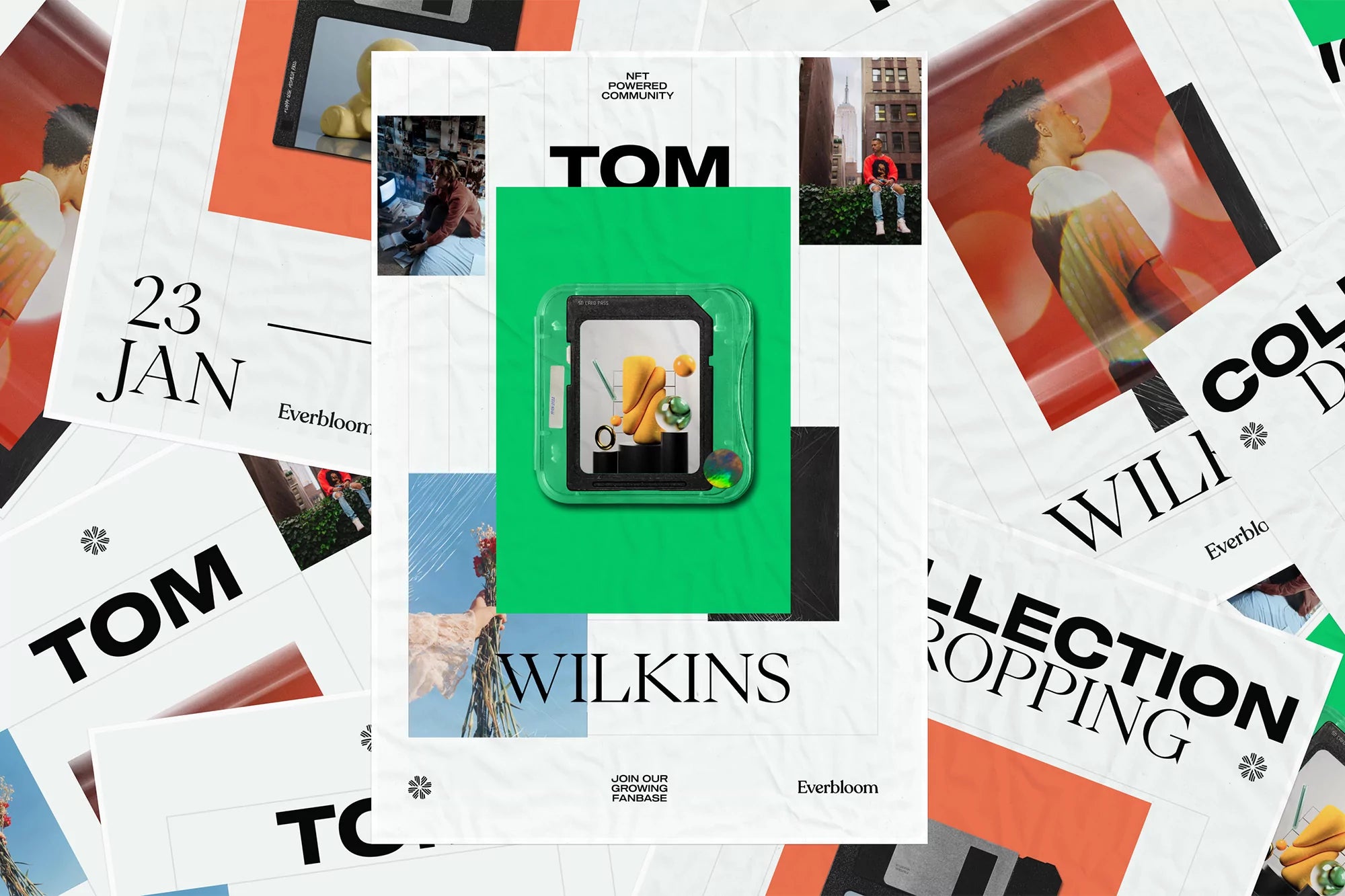
Founded to democratise the production and distribution of NFTs, online platform Everbloom is proudly independent, hoping to use its technological outlet to make the world they inhabit more accessible to creators and collectors alike. Looking to embody this outlook in how they present themselves, Everbloom turned to Danish design studio 28K to craft their intrinsically digital brand, one led by the stories of their hosted creations, with the flexibility to shift as the platform evolves.

The notion of continued evolution is immediately apparent in Everbloom’s colour palette and blossoming logomark, graphic elements that, as 28K tell us, are legacies of the previous visual identity. “The ‘infinite flower’ supported our brand message of using blockchain as a platform for never-ending self-expression and blooming,” they explain, distilling the graphic language with a renewed sense of value and reliability whilst conveying the core idea of expression. This notion not only manifests in the identity’s so-called ‘EverGrid,’ which sees a never-ending, adaptable grid system informing the visual output alongside an eclectic combination of typefaces.


All images © of their respective owners.
Content taken from 28K

