Emme is a fresh Italian studio focused on depicting reality with a brand new style. From architectural visualization to anything 3D related.
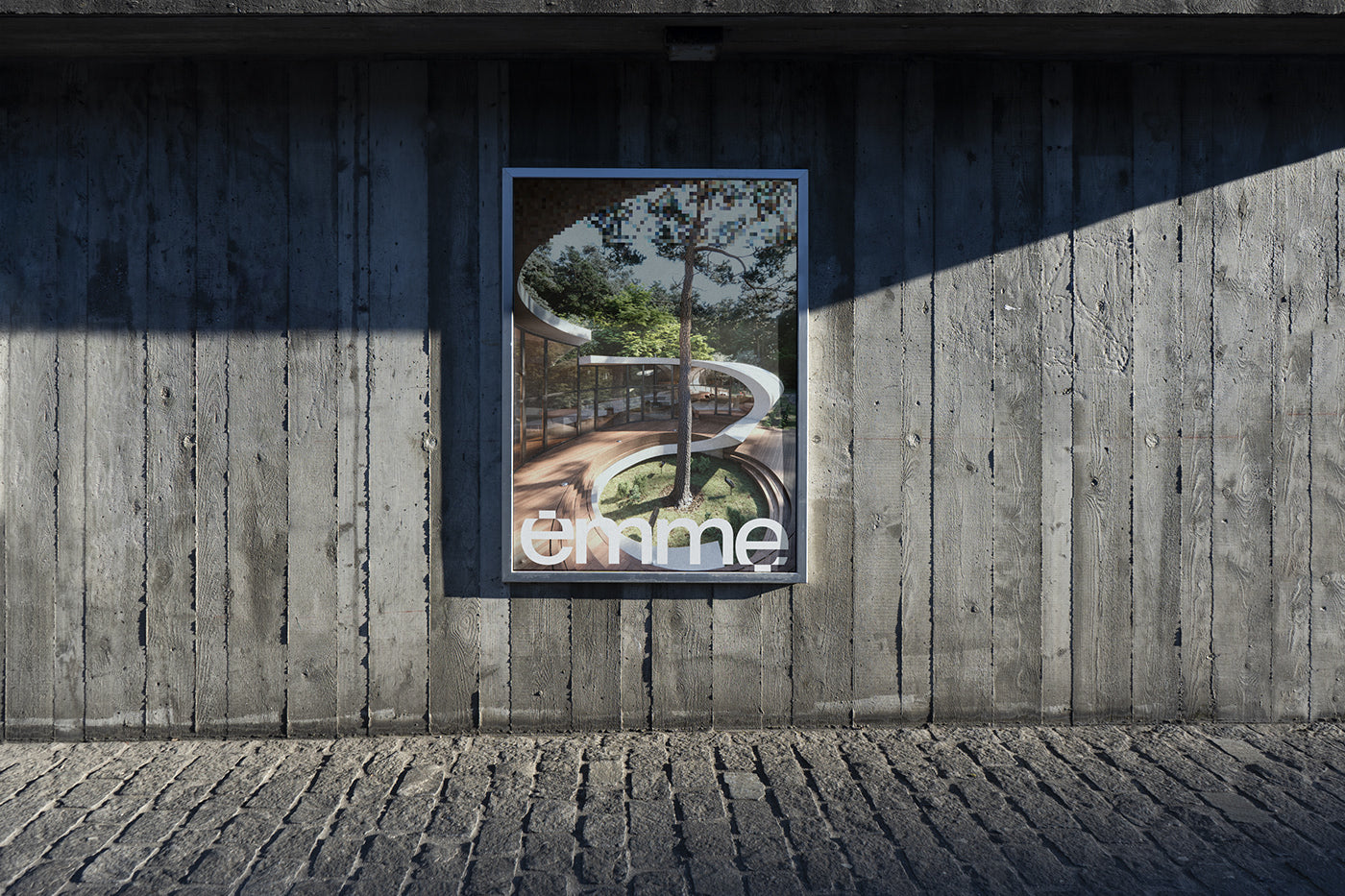
The studio’s visual identity revolves around an all lowercase wordmark based on Neue Montreal by Pangram Pangram Foundry.


The two letters e at the beginning and at the end of the name present the extreme pixelated parts and they want represent the work and the architectural visualization process of the studio: from the project drawing to its digital visualization.


This pixel effect is reflected in the images and the proportions of the letter cuts become proportions for stationery and posters.


All images & texts © of their respective owners.
Content taken from Antonio Calvino


