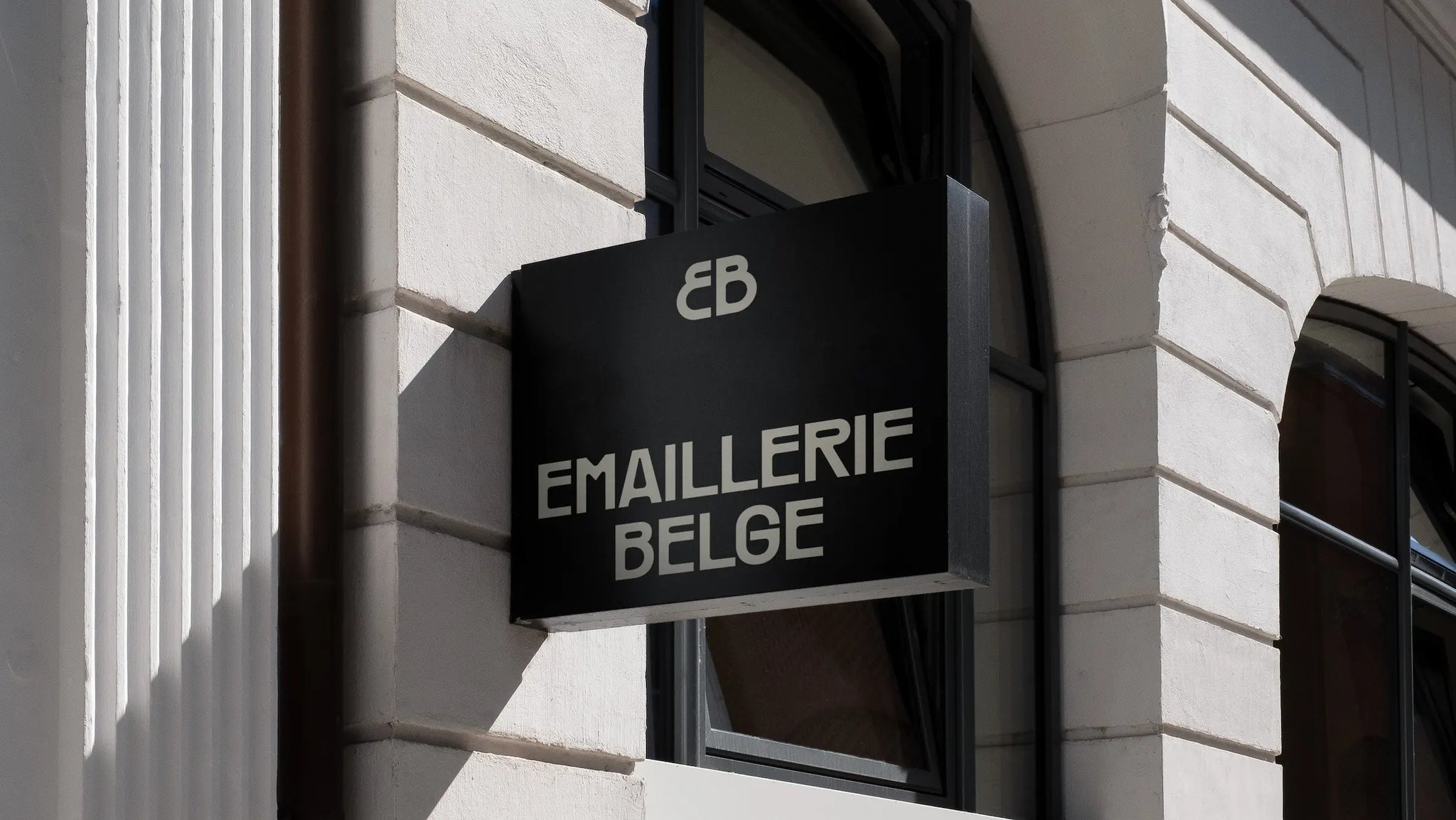
Emaillerie Belge, founded in 1923, is the last maker of enamel plates in the Benelux.
They are an icon in the Belgian printing industry, with world-renowned works for brands such as Orval, Spa, and Michelin. Emaillerie Belge enlisted Hunt to give their brand a new look. Our goal? To embrace their history, while preparing them for a new generation of creators.


Emaillerie Belge is at the intersection of craft, art and design. Their craftsmanship and the durable quality of enamel have recently been rediscovered by top designers and artists. We needed to translate this unique position into a brand that claims both their historic status and their new, creative future.


We chose an elegant and timeless brand identity that puts their colorful work front and center. The "Räder" font refers to their history as a maker of street signs, while a powerful monogram gives them the status they deserve. This visual identity, coupled with a sleek website and a new way of communicating online, reinforces their position as a unique player in the Belgian designg world.


At Emaillerie Belge, we see how tradition and innovation come together in a unique and iconic brand. Do you work in an industry where history and future intersect? Hunt helps you bring that story into focus.


All images © of their respective owners.
Content taken from Hunt Branding

