The briefing was quite simple: “we want to create a brand of insanely stuffed and flavorful cookies, the rest is up to you.”
— I remember at the start of the project, during a team conversation when Doi (one of our designers) blurts out the following question: “cool, so can we build this brand as if it were our own?!” Yes, that’s exactly what Petrikór did! Petrikór delved into all stages of the project, positioning, naming, design, architecture, web, and photography direction.


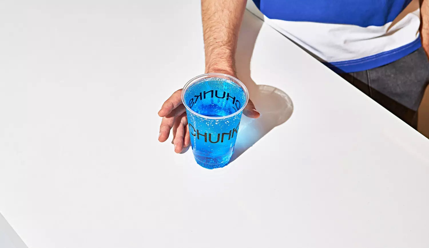
About the name, that’s right, they were stupidly literal. Whenever someone tries the cookie for the first time, it’s common to hear something like: “wow, it’s really stuffed.” and we respond: “yes, it’s chunky!”. An important aspect of this brand is that it is born with the energy and planning to rapidly expand the number of stores and soon begin the franchise process. Throughout the whole process, we had something that kept bugging us: Franchises are boring!


Petrikór started from there to try and create a design that could be easily replicable and scalable at the same time, but that would have the look and soul of a unique place. Petrikór steered clear of the “promotional” appearance of franchises and focused on a design that fits into the lifestyle and everyday life of the people who visit Chunky.


All images © of their respective owners.
Content taken from Petrikor
