Barkas’ identity for adult soft drink company Bitterschön takes you on a bittersweet nostalgia trip
Copenhagen and Stockholm-based design practice Barkas have gone on quite the nostalgia trip in their identity for Austrian soft drink company Bitterschön, in terms of both aesthetic and concept – returning to an era before the introduction of heavily sugared carbonated drinks in the latter half of the 20th Century. Sans-additives, or any other nasty bits, the company aims to be an adult soft drink to be savoured with or without alcohol.

Approached with only an idea for a soft drink that isn’t detrimental to the health of the planet or the body, and the accompanying tasty recipes to go with it, Barkas were also involved in the naming of the soft drink. Landing on an adjustment to the German phrase ‘bitte schön’, meaning ‘you’re very welcome’ in English, the name appropriately refers to the tastiness of the drink and the manners of the brand’s intention. To an extent, Barkas’ typographic choices reflect this relationship; similarly to how the punch of the flavours compliments the gentle manner of the name, so too do the typographic pairing flatter one another.

Using Queens for the logomark provides an immediate confidence due to the elegance but innate quirk of the typeface. Tightly kerned in a light, compressed weight, the design creates an assured tension between the letterforms, inspired by the bittersweetness of the drink. “We decided to type the letters ‘b’ and ‘s’ in italic,” Barkas explain, in order to help “distinguish the brand name from the well-known German phrase ‘bitte schön.’”

“A lot of the nostalgia in the Bitterschön brand lies in the use of various typefaces,” Barkas note, in discussing the use of Editorial New as Queens’ supporting act. Using four typefaces in total, with a mix of sans and serif, Bitterschön manages to successfully pull off the impressive task of consistency and cohesiveness – designing a delicate typography system that uses Neue Montreal and Lars, on top of the aforementioned serifs, without looking utterly chaotic. Instead the typefaces harmoniously sit together in an identity that is refined, fun and punchy.

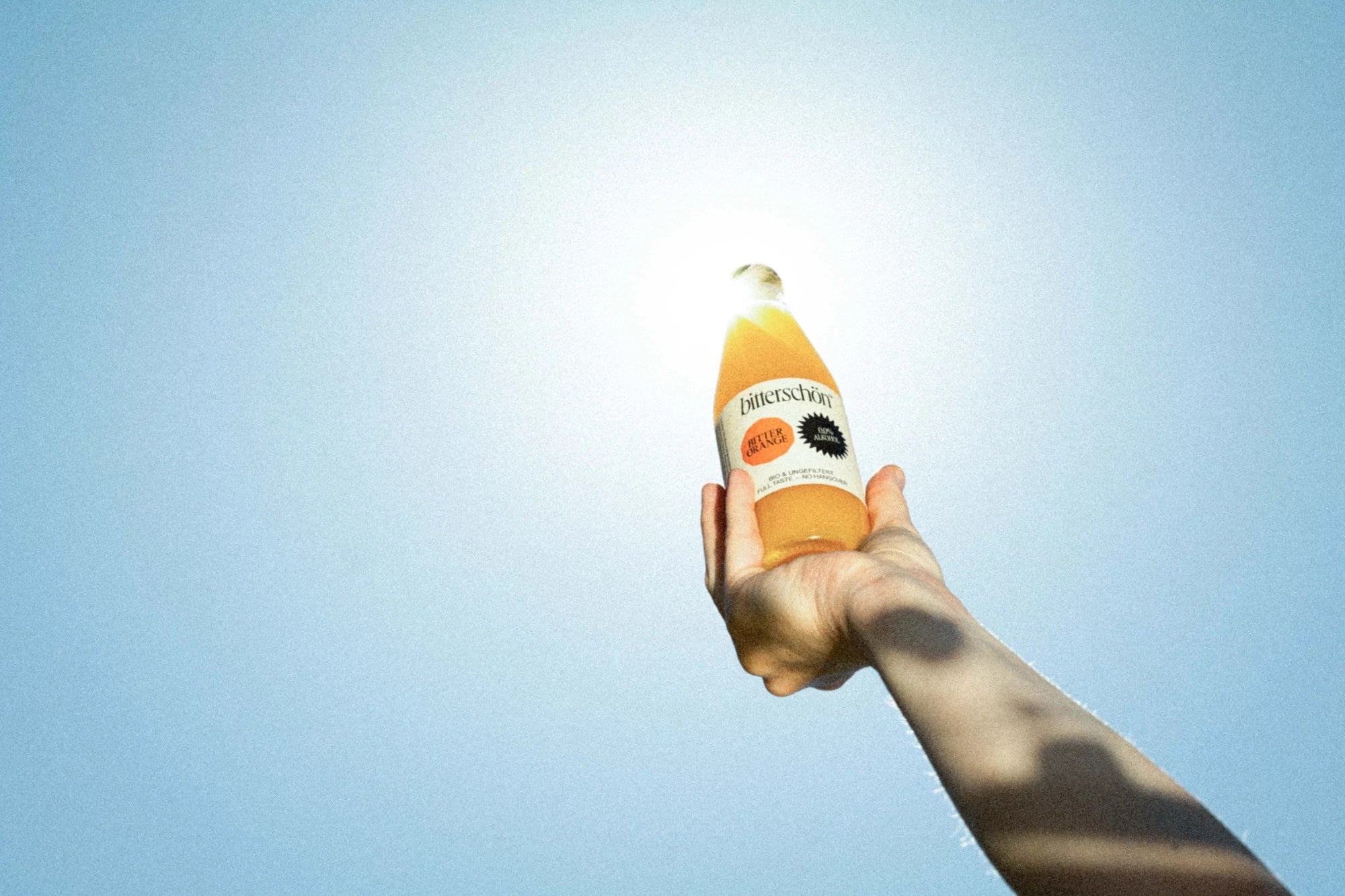
Across the identity, product and packaging, there is a liberal use of geometric shapes in the presenting of information. In reference to traditional fruit stamps, the specific shapes are determined by Barkas’ stylistic interpretations of the drink’s flavours. “By adding sharp edges to a natural object,” Barkas tell us, “we hint to the sharp, bitter taste of Bitterschön,” adding that it’s “a simple design system that’s easy to expand further if new flavours are developed in the future.”
Working directly with Bitterschön’s founders, Barkas were also heavily involved with the production of the bottle. “An untraditional product called for an untraditional bottle, and therefore we ended up going with a small elegant bottle,” Barkas explain, “the crafted texture on the label gave it an organic feel, while the black bottle cap added some sophistication to the overall look.”
The refined system Barkas have put in place is future-focused; adjustable for any additions to Bitterschön’s flavoursome family, to which they note “hopefully we will be involved in welcoming new members!”
All images © of their respective owners.
Content taken from The Brand Identity


