Visual identity work for Rubens Cortés Arquitectos
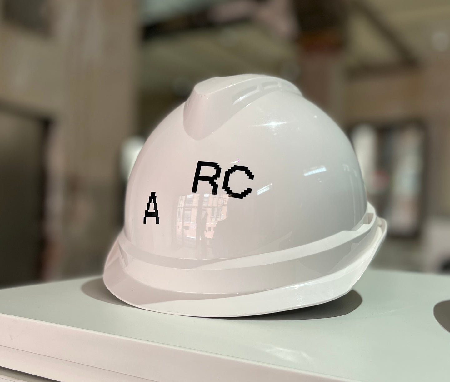
It is resolved with initials and thanks to a simple gesture that alters the position of the A, the identity adopts the generic, abbreviated, and universal meaning of the activity that represents the client: A R C hitecture


The choice of the corporate typeface represents the main part of the work. Functional type with a strong character was practically expected to be the only graphic element. It also represents the simplicity, minimalism, and sobriety that this studio has as its identity values. The NeueBit by PPF in Bold version met all the requirements.


Slightly more expressive solutions have been provided using spot color, as well as the highlighting of the inner part of the characters. These elements can be applied or not, depending on the objectives of each application. Thanks to these small nuances, the level of expressiveness can be adjusted to adapt the communication to different needs.


All images © of their respective owners.
Content taken from Studio 2041/Fernando Cienfuegos


