Telegraf
Mid-century muscle meets modern minimalism with a brutalist edge.
Free to try
Licenses start at $40
Telegraf style list
24 Styles
01234567
{(!@#$?&)}
01234567
{(!@#$?&)}
- Ultralight 200
- Light 300
- Regular 400
- Medium 500
- Semibold 600
- Bold 700
- Ultrabold 800
- Black 900
- Ultralight Slanted 200
- Light Slanted 300
- Regular Slanted 400
- Medium Slanted 500
- Semibold Slanted 600
- Bold Slanted 700
- Ultrabold Slanted 800
- Black Slanted 900
- Ultralight Oblique 200
- Light Oblique 300
- Regular Oblique 400
- Medium Oblique 500
- Semibold Oblique 600
- Bold Oblique 700
- Ultrabold Oblique 800
- Black Oblique 900
Telegraf
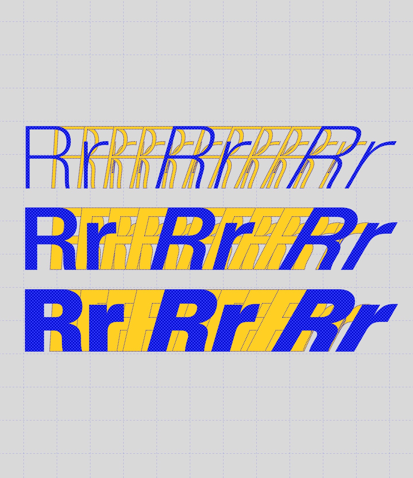
Glyphs set overview
Glyphs set overview
Glyphs View
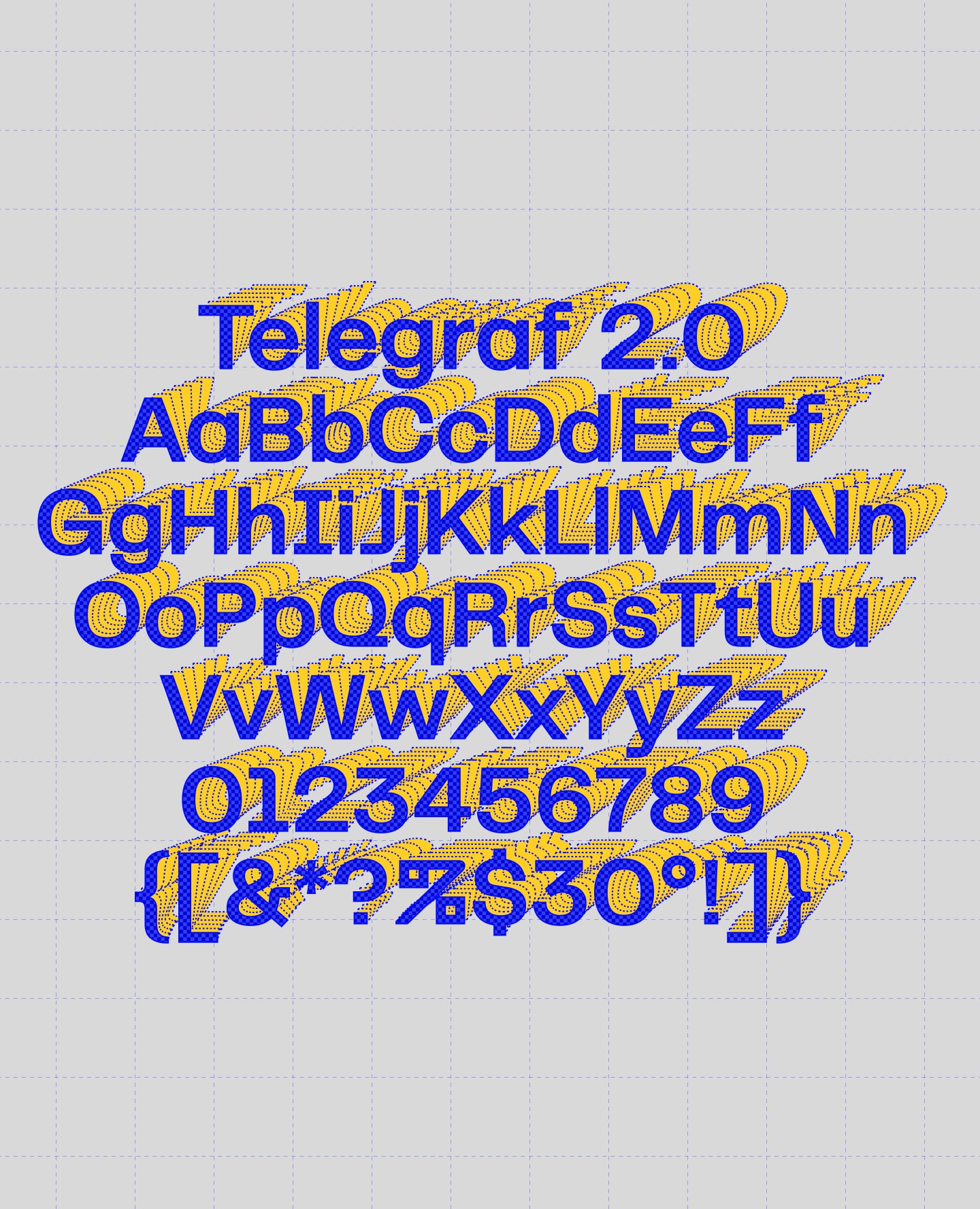
Telegraf's Features
Grotesk with grit.
Telegraf combines the forms of mid-century grotesks with rigid angles. As its weight increases, Telegraf’s counters become more rectangular, to help with on-screen viewing at small sizes, and to increase impact at large sizes.
It would define itself as a well-planted modern grotesk with a powerful presence and a touch of brutalism. Suitable for both large-scale and indie projects.
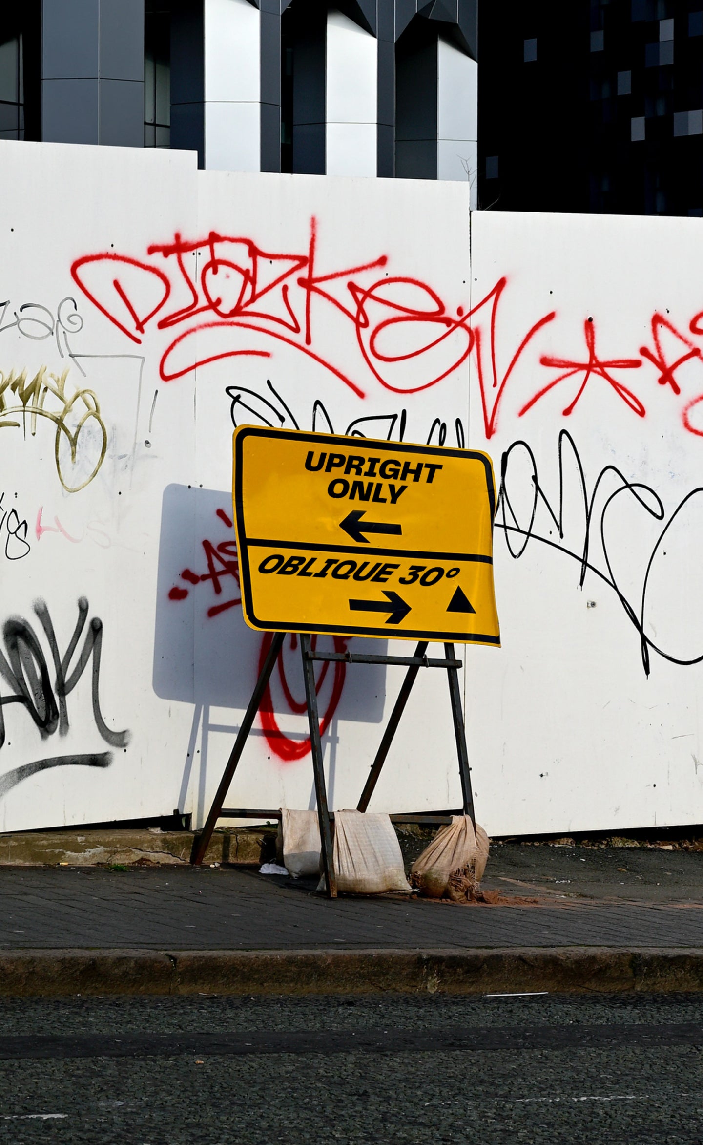
The Slanted have a comfortable 15° angle for your editorial or long-form content. We also created an extreme 30° Oblique for a more brutalist and graphic approach.
Designers
Categories
- Brutalist
- Grotesk
- Italics
- Variable
Styles
- 24 Styles
24 Styles with 429 Glyphs each
Version
2.000
Latest update: January 2023
Available formats
OTF, TTF, WOFF, WOFF2
Language Support
Afrikaans, Basque, Breton, Catalan, Croatian, Czech, Danish, Dutch, English, Estonian, Finnish, French, Gaelic, German, Hungarian, Icelandic, Indonesian, Irish, Italian, Latvian, Lituanian, Norwegian, Polish, Portuguese, Romanian, Saami, Serbian, Slovak, Slovenian, Spanish, Swahili, Swedish, Turkish, (and more)
Commercial Licenses
Not sure what to get? Or can’t find the right coverage?
Please contact us for our tailored corporate licenses!
Need more information about our licenses?
Our FAQ usually contains most of the answers.
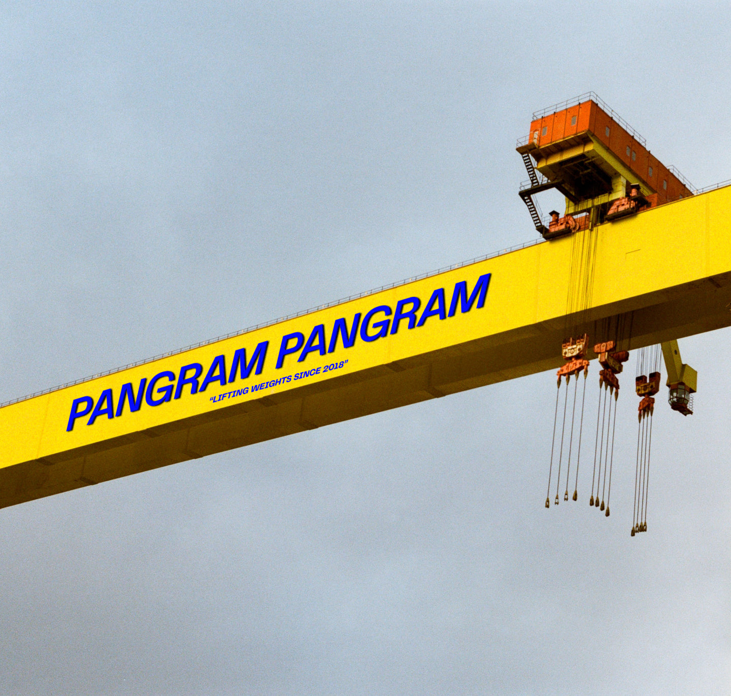
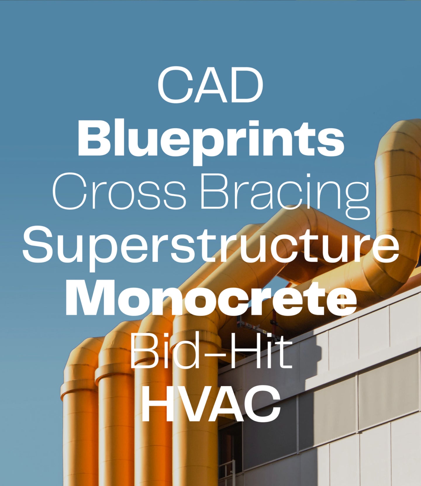
Telegraf in use
View all using Telegraf
Colossal
View project
Mammamia
View project
Klein Galerie
View project
Huspy
View project
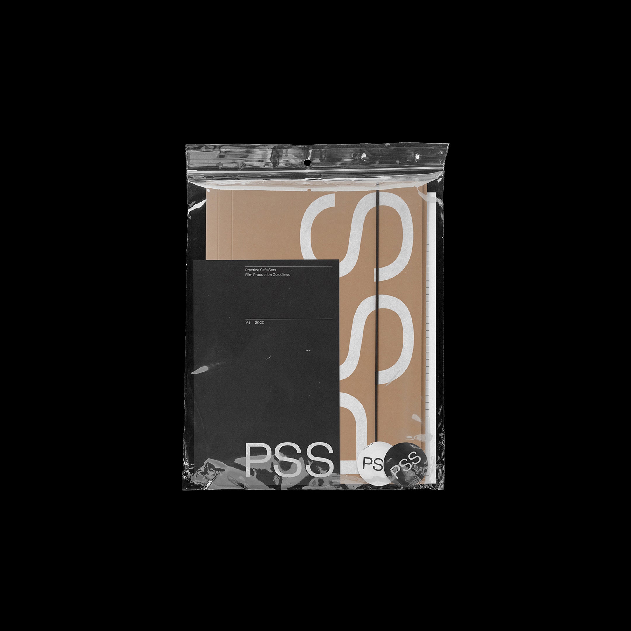
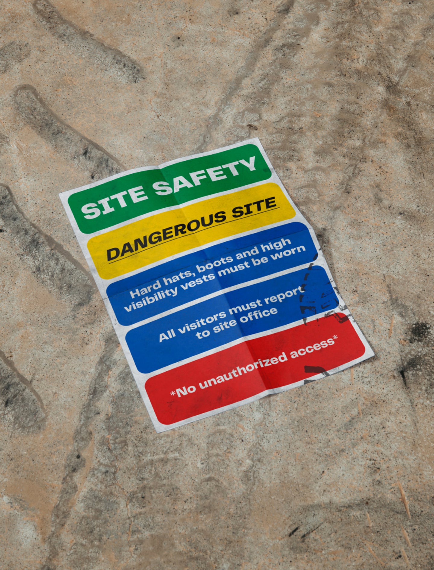
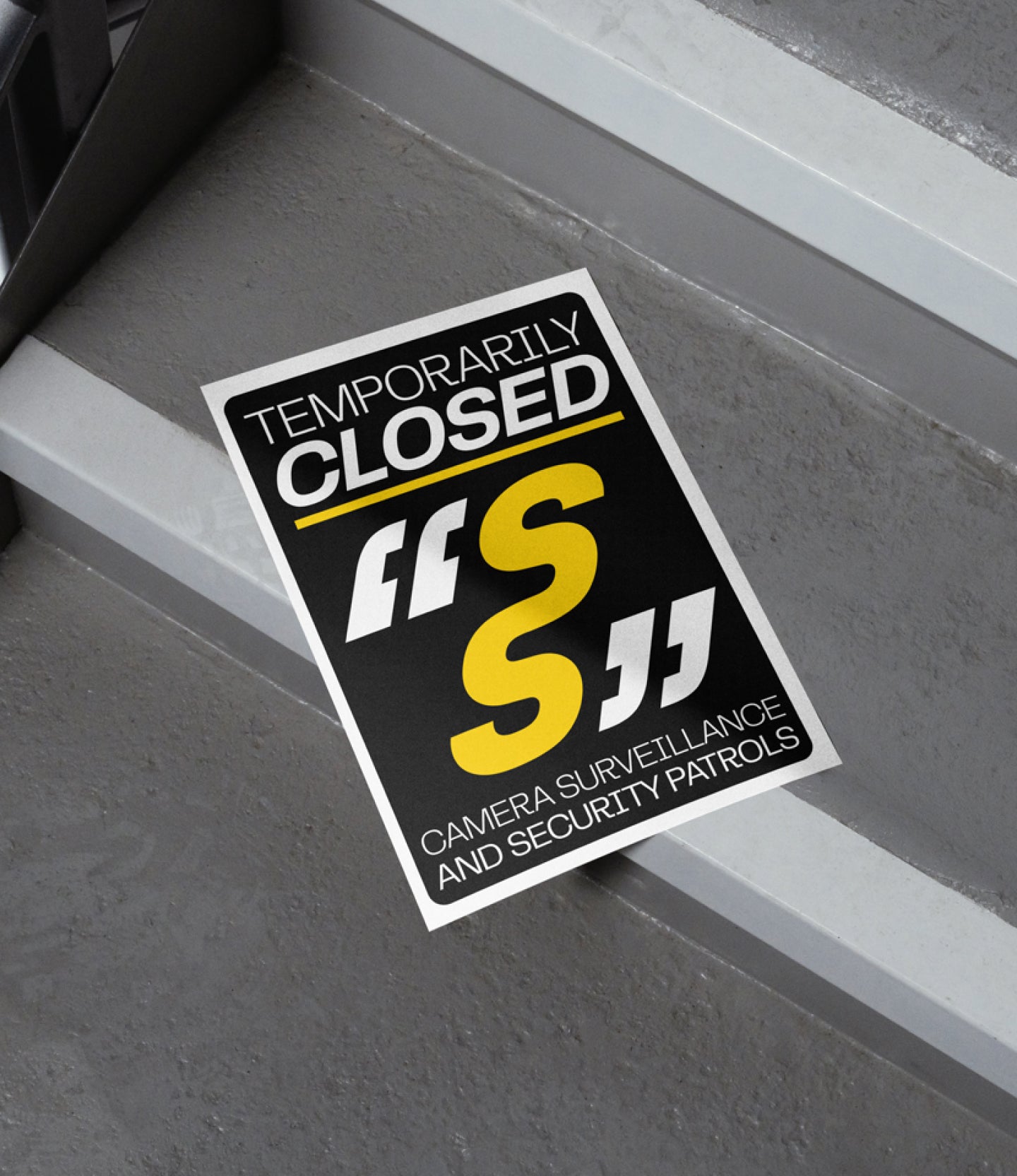
Practice Safe Sets
View project