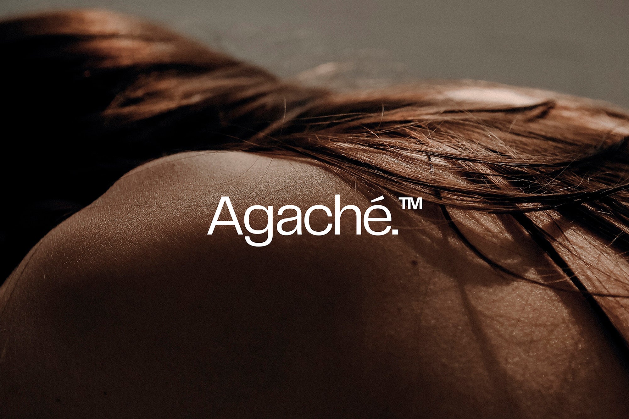
Alphamark brands Agaché, finding inspiration in the skincare brand’s use of natural ingredients.
Agaché is a cosmetics company, founded by an experienced dermatologist to offer high-end skincare products for a healthy skin barrier. They entered the market with four products: a face cream, a cleanser, a toner and a serum; targeted towards busy and career-driven women that lead an active, healthy lifestyle.
Macedonian branding studio Alphamark was employed to create Agaché’s visual identity and packaging system. Inspired by the products clean formulas and use of natural ingredients, they created a circular logo with a double meaning representative of inner purity and shine. “The thicker lines form a water droplet, which is often connected to clearness”, explains Alphamark Founder Antonio Stojceski, before adding that “the thinner lines form a circle within another circle to represent inner shine, which comes from nature and people”.

The wordmark and accompanying typography are set in our Telegraf, a sans serif with short ascenders that combines the forms of mid-century grotesks with rigid angles. Stojceski reveals that it was chosen to “give the brand a little playfulness in the details while keeping a serious tone”. It’s used simply in applications, with a contrasting balance of upper case and sentence case defining the hierarchy between headline and wordmark respectively.


The product types are defined by a series of soft gradients, each flowing seamlessly in use across packaging, advertising and stationery. Speaking on the colour choices, Stojceski tells us that they selected “earthy tones to match the earth and soil, nature and plants, sea and water and atmosphere and air”.


All images © of their respective owners.
Content taken from The Brand Identity


