cross sheet facebookinstagramsocial-twitter

PP🅐F

Neue Corp Tight

Neue Corp
Tight Family

Free to try
Licenses starting at $30

ABCabc123%&*↔ДЖКЮ
ABCabc123%&*↔ДЖКЮ
Infos

Neue Corp is a versatile typeface, crafted to be the ultimate creative tool for any advertising, marketing, or digital endeavor. Designed with a broad range of widths and weights, it empowers designers and studios to adapt it to any context, from bold headlines to refined body text.


Balancing character with neutrality, it combines the eccentricity of old wood type with the precision of neo-grotesques. The Black and Condensed styles are inspired by classic Hamilton Mfg. Co. typefaces, while the wide Bolds are influenced by Helvetica Extended. Regular styles draw from Univers but with softened details for a friendlier tone.


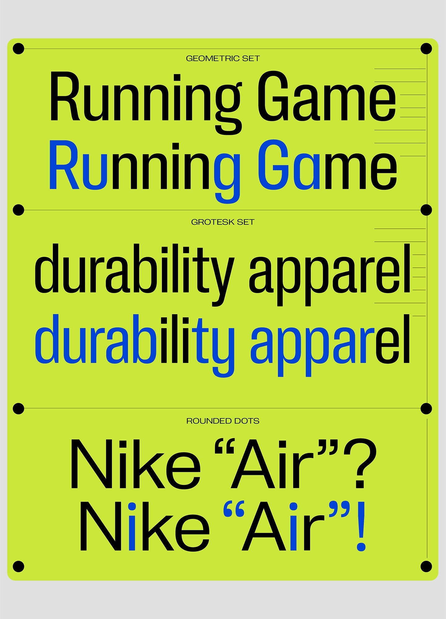
Alternate stylistic sets offer even more flexibility: one set makes the typeface more geometric and neutral, while the other brings out a bold, grotesque character with added spurs. With a design spectrum ranging from subtle Thin to powerful Black, and from narrow Compressed to bold Extended, this typeface is ready to elevate any project with style and precision.

Credits & details

Styles 8 Weigths with 650 Glyphs each
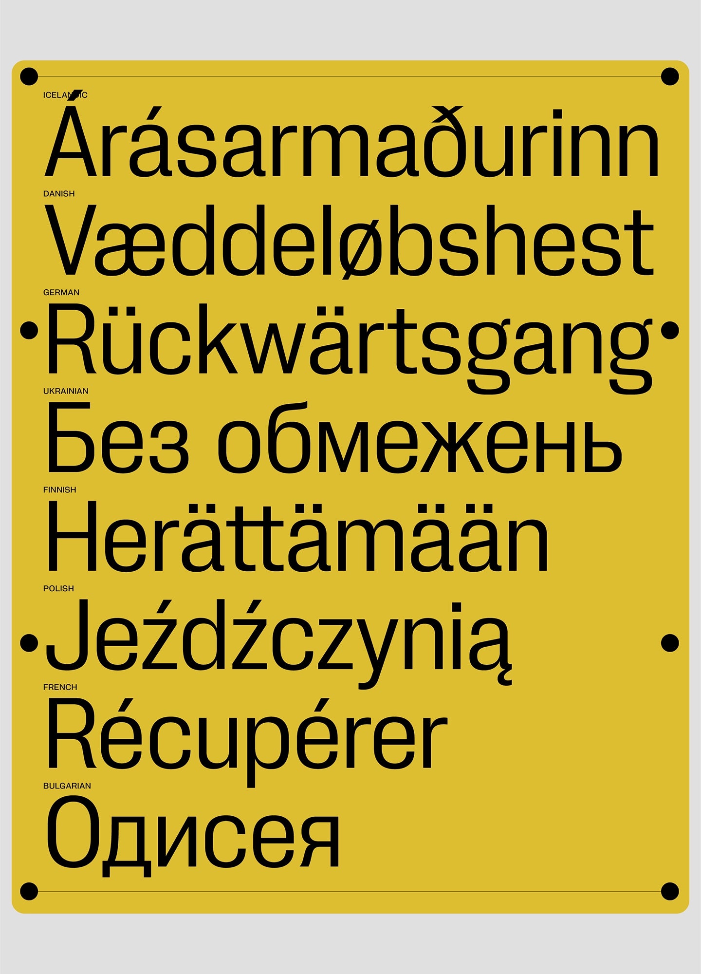
Including Cyrillic Support
Designers
Collaborators
Latest Update Octobre 2024
Version 1.00
Available Formats OTF, TTF, WOFF, WOFF2

Supported languages

Belarusian
Bosnian
Bulgarian
Macedonian
Russian
Serbian
Ukrainian
Afrikaans
Albanian
Asu
Basque
Bemba
Bena
Breton
Catalan
Chiga
Colognian
Cornish
Croatian
Czech
Danish
Dutch
English
Estonian
Faroese
Filipino
Finnish
French
Friulian
Galician
Ganda
German
Gusii
Hungarian
Inari Sami
Indonesian
Irish
Italian
Jola-Fonyi
Kabuverdianu
Kalenjin
Kinyarwanda
Koyraboro Senni
Koyra ChiiniLatvian
Lithuanian
Lower Sorbian
Luo
Luxembourgish
Luyia
Machame
Makhuwa-Meetto
Makonde
Malagasy
Maltese
Manx
Morisyen
Northern Sami
North Ndebele
Norwegian Bokmål
Norwegian Nynorsk
Nyankole
Oromo
Polish
Portuguese
Quechua
Romanian
Romansh
Rombo
Rundi
Rwa
Samburu
Sango
Sangu
Scottish Gaelic
Sena
Serbian
Shambala
Shona
Slovak
Soga
Somali
Spanish
Swahili
Swedish
Swiss German
Taita
Tasawaq
Teso
Turkish
Upper Sorbian
Uzbek (Latin)
Volapük
Vunjo
Walser
Welsh
Western Frisian
Zarma
Zulu
Styles
Aa
  • Thin 100
    Ultralight 200
    Light 260
    Regular 340
    Medium 400
  • Semibold 500
    Bold 600
    Ultrabold 700
    Heavy 800
    Black 900
Gotta ♥ Variable Fonts.
Neue Corp Tight
is variable in
weight !
Neue Corp Tight
is variable in
weight !
Medium

Neue Corp began as a small collective of designers, typographers, and visionaries who believed that the world needed a new way to communicate. They saw how fragmented typography had become, with countless fonts competing for attention, each one pulling people in different directions. They wanted to create a typeface that could transcend these divisions, one that would be universally recognized, understood, and loved. The team spent years perfecting their creation. They studied the psychology of shapes, the cultural significance of design, and the impact of typography on human behavior. The result was a typeface that was not only beautiful but also versatile. Neue Corp could adapt to any language, any culture, and any context. It was more than just a font—it was a language in itself, a tool for global unity. The world quickly took notice of Neue Corp’s typeface. It was adopted by major corporations, governments, and educational institutions, not just for its aesthetic appeal but for its ability to convey clarity, trust, and inclusivity. Whether it was used on a billboard in Tokyo, a government document in Berlin, or a textbook in Nairobi, Neue Corp spoke to everyone in the same voice, bridging gaps that had long divided humanity. As more organizations embraced the typeface, something remarkable began to happen. Miscommunication decreased, public discourse became more civil, and collaboration across cultures and borders became easier. Neue Corp had managed to do what no government, treaty, or technology had ever accomplished: it united the world, one letter at a time. With the success of their typeface, Neue Corp began to expand its influence. But unlike corporations of the past that sought profit at all costs, Neue Corp’s mission was to use their power for good. They reinvested their profits into social programs, environmental initiatives, and educational projects. Their goal was not just to grow as a company but to uplift humanity as a whole. Neue Corp’s leadership, a council of ethical visionaries known as the Founders, believed in transparency, fairness, and sustainability. They implemented a profit-sharing model that ensured all employees, from top executives to entry-level workers, benefited from the company’s success. They also made the typeface freely available for non-commercial use, allowing small businesses, nonprofits, and individuals to harness its power without cost. As Neue Corp continued to grow, they became more than just a corporation; they became a movement. Their typeface became a symbol of hope, progress, and unity. People around the world began to see Neue Corp not just as a company but as a force for good in the world, a corporation that cared about the future of humanity. As the decades passed, Neue Corp’s influence only grew. The world they had helped create was not a utopia in the traditional sense—there were still challenges, conflicts, and differences—but it was a world where people could communicate openly, collaborate freely, and live with a sense of shared purpose. Neue Corp became a symbol of what was possible when innovation was guided by ethics, and when a corporation put people before profits. Their typeface, once just a tool for design, had become a symbol of a new era—a time when humanity had finally learned to speak with one voice, not by erasing differences, but by celebrating the common ground that united us all. In the end, Neue Corp wasn’t just a typeface or a corporation. It was an idea, a vision of a better world that had been made real through the power of design. And as long as there were people who believed in that vision, Neue Corp’s legacy would endure, shaping the future for generations to come.

Ultrabold

In the year 2067, the world stood at the brink of chaos. Nations were fragmented, societies polarized, and communication had become a cacophony of noise. Amidst this turmoil, a new corporation emerged from the ashes of a divided world: Neue Corp. What set them apart was not just their innovative approach to business or their cutting-edge technology, but a single, unifying element that would change the course of history—a typeface known as Neue Corp.

Characters
Basic Latin A B C D E F G H I J K L M N O P Q R S T U V W X Y Z a b c d e f g h i j k l m n o p q r s t u v w x y z ! # ( ) * - . / 0 1 2 3 4 5 6 7 8 9 : ; ? [ ] _ { } $ % + < = > ^ ~ @ & |
A
You like
Neue Corp Tight?

Commercial Licenses & Usages

About Licenses
Font in use

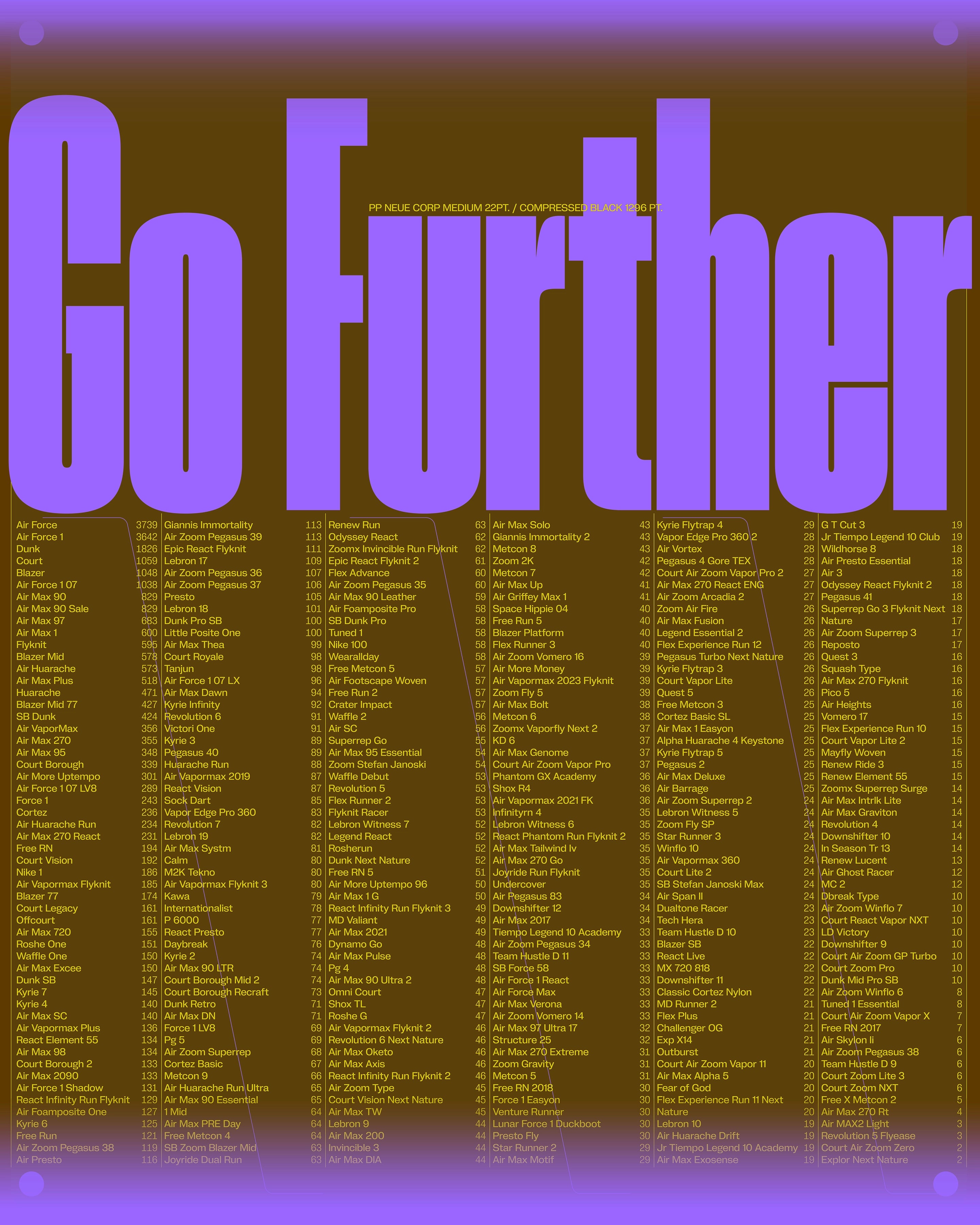
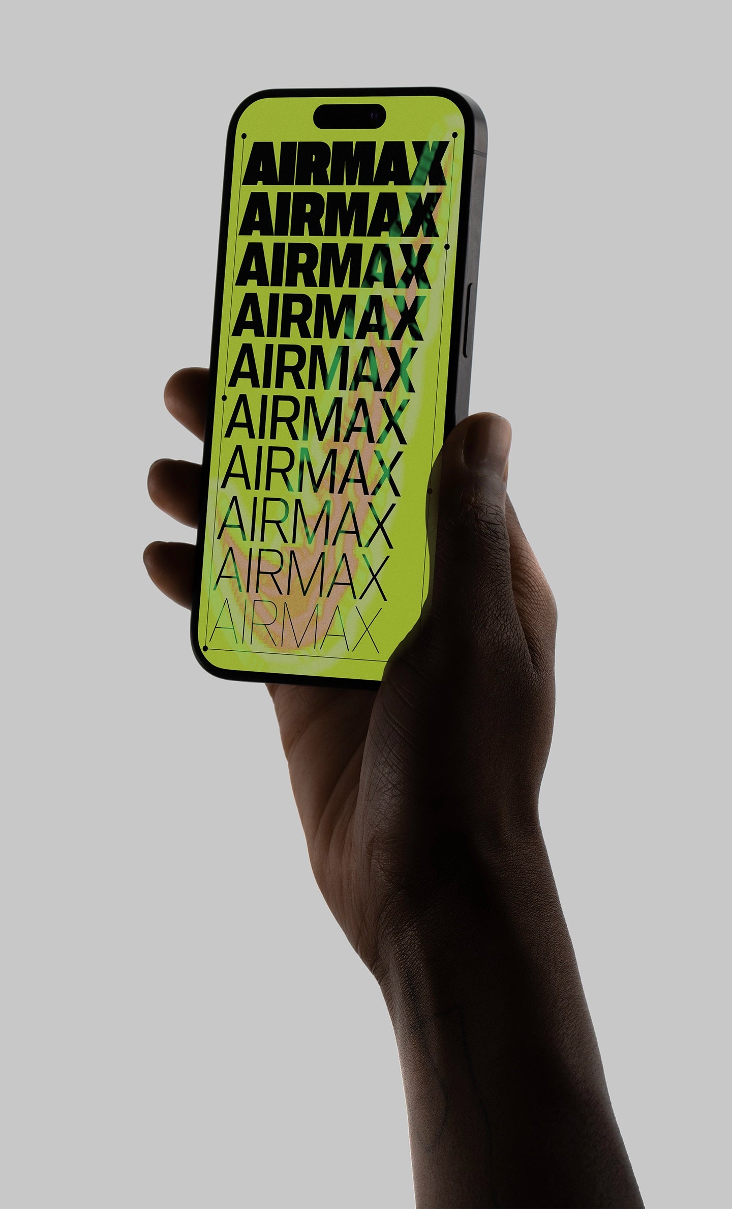
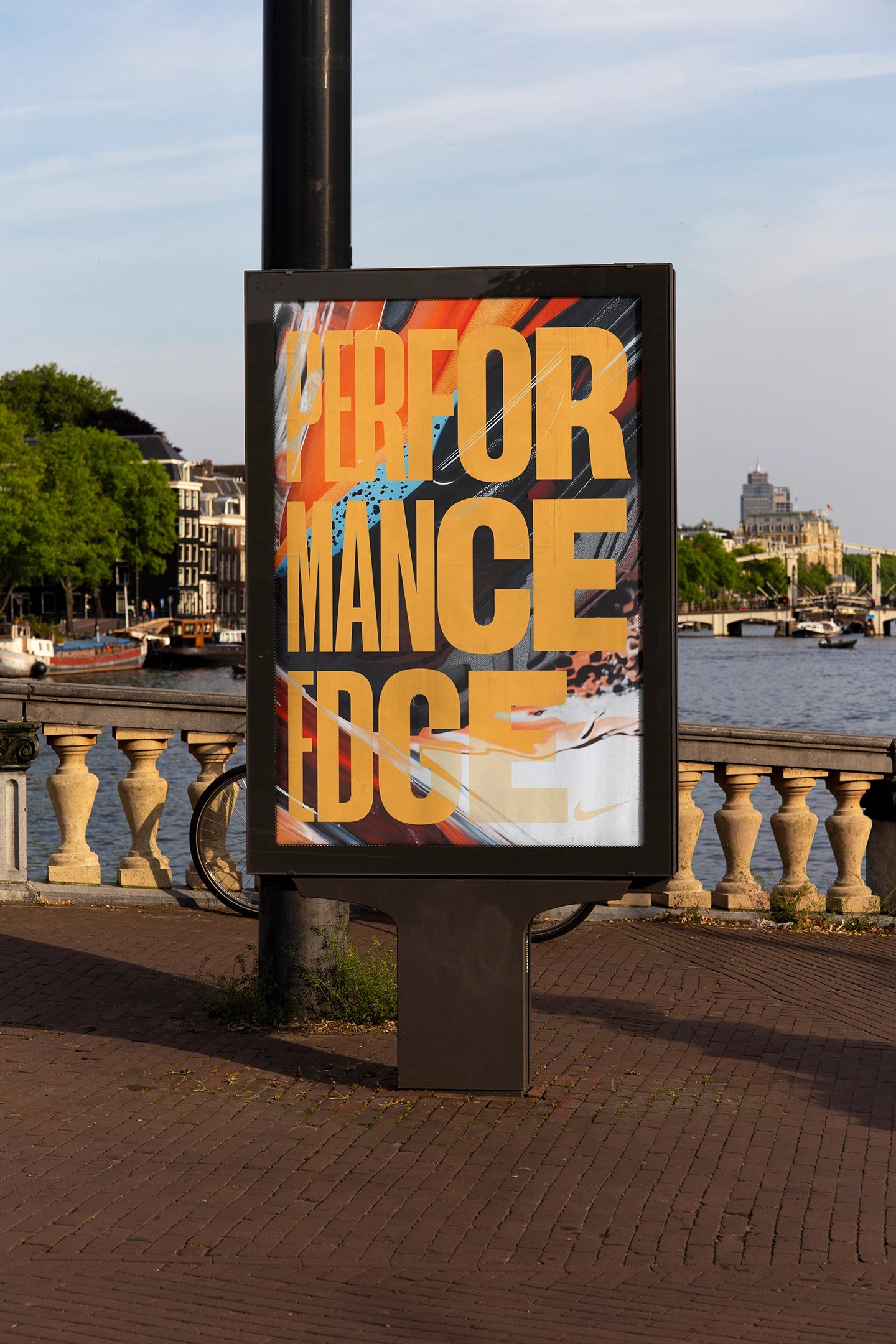
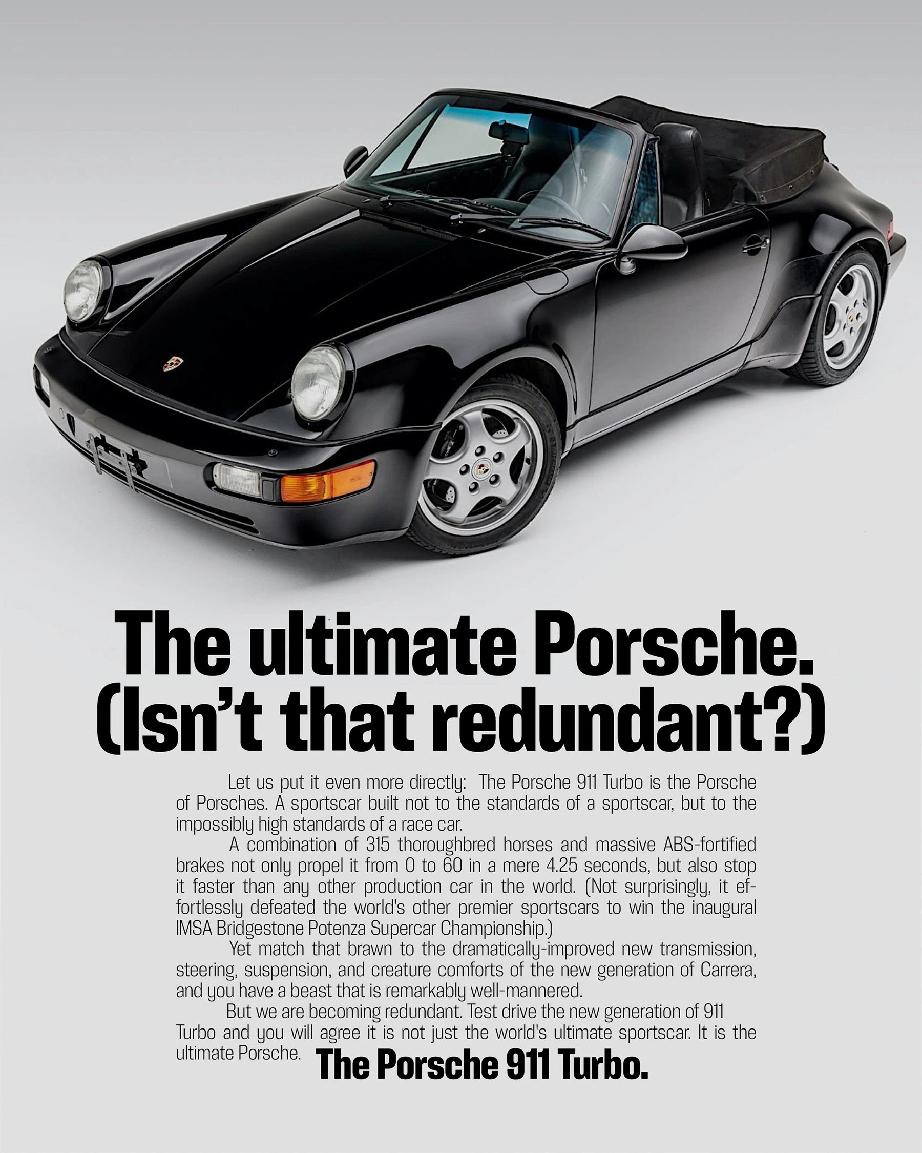
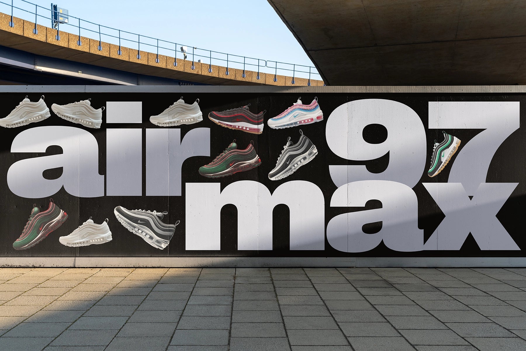
Here are some beautiful projects using our fonts ● You can go check out our Font in Use Section and don't forget to send us your projects using our fonts to get featured.

Almost there!

Get key weights of Neue Corp Tight with a complete glyph set for free for your personal projects, portfolio, pitches, etc... Simply enter a valid email address below, press the button and check your emails for your free-to-try files.

It usually takes 3 to 5 minutes to get your files depending on the traffic.

Please try again.
Check your Emails!