Grafier
This is what happens when Baskerville grows a backbone.
Free to try
Licenses start at $40
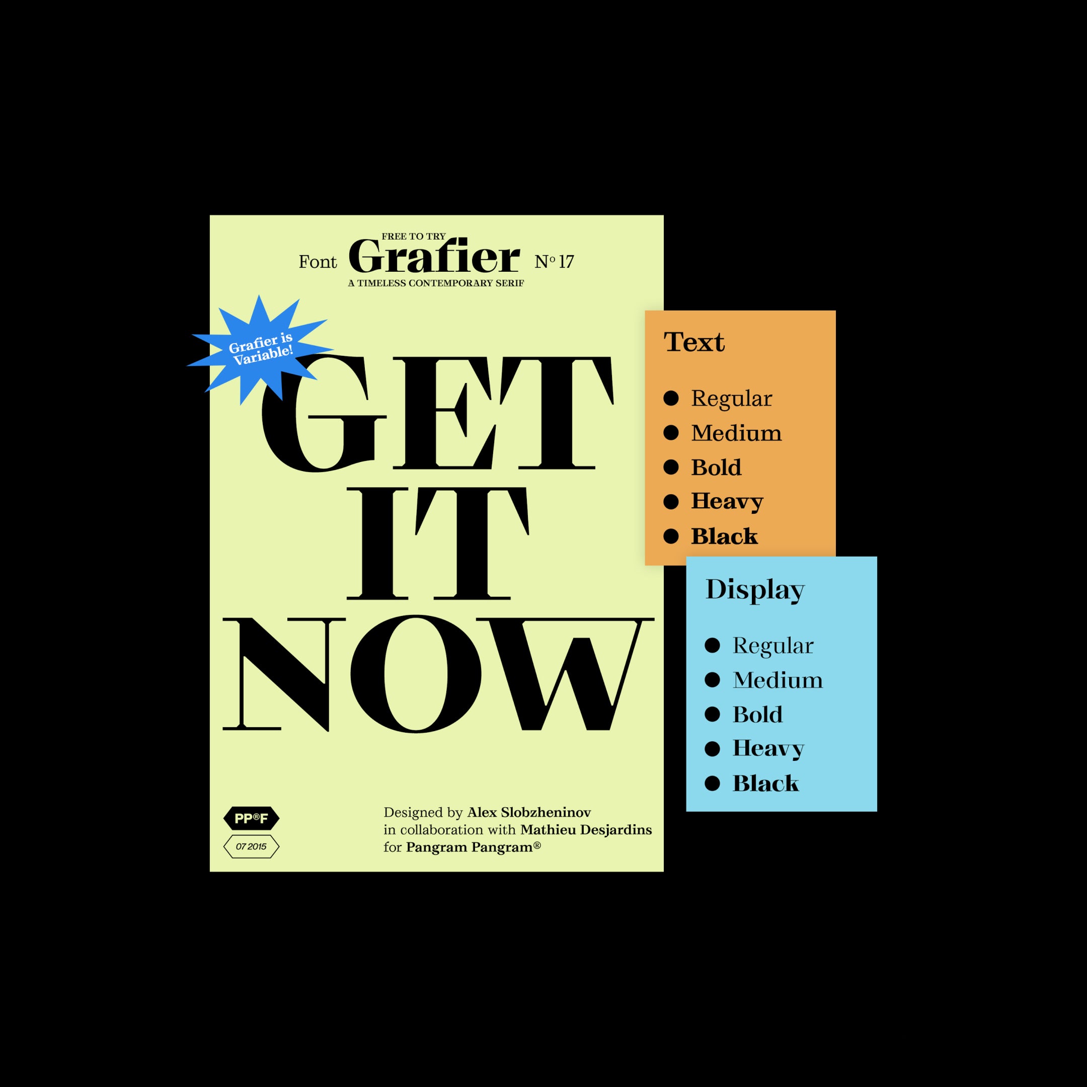
Grafier style list
10 Styles
01234567
{(!@#$?&)}
01234567
{(!@#$?&)}
- Regular 400
- Medium 530
- Bold 650
- Heavy 785
- Black 900
- Regular Display 400
- Medium Display 530
- Bold Display 650
- Heavy Display 785
- Black Display 900
Grafier
Glyphs set overview
Glyphs set overview
Glyphs View
Grafier's Features
Classic Bones. Modern Blade.
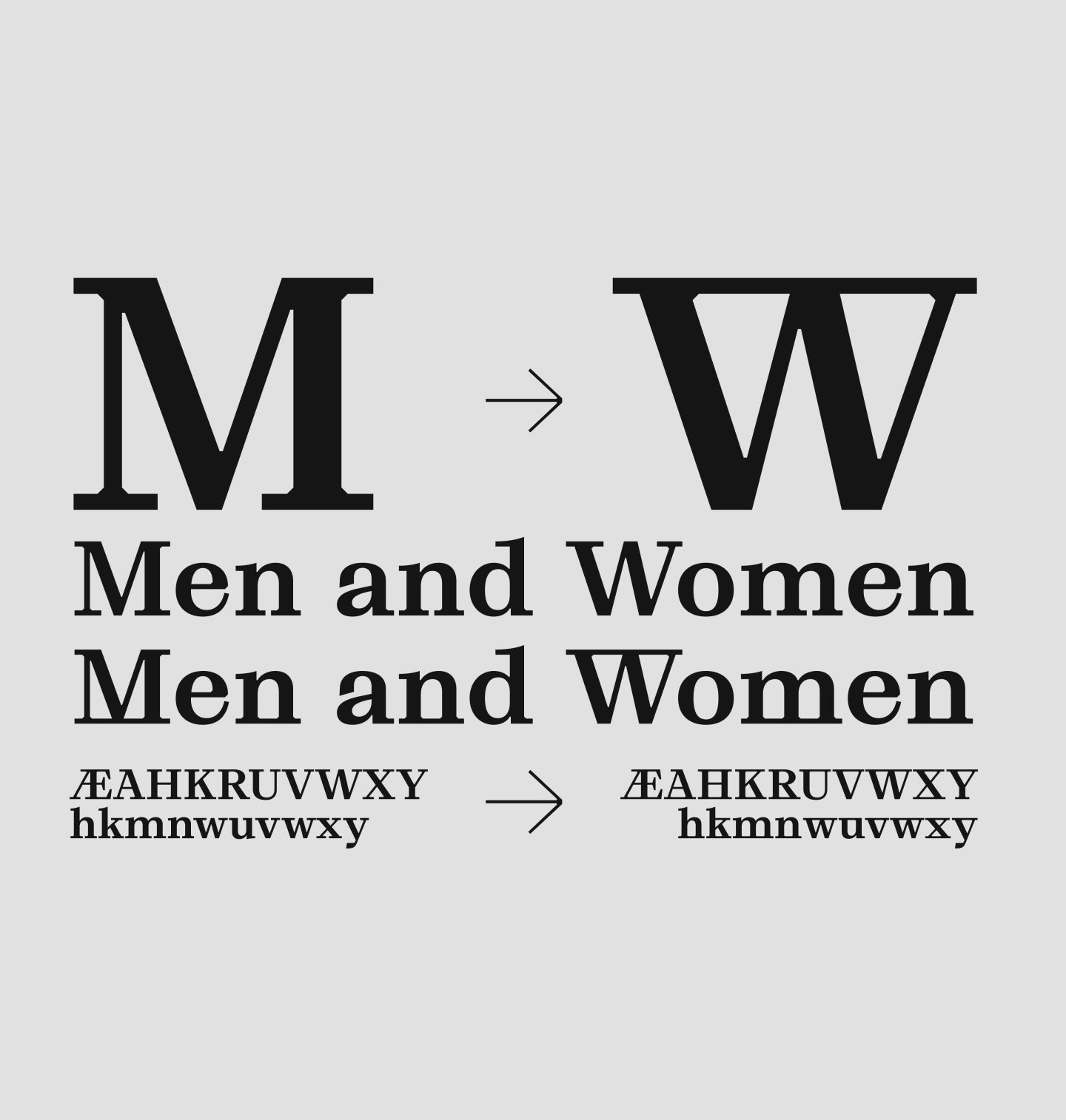
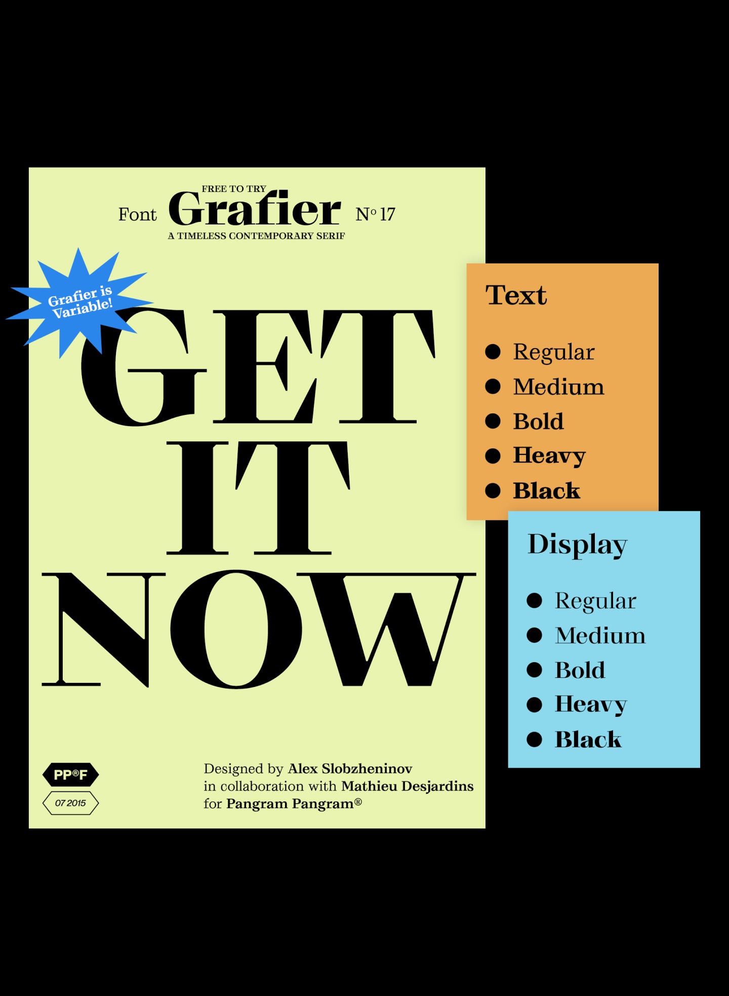
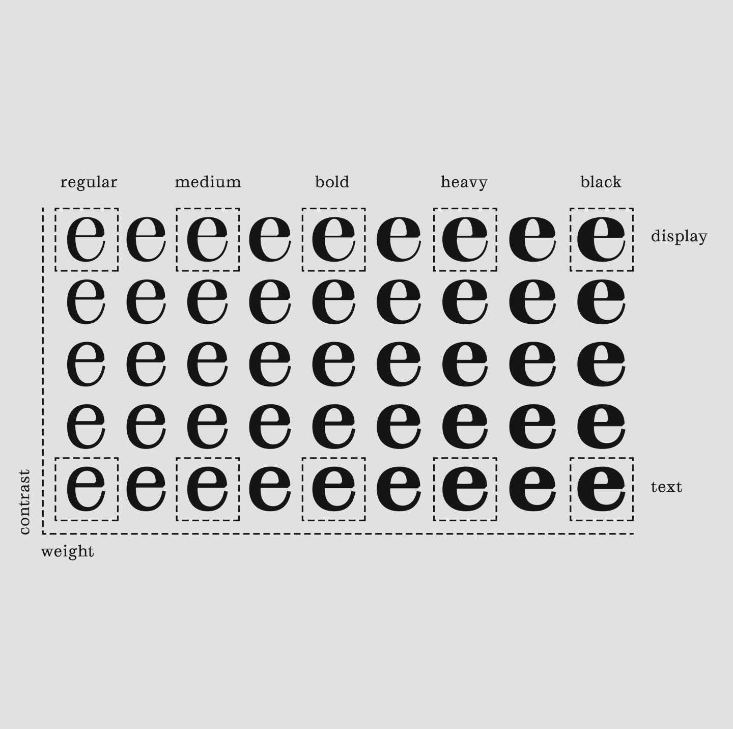
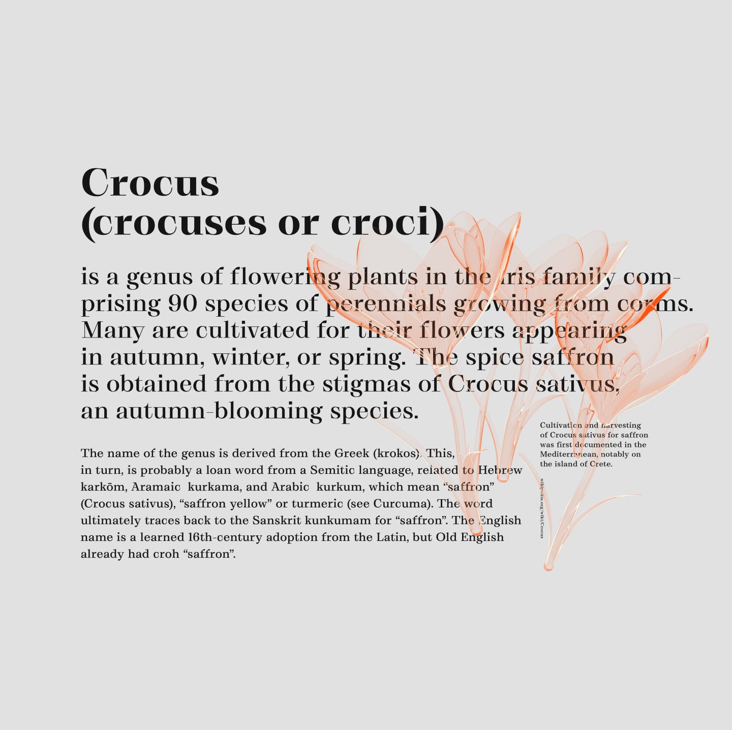
Grafier is a serif typeface that rethinks classic design in the digital era. The original source of inspiration was good old Baskerville, an English typeface from the 18th century. But Grafier went its own way and got some unique new features. The most obvious one is uncompromisingly straight serifs, which join inside the letters. This brutal linearity is also supported by distinctive flag-terminals, chopped shapes and squarish punctuation.
The family consists of 10 styles: five weights from Regular to Black in two contrast variations. All the styles are also available as one variable font with two axes. Straight letter shapes makes Grafier a good pair for sans serif fonts. The typeface works perfectly in big and medium sizes; low-contrast styles are suitable for short texts as well. In such cases the readability can be improved by using stylistic alternatives that disconnect serifs.
Designer
Categories
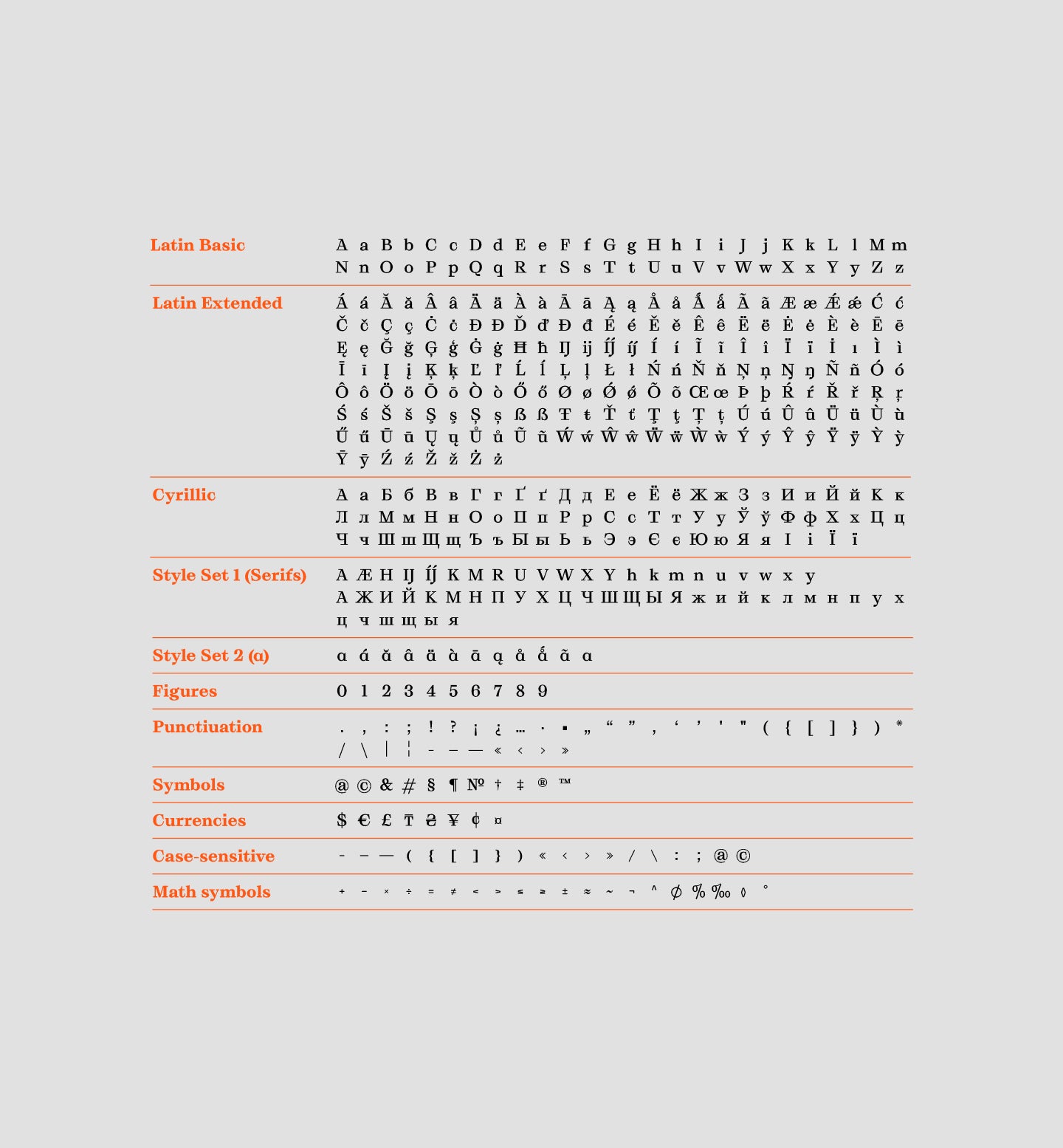
- Cyrillic
- Expressive
- Serif
- Variable
Styles
- 10 Styles
10 Styles with 594 Glyphs each
Including Text/Display and Cyrillic Support
Version
3.00
Latest update: November 2018
Available formats
OTF, TTF, WOFF, WOFF2
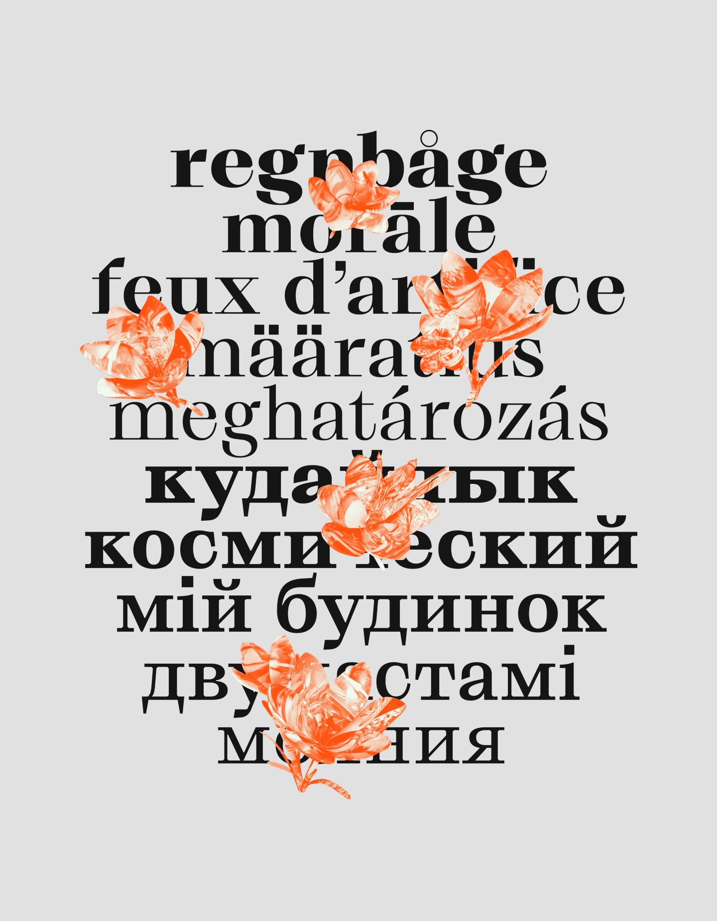
Language Support
Afrikaans, Basque, Belarusian, Bosnian, Breton, Bulgarian, Catalan, Croatian, Czech, Danish, Dutch, English, Estonian, Finnish, French, Gaelic, German, Hungarian, Icelandic, Indonesian, Irish, Italian, Latvian, Lituanian, Macedonian, Norwegian, Polish, Portuguese, Romanian, Russian, Saami, Serbian, Slovak, Slovenian ... (and more)
Commercial Licenses
Not sure what to get? Or can’t find the right coverage?
Please contact us for our tailored corporate licenses!
Need more information about our licenses?
Our FAQ usually contains most of the answers.
Our fonts in use
View all
The Webster
View project
The Moraine
View project
Havelufer Quartier Berlin
View project
Office of Demande Spéciale — 7th Anniversary
View project
Strange House
View project