When, to establish a memorable brand that customers would recognize and trust, designers were tasked with creating designs that would be increasingly consistent with previous ones. This, without a doubt, led to a growing standard of assets that once consolidated would be considered as what we today refer to as “brand assets” —among which the type scale would be featured.
A scale is a set of levels or numbers which are used in a particular system of measuring things and in that regard, a type scale — also sometimes named type ramp — can be diminishingly described as such: a set of type levels, which naturally starts to emerge from the moment one can discern various levels of text. Beyond the simple self-explanatory meaning, it is an essential design tool that is central to building the face of a brand. It plays its part in laying down the visual rhythm, it codifies content hierarchy and is a key player in building a coherent vernacular.
Technical
When designing for the Web, using a type scale is a crucial productivity habit to a professional workflow and fortunately, Sketch has built-in features to facilitate it.
Some people have basic type scales they always use, some will base their scale off of the Golden Ratio, some others off of Fibonacci sequence and other numbers. Personally, I always find myself landing on an approximately similar scale, but nevertheless, I like to start designing first, from scratch, and then reverse-engineer it as a formal type scale, to make sure it’s exactly tailored to the project. In this regard, besides never going below 8 points in size and generally having even size points, I don’t use particular rules: I just start designing right away. The idea is just to flesh out as many design occurrences as possible while establishing the art direction, to make sure everything is already working in context.

Let’s take this simple interface that I designed for this purpose (based off Pierre Bourdieu’s Symbolic Violence Wikipedia page, enlightening concept, just saying and DAMN! Neue Montreal is such a workhorse).
Let’s say I’m happy with no tracking (in Sketch, never set the tracking to 0, lest you want to have a horsey kerning - just remove any value and hit enter), the line-height is adjusted, the paragraph space specified - the type is all set.

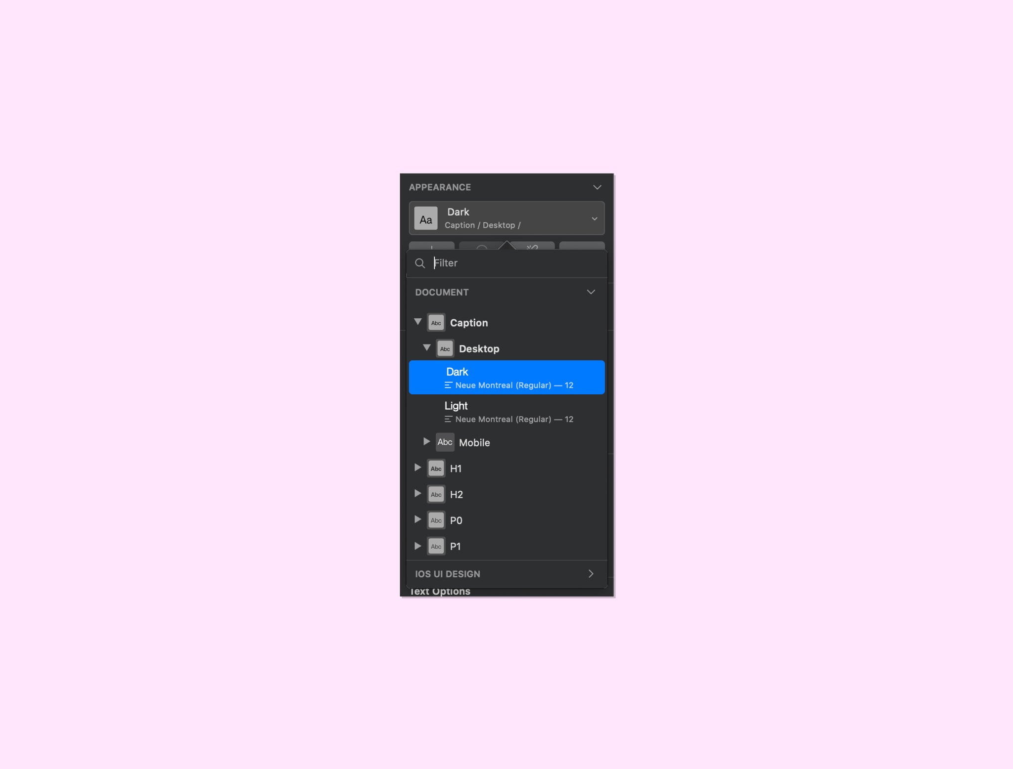
From that point, you would then proceed to make a copy of each text levels in a new artboard and rename each layer. There are two aspects when renaming in this process: identification and scalability. First, it doesn’t matter exactly what you name your text levels: it just matters that it makes sense to you and helps you keep things consistent. You can see that I used a nomenclature inspired by HTML, but that is also departing from it. And second, for scalability purposes, you should specify the breakpoint in which this level appears.
Using Sketch’s slash nomenclature, your layers’ names should follow this formula: <Type level> / <Breakpoint>. You can save yourself some time and do it in batch with this plugin.

Once that’s done, install the Styles Generator plugin; select your renamed layers; go to Plugins > Styles Generator > Generate Shared Styles and that’s it. All levels of the type scale should now be available in the first dropdown in the Appearance section of the Inspector, when a text layer is selected.

You’ll then repeat the process for every breakpoint, as you flesh them out.
You might have noticed that I conveniently didn’t mention the “light” spec that is shown in the screenshots. Sometimes, a project will have some type levels in opposite brightness color schemes, in which case you could set the type scale just like in the screenshots, or expand any other way you consider relevant. But I generally stick to setting the styles in their intended color, documenting only the level (color, tracking, line-height and paragraph space) in its breakpoints, in order to keep it as bare as possible. When needed, I just manage color variations manually using Document Colors. This way, I don’t have to update 6 colors of the same style in two breakpoints if I simply need to adjust the line-height. Furthermore, by selecting colors from the Document Colors, you’re making sure that you’re using only specific colors you selected (let’s be honest, who never came across a 50-shades-of-similar-grey type of situation when readying design files for hand-off to devs?).
Do I need a formal type scale?
While we haven’t dived into the actual theory of defining a type scale (perhaps in another article), the question remains pertinent. I remember that in my beginnings as a designer, I was always eager to systemize my designs, even if the scale of them didn’t call for it. In retrospect, it allowed me to appropriate the concept of it, preparing me for when the proper occasion arose.
Everyone gets better at gauging what is the optimal ratio of minimal effort to maximum yield with their tools. In the end, one could argue that although the design system’s components of big and small projects, such as a type scale, differ in how formally they have been established, they are there regardless.
In practice, as soon as a website has more than two pages, basic design patterns should have emerged and that’s where a type scale will start to form itself, so you might as well make your life easier and set a type scale early. Additionally, it makes the developers’ lives easier to have well defined specs.


