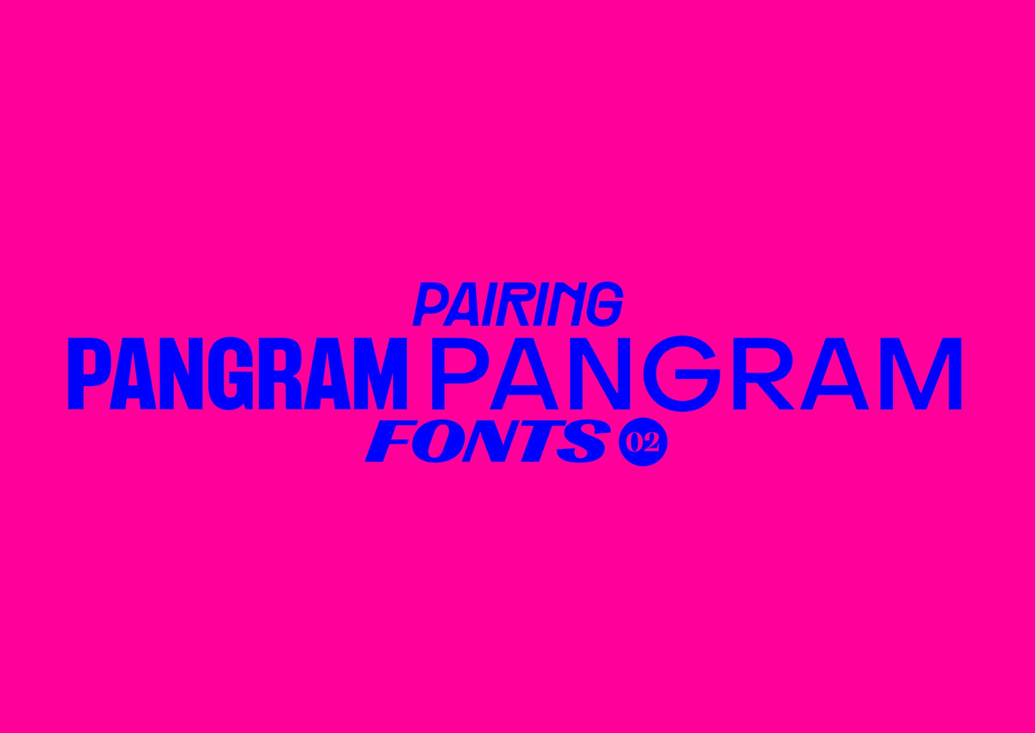
Welcome to round two of pairing Pangram typefaces! As we said before, pairing typefaces isn’t the easiest task. With so many weights, widths, families and subfamilies, it often can be quite overwhelming. Well, fear not! In this article we’ve got another series of typeface pairings to get you started.
Below you’ll find some suggested pairings for Pangram Pangram typefaces. Try them out and tag us in your designs at @pangram.pangram!
RÄDER and TELEGRAF
With ligatures like these, how could you resist Räder?! Paired with the chunky character of Telegraf’s Black cut, this combination is both punchy and lively, whilst maintaining a softness and charm that only these two can create in tandem. And again, those ligatures, are you kidding? How could you not?

FORMULA and RIGHT GOTHIC
Curvaceous and contrasting, these two truly embody the variety that condensed typefaces can offer – from the sharp forms of Right Gothic’s plunging architecture, to the brazen weight of Formula’s construction. Working in tandem, this pair provides a similarity of style, alongside individual character. A lethal combination!

GOSHA SANS and GRAFIER
Both uniquely crafted with a contrast between soft and rigid forms, Gosha Sans and Grafier not only share an initial, but also share a love of the horizontal, with both sans and serif leading the charge with an emphasis on their strong and sturdy cross bars. This mixture of sans, serif and conceptual context culminates in a thoughtful, endlessly appliable set, ready and raring for any opportunity that comes their way.

FUJI SANS and OBJECT SANS
How could you possibly OBJECT to a combination as lovely as these two? Showcasing the variety of forms, widths and weights without faff or pretention, Fuji and Object Sans in tandem make for a sweet and subtle pairing.

RIGHT GROTESK and PANGRAMS SANS
Big AND bold, using Right Grotesk’s powerful Spatial cut alongside Pangram San’s heaviest weight certainly makes a statement, whilst also making a case for only ever using enormous broad typefaces in every and all projects… When you’ve got this much joyful audacity brimming for every curve and crossbar, you really can’t go wrong!


