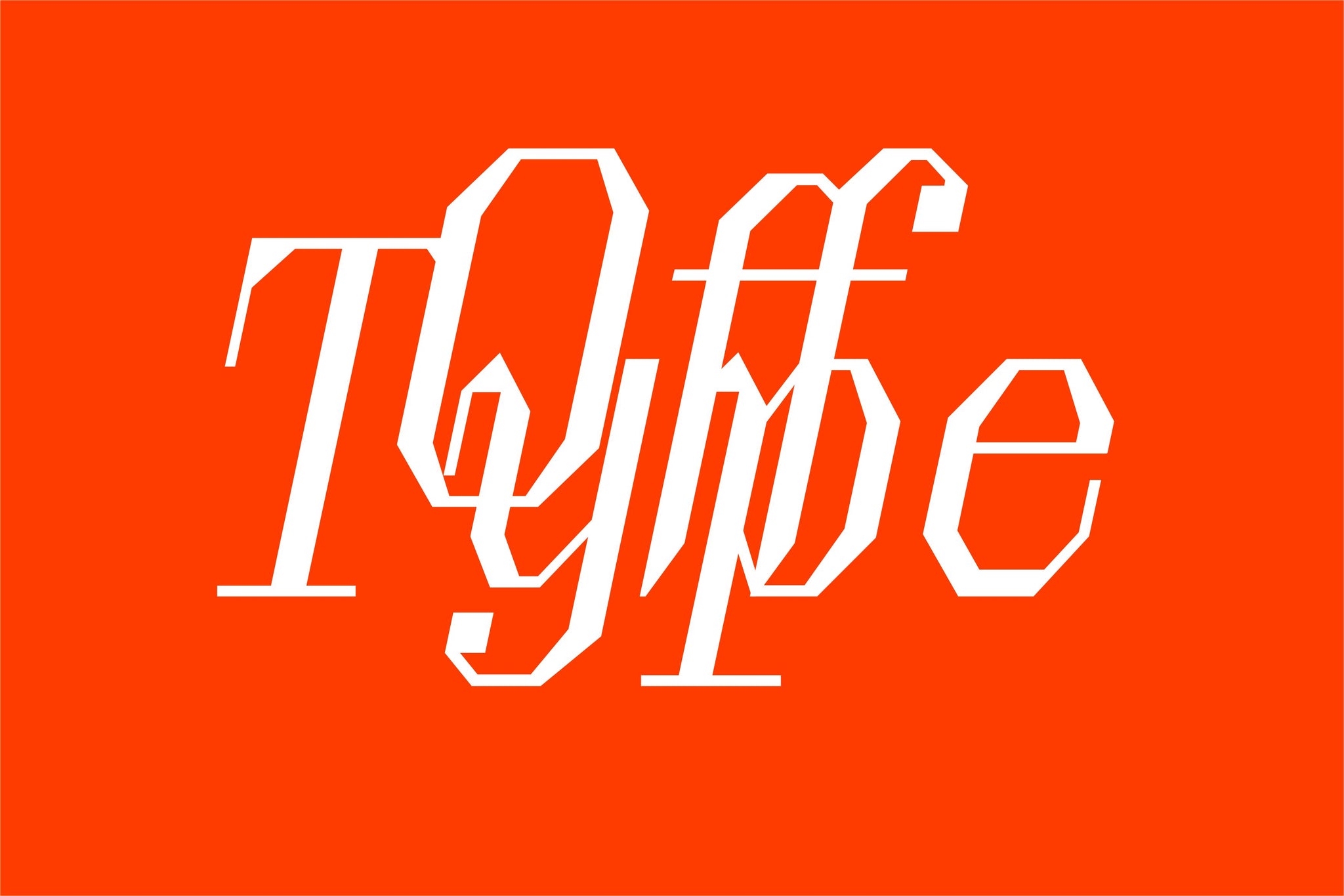
Sometimes you just need a little bit of a kick to drag you out from the depths of those same old font pairings that you go back to time and time again. And sometimes that kick comes in the form of fonts that are silly/playful/charming/wonderful/fun, as well as really really well made. You might’ve heard by now, but if you haven’t, say hellooo to Off Type, Pangram’s new sister foundry, publishing typefaces that fit the exact description you’ve just read, so that wherever you use them, they’ll work hard and look dashing/great/perfect/amazing/just-how-you-imagined-them.
But how to pair these beauties? The typefaces themselves are a vibrant/ecstatic/electric/charming hodge-podge of inspirations, legacies and letterforms – from royalty and rockets to the silver screen and b-sides. With personality abundant, and expert craft at their core, what better pairing formula could there be than Off Type + Pangram?! Well, we agree, so that’s exactly what we’re going to do. Pairing each Off Type typeface with a Pangram classic, we’ll give you a little taste of their potential, for your next big book, website, brand, or whatever you’re up to really. We’re not here to tell you exactly how to use them. We’re just here to give you the tools you need. Really well-made, weird tools.
OT Abalos and PP Agrandir
Serene, spacey and sleek, Abalos is the forward-facing, futuristic, retro-like, space-exploring typeface you’re looking for. Paired with Agrandir from the Pangram catalogue, the friendly forms Off Set and compliment Abalos, with the unaligned, quirky and funky sans serif working perfectly alongside its Off Type counterpart. Celebrating humanity, not machines, the grounded nature of Agrandir and the out-of-this-world futuristic qualities of Abalos create a match made in heaven.

OT Brut and PP Supply Mono
Why not go all in on the monos? OT Brut offers an unexpected alternative to today’s (and yesterday’s) high-contrast serifs, full of fascinating discretionary ligatures, linkable serif characters, and coding abbreviations within its mono styles. Pairing Brut mono’s delicate yet brutal forms with Supply Mono’s visual weight, precise curves and sharp angles, the two perfectly contrast each other, whilst finding common ground in the wonderful mono world in which they exist.

OT Jubilee and PP Pangram Sans
Transforming the challenging context, legacies and reputations of British institutions, Jubilee marries the pomp of the Windsor Royal Family and the country’s most notorious font Gill Sans to create something entirely new. Echoing the rounder, wider forms of characters the likes of Jubilee’s /o/, /e/ and /c/, Pangram Sans brings its geometric nature to the table, comfortably sitting alongside the fanciest of type in Jubilee’s set, grounding it through its workhorse nature and letting Jubilee take the stage.

OT Miniature and PP Radio Grotesk
Miniature welcomes the theatrical and the restrained, flexibly balancing both with its sturdy baroque structure. Offsetting the flamboyance of Miniature, Radio Grotesk brings contemporary characteristics to a classic grotesk style, letting Miniature be as loud (or as big) as it likes. Sometimes, you need a typeface that’s going to sit back, and let the hero sing, and Radio Grotesk will sit back here, but is by no means lazy.

OT Négligé and PP Neue Montreal
Négligé creates an air of mystery, existing and flourishing between the worlds of geometry and the decoratively eccentric. Bringing the opposite of eccentric to the table, Neue Montreal, a Pangram classic that’s a trusted bet time and time again, is a timeless, versatile grotesk, that brings balance to Négligé’s vibrant character. Whilst it works beautifully set against the majesty of Négligé, Neue Montreal is a typeface that you could pair with any display font to provide a considered, yet striking, approach to your designs.


