
Futura is undoubtedly an iconic typeface and clearly has earned its place in typographic history. However, has it had its day...?
First launched in 1927 by designer Paul Renner, the sans-serif was arguably ahead of its time, with a modern and geometric aesthetic that was a far cry from the traditional grotesques of the period. Instead opting for simple, low contrast forms, it reached acclaim relatively swiftly, appearing centre stage in brands from IKEA and Volkswagen to Crayola and HP – not to mention the infamous practice of artist Barbara Kruger. Today, Futura continues to be widely used, by the likes of Nike, for example, yet the proliferation of the accessible typeface has somewhat muddied the waters of its reputation, becoming so commonplace that its geometric forms go underappreciated. Do not fear, however, as that’s why we’re here!
In this article, we’ve curated some fun alternatives to Futura, from close, faithful familiar fonts to typefaces that offer a little something different whilst harkening back to the iconic sans. Either way, if you’re a Futura fan or sceptic, there is something for you.
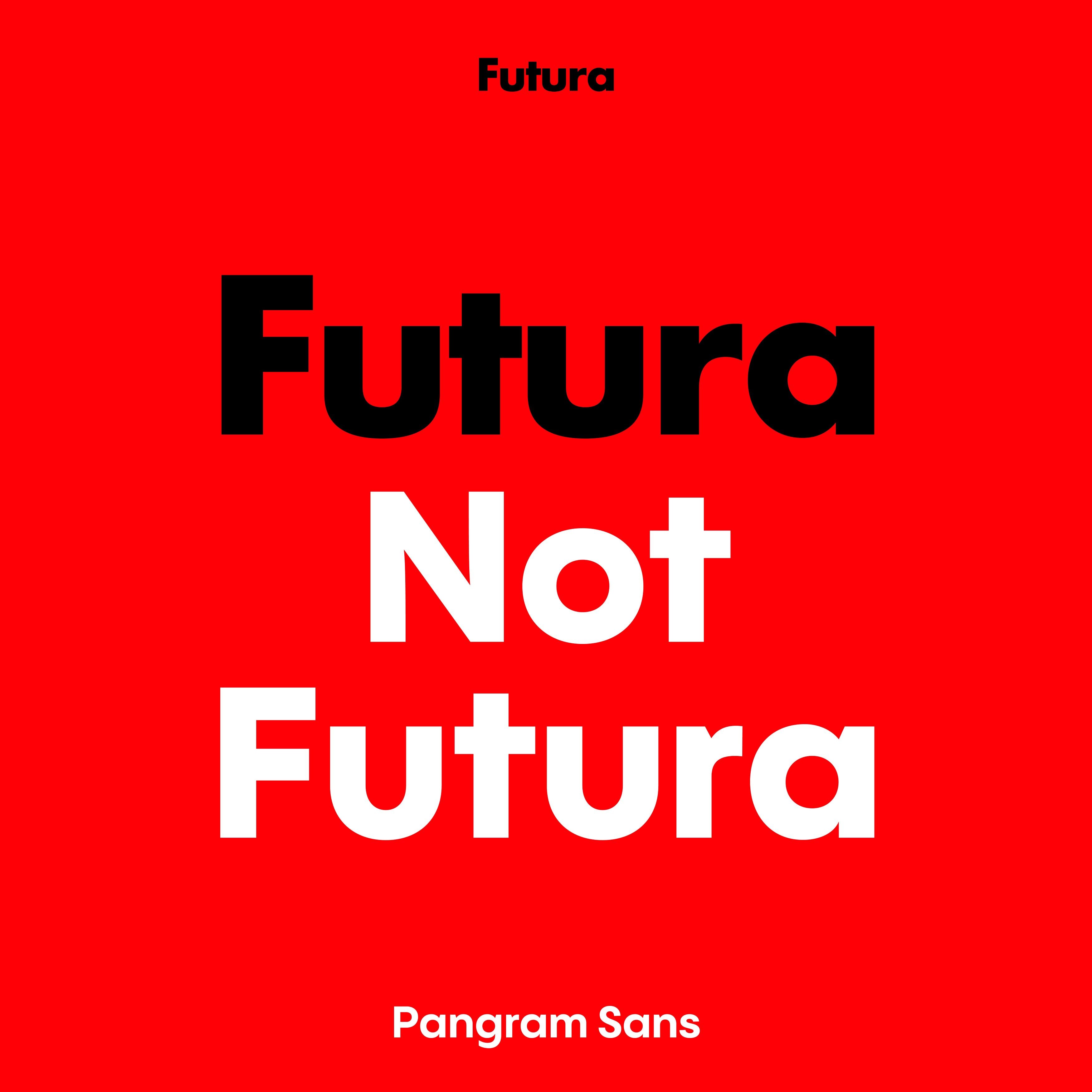
Pangram Sans by Pangram Pangram
Futura truly walked so that Pangram Sans could run! Fully variable across both its width and slant (easing all the way back to a favourable reclined position), Pangram Sans takes the Geometric sans genre to a truly prolific, fluid space, offering a powerful and extensive range of styles, weights and general typographic goodness. With six weights over 24 styles, there is a tremendous amount this humble workhorse sans can offer whilst maintaining the distinctive genre features defined by Futura almost a century ago.


Gt Eesti by Grilli Type
GT Eesti is a very good friend to the designer… with two distinct subfamilies – Text and Display – the flexibility of this striking geometric sans serif makes it suitable for almost any and all projects thrown its way. Earnestly taking inspiration from the books and typefaces found in Soviet-era, occupied Estonia, the typeface itself comes packed with a rich history equal to Futura itself, taking the legibility of the latter to new heights through its print and pixel-improving ink traps. Big or small, GT Eesti has your geometric needs covered.


Hot Sans by Hot Type
If you’re looking for something geometric and robust but perhaps aren’t feeling quite as fussed as the Futura fandom, Hot Sans from Hot Type might just be the font for you. Innately rational in its design, with a handful of self-described ‘loosened up’ humanist features, Hot Sans embodies both geometric and grotesque forms, combining the two in a warm, welcoming sans serif that takes small hints of Futura’s geometric spirit down a refreshing new path.


Eina by Extra Type
Designed initially by Extra Type as a corporate typeface for EINA, University Center of Art and Design, the geometric, humanist sans serif is as pragmatic and industrial as it is satisfying. Crafted to embody the teaching potential of the University, Eina carries a delicate balance of rationality and personality within its letterforms, alongside a plethora of slick styles, categories, families and weights. It certainly puts in the extra effort and, as a result, packs quite a punch. With similar lowercase u's and a's to Futura's forms, there's a little hint of the past in this future-facing typeface.


Certeau by A Practice For Everyday Life
Certeau champions and embodies a simplified interpretation of geometric modernism, and we’re incredibly grateful for it! Monoline in its design, the sans serif from A Practice For Everyday Life, takes direct inspiration from the geometric letterforms of 1930s Dutch and German sans serifs and shows their research the light of contemporary life, balancing the rationality of the former and the technicality of latter to make for something extraordinary. It’s a bit of a step away from Futura’s pure form, but the human, inviting vibe at the creative core of its design transcends the decades into Certeau’s expressive alphabet.


