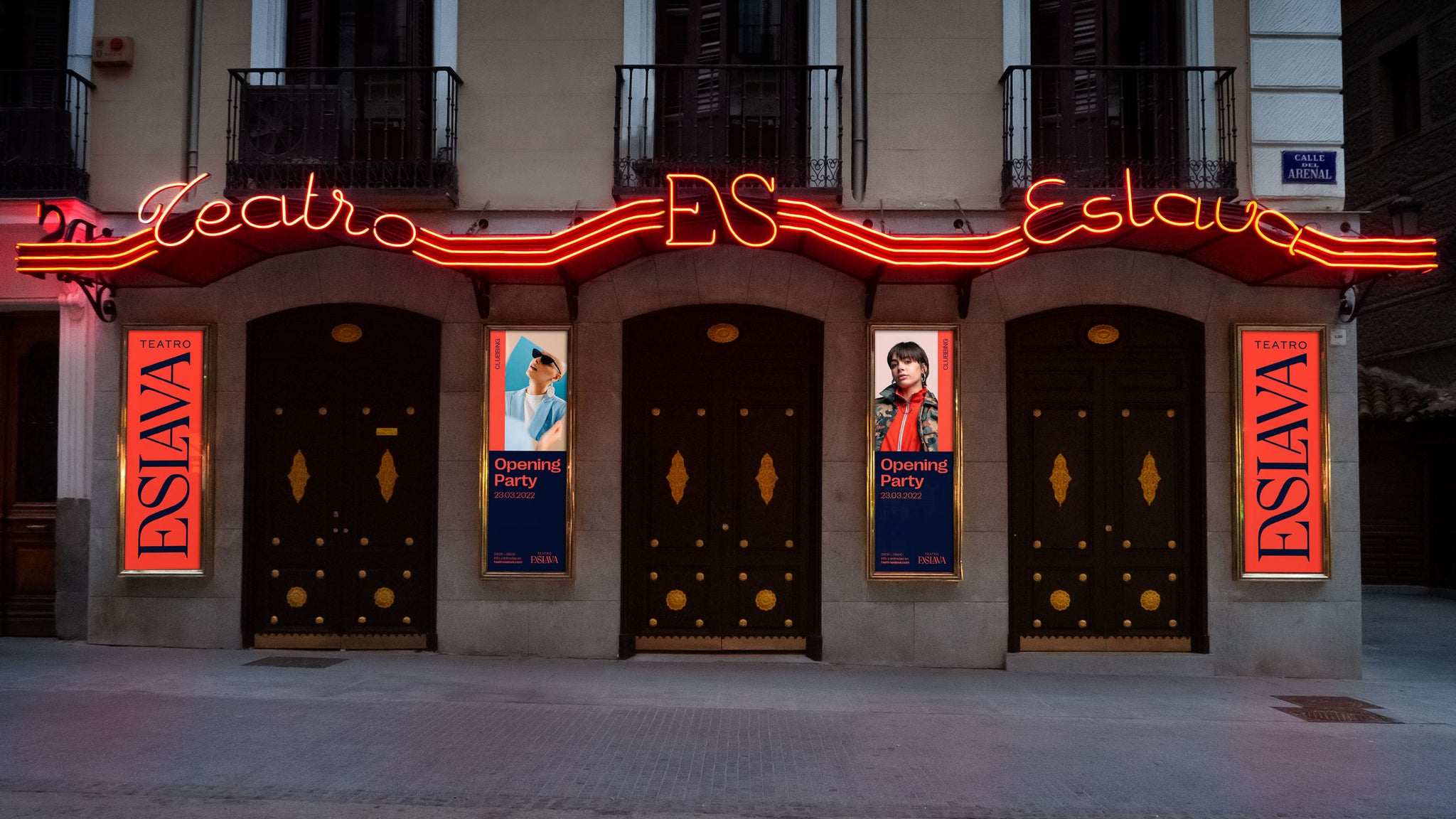
With over a century and a half of theatrical and cultural legacy to its name, Madrid-based creative studio Grávita had a lot of character and history to encapsulate within their flourishing identity for Teatro Eslava – Madrid’s famous concert hall.
However, beyond the hall’s chronicled legacy, Grávita also sought to reference the building’s distinctive reimagined interior, designed courtesy of renowned architect Philippe Starck.


The typographically-opulent result carefully balances heritage, novelty and originality, reflecting its 19th Century origins whilst championing contemporary talent. Sat within a friendly, flexible visual system, Grávita combined vibrant colour with Pangram Pangram’s Right Grotesk Wide to master an approachable, practical and informative aesthetic; whilst also referencing the striking character and diversity of the hall and its hosts.


Leading the identity, however, is the Teatro Eslava’s lavish bespoke wordmark, the ornamental ‘ES’ ligature of which guides the brand. Plunging and flourishing, the refined typography once again captures the architectural history of the hall whilst cementing its contemporary standing.
All images © of their respective owners.
Content taken from Grávita

