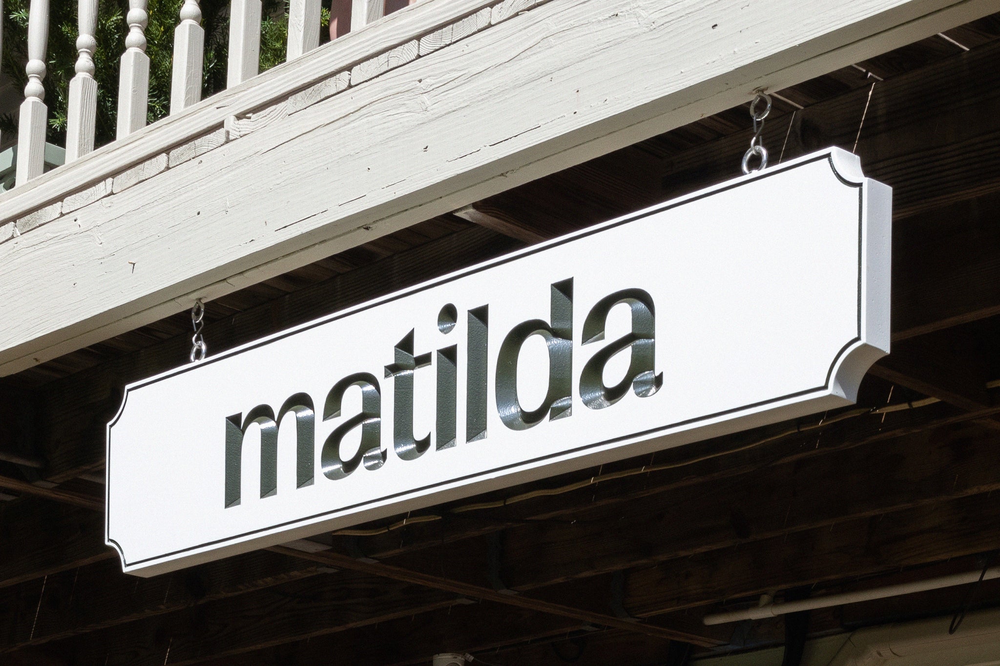
Matilda is the fine-dining counterpart to The Henson Hotel, a luxurious 16-room inn in the heart of the Catskills.
Owned and operated by Jeremiah Stone and Fabian von Hauske Valtierra of NYC’s Contra and Wildair, it’s the duo’s third project in the region after Parcasa, a gourmet grocer and Day June, the luncheonette next door.


After spending the last few years building roots in Hensonville, the chefs became deeply inspired by the beauty, abundance, and dynamic landscape of the Catskills. Working exclusively with meat, produce and dairy from local farmers and friends, Matilda is the bounty of the Catskills embodied. Already tasked with creating the visual identity for The Henson, we were asked to create a distinct visual identity for Maltida that captured the spirit of the project while working in tandem with the branding of The Henson.


Building off the inspiration we drew from the region’s abundant flora and fauna and the illustrative system we established with The Henson, we created a sweet yet seld-assured rabbit to serve as Matilda’s emblem. Representing a playfulness and certain agility, the rabbits of the Catskills easily manoeuvre the often treacherous landscape to uncover (and devour) the best things that grow in the region. Named after a team member’s grandmother, the illustrations for Maltida also include various versions of a woman dressed in different hats — a little wink at the real-life Maltida.


The resulting design matches the playfulness of the Henson while letting you know that, like the handsome bunny striding confidently through the rocky terrain, the chefs here know how to procure the best of the Catskills and put it on a plate.


All images © of their respective owners.
Content taken from Saint-Urbain

