A bold new identity sets the foundation for Rainfall's future. Rainfall was founded in 2016 with the belief that clients would be better served by a creative agency that places the needs of their audience members at the center of everything they make.
This approach has served us well, and over the last several years we have developed amazing work for companies of all sizes, each time starting with a deep exploration into the people who interact with their products and services.

We pride ourselves on letting that work speak for itself, demonstrating our capabilities, ethos, and meticulous nature through in-depth case studies that explore that strategy and impact of every decision. While humility is important to our culture, we want more people to see what we have achieved, and trust that our approach can result in solutions that transform their business.

As with client work, we applied Design Made Human™ to identify the needs and desires of both current and future audience members, and address gaps in our marketing and new business efforts. Through those activities we saw a consistent need to provide a more complete picture of our service offering and unique approach so that we stand out from our peers and build trust with potential clients.

Rainfall’s resulting identity is intentionally assertive, allowing us to articulate exactly what we do, and how our work sets the standard for our field. It is bold rather than “shiny,” “slick,” or “techy,” because we have a point view and sensibilities rooted in design philosophy and bespoke solutions rather than the latest trends.

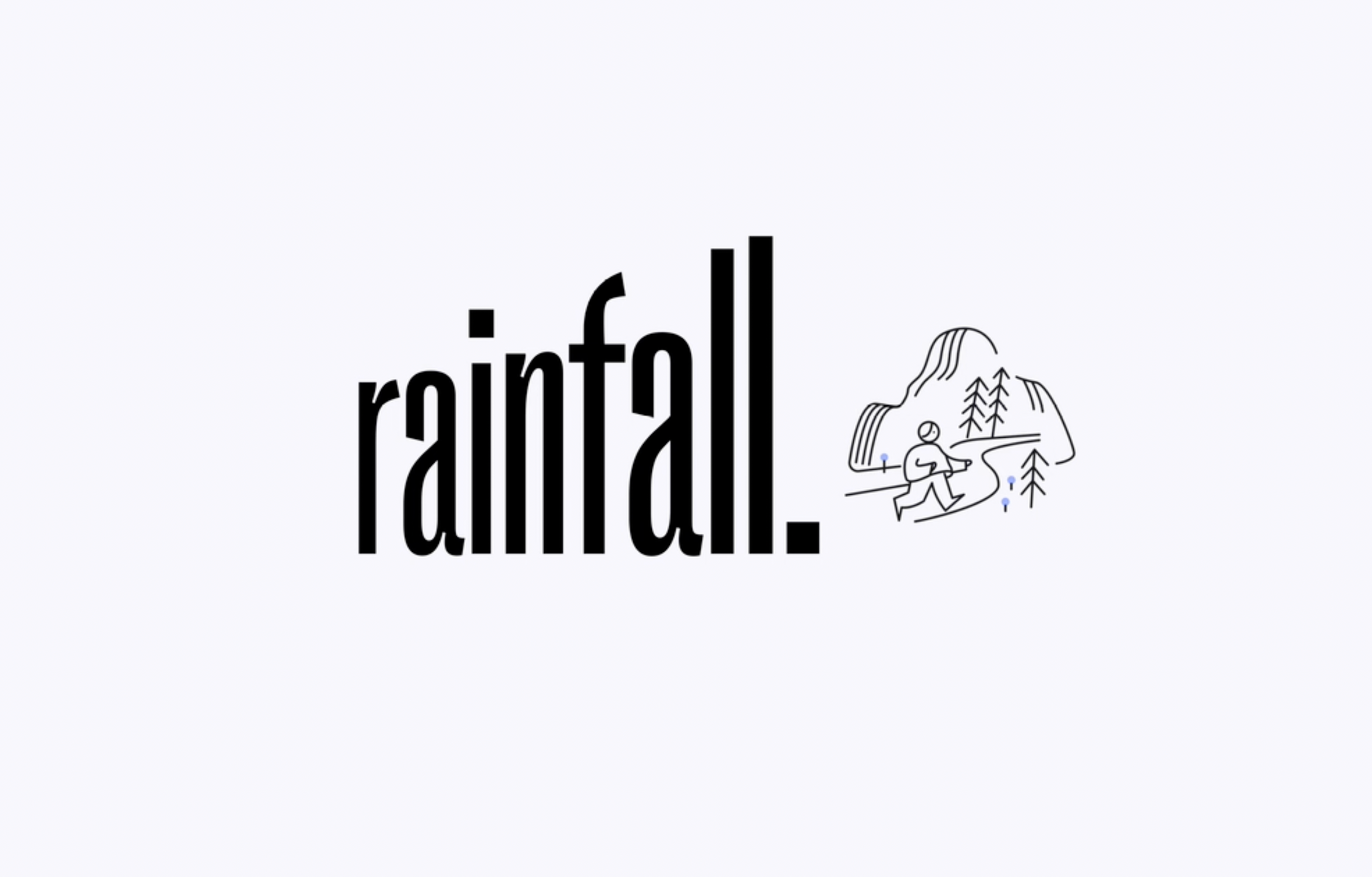
PP Right Grotesk serves as the foundation of our visual language, boasting unique letterforms that can be set wide and bold to give ownership to our message and strength to our voice.
PP Right Grotesk serves as the foundation of our visual language, boasting unique letterforms that can be set wide and bold to give ownership to our message and strength to our voice. While we can now say more, we continue to embrace our philosophy that work speaks the loudest. Using the variable capabilities of PP Right Grotesk visual moments can push words out of the way, literally illustrating the maxim “Show, don’t tell.” While we can now say more, we continue to embrace our philosophy that work speaks the loudest. Using the variable capabilities of PP Right Grotesk visual moments can push words out of the way, literally illustrating the maxim “Show, don’t tell.”


Working with illustrator Lillian Liu, we developed a family of hand drawn icons that exude the free-flowing nature of our iterative design process and feel like a “peek behind the curtain” into how we work. The result is an unorthodox and recognizable pairing of type and image that is easily tailored to any headline, announcement, or affirmation. Simple animation brings the effect to life, as does a palette inspired by the unique landscape of Seattle and the Pacific Northwest.


With a new identity and framework for expressing ourselves, our work, and our beliefs, we’re poised to confidently make our presence known and encourage the world that they should be paying attention to our work.


All images © of their respective owners.
Content taken from Design Made Human
