Permission reinvents the concept of activewear with a retail store and supporting digital platform that embraces the body in all states, and creates an experience that celebrates authenticity.
Permission is Toronto’s first size-inclusive and body-positive retail experience for curated athletic fashion. With inclusivity at the core of the brand story, Vanderbrand created a dynamic and flexible brand system and visual identity that is bold, empowering, and fresh.
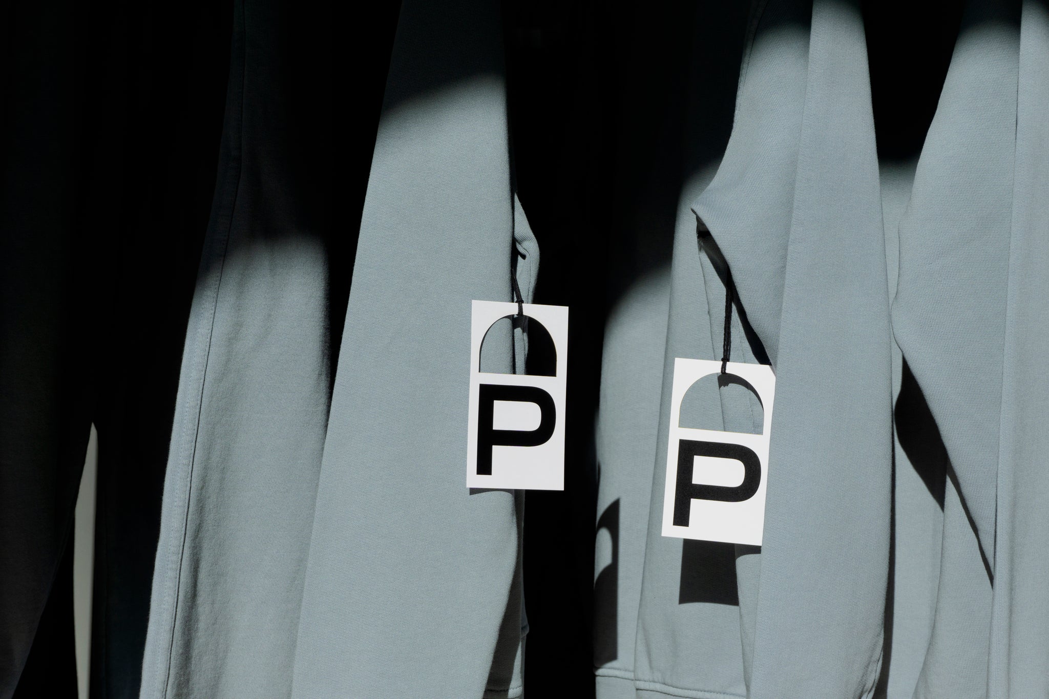
The Permission brand system is a visual representation of fluidity and flexibility. Set confidently in a condensed typeface with wide alternate glyphs, each application of the logo variant visualizes the countless evolutions that individuals experience.


Bold, enlarged, and interactive typographic treatments act as a graphic expression of one’s body in motion. This application is then further enhanced through strong use of colour in the merchandise highlighted in campaign photography across digital and print applications.

The sweeping curves of the architectural design used throughout the flagship store informed and amplified the typographic language with the evolution of each letter’s form. The extension of the letter ‘P’ in ‘Permission’ is a primary condition of the visual identity, highlighting the arched details in the retail store as well as the forms of physical movement.


All images © of their respective owners.
Content taken from Vanderbrand Creative Agency


