Signifly recognised the mismatch immediately. Here was a company creating some of the world’s most coveted automotive artistry, yet lacking the visual sophistication to match their mechanical mastery.
“There was very little in place in terms of brand identity beyond the logo,” Senior Digital Designer Lukas Jurcik reveals. “Everything else felt fragmented – there was no consistent typeface, colour palette or tone of voice. The brand lacked a cohesive visual and verbal system to reflect the precision, performance and craftsmanship of their work.” The Danish agency’s London team set about crafting an identity that could stand alongside the precision engineering emerging from Rennsport’s workshops.

The transformation draws directly from Porsche’s golden era, channelling the expressive typography and graphic dynamism of 1980s and 90s automotive design. Bold forms and sharp angles energise the identity while maintaining the elegance central to the Rennsport experience. The logo itself conceals a clever automotive reference – the symbol’s first two lines represent ‘11,’ while the R-shaped form mirrors racetrack curves, and when mirrored, reveals the complete ‘911’ homage.
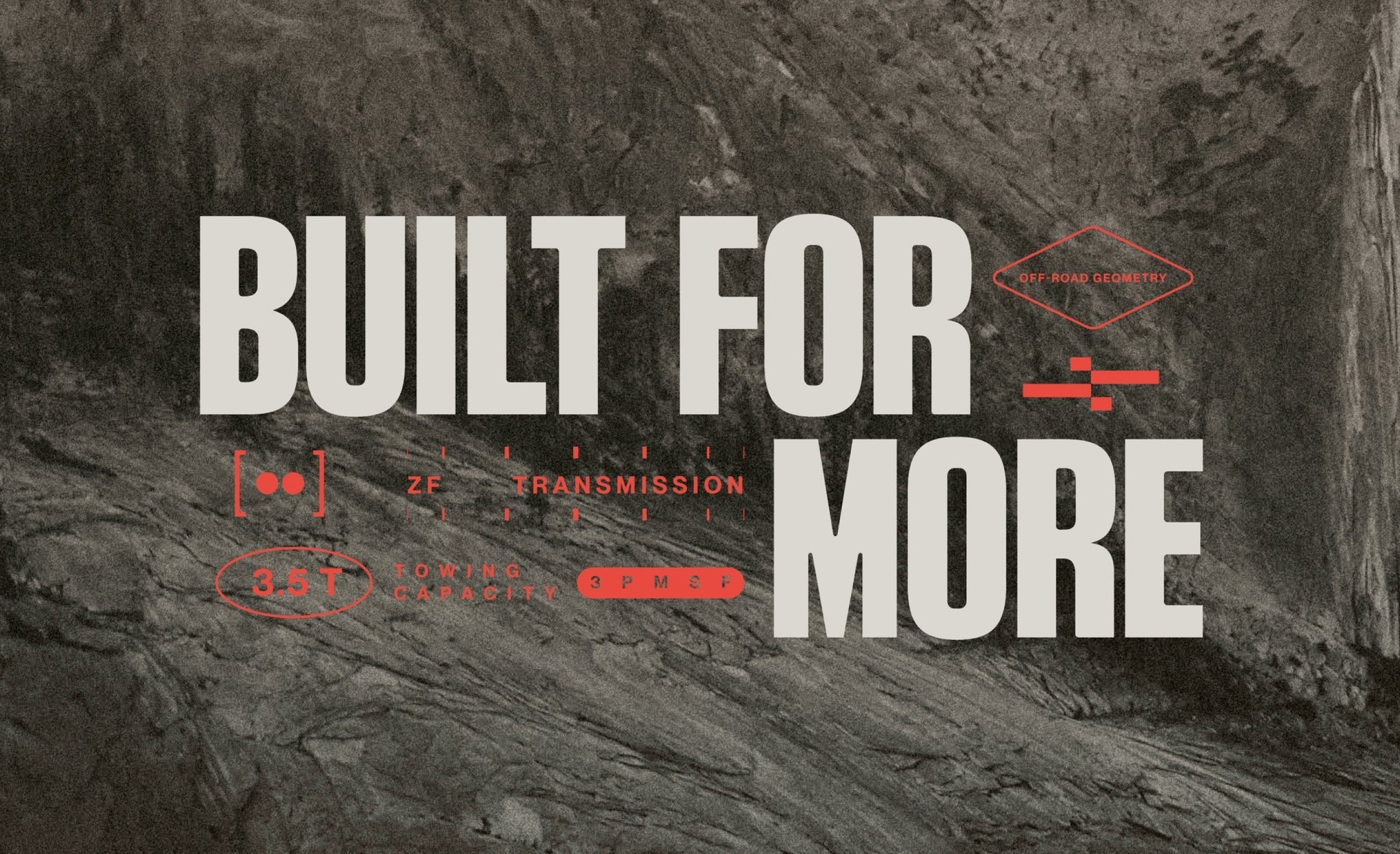
“We began by studying Porsche’s historic design language from the 1980s and 90s, with a special focus on the typography and graphic style of that era,” explains Jurcik. “An important consideration was making sure the Rennsport logo would not overpower the Porsche logo on the cars. To achieve this, we kept Porsche’s typeface for the wordmark, preserving a direct link to the brand’s heritage.” Typography became the foundation for expressing both heritage and performance. Formula Extended brings motorsport-inspired impact to headlines, its stretched letterforms capturing high-performance engineering spirit, while TWK Lausanne provides Swiss-inspired precision for body text. The pairing balances automotive dynamism with typographic sophistication.


The colour system demonstrates particular intelligence, creating flexibility that honours each project’s unique character while maintaining brand consistency. Rather than imposing rigid restrictions, the palette adapts to showcase individual builds whilst preserving the overarching identity – essential in a world where colour plays a defining role in Porsche culture. “The main goal was to balance heritage, craftsmanship and performance,” notes Jurcik. “It’s easy to lean too heavily into the performance aspect and create something overly futuristic, which would have felt out of step with Rennsport’s values. During our research, we saw several competitors focusing almost entirely on performance, often at the expense of heritage.”

Technical considerations demanded particular attention to scalability across applications. The identity needed to function as metal badges, embossed leather details, digital applications and car liveries. This required a boldness and simplicity that could withstand the varied contexts of luxury automotive branding without losing impact or legibility.
The rebrand made its public debut at Goodwood Revival, where one social media reel generated over 760,000 organic views and attracted 4,000 new followers within a month. The response from Rennsport’s established clientele and the broader automotive community proved equally enthusiastic, validating an approach that respects tradition without defaulting to stodgy conservatism.
All images © of their respective owners.
Content taken from Signifly


