The world of panettone has had a media and popular irruption at all levels. The historical and seasonal component that precedes it is visually translated into conservative identities with purely decorative and baroque cliché resources that directly allude to Christmas.
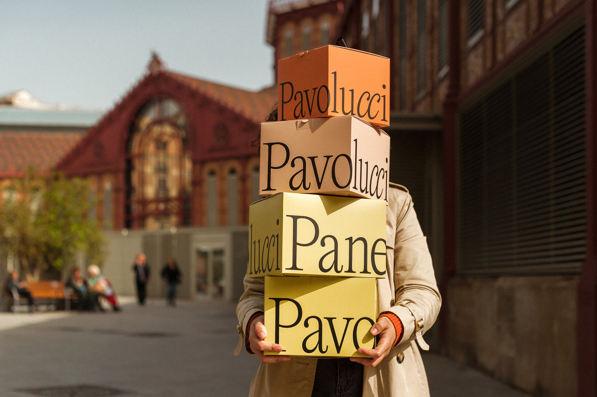
Panettoni Pavolucci must project a strong character, going beyond the concept of Christmas Panettone for Mass Consumption.
We have a genetic particularity of the client that will be our definitive visual trigger to project the brand language; The Pavolucci twins. The name also naturally contains and hides a perfect formal analogy, a visual metaphor to highlight the dual and genetic character of the Pavolucci sisters. Twin Letters.


We reposition the traditional vision of panettone in a classic but original product, handmade but contemporary, typical but seductive. We optimize flavors and ingredients in a single functional pack without the need to add extra labels. The graphic brand strategy favors and reinforces the constant discourse of duality through symmetry, arrangement and composition of spaces.


All images © of their respective owners.
Content taken from Andrés Requena


