Breaking: Pioneering Plastic Degradation for a Cleaner Planet
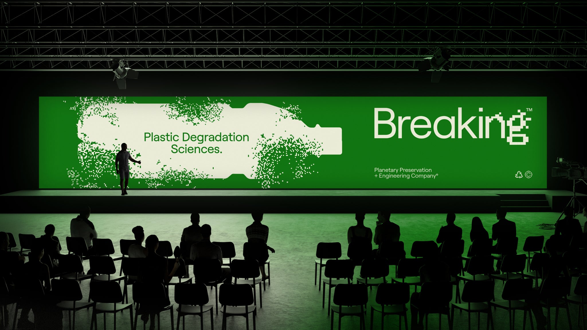
Breaking is a plastic degradation company dedicated to developing solutions for a cleaner planet. Our brand identity channels the kinetic energy of Microbe X-32, an enzyme poised to change the world. Conceived within the innovative corridors of Colossal Biosciences, Breaking epitomizes disruptive creativity and scientific breakthroughs.

Inspiration and Visual System
Our visual system embodies the energy of our mission. The brand aims to inspire and instill belief in our ability to address plastic pollution. We wanted a design that is both eye-catching and reveals hard truths about environmental issues. The pixelation in our design breaks down elements to reveal deeper truths, making the design both functional and symbolic. From the logo and illustrations to our motion styles, the essence of Breaking is at the core of our visual identity.
Typography and Aesthetic
The type systems focus on plastic degradation. We chose Roobert, a clean and smooth geometric sans serif from Displaay, representing the clean plastic molded objects we encounter daily. To contrast, we used NeueBit from PangramPangram, which evokes a sense of pixelation or breaking apart. This contrast captures the essence of Breaking, and we carried this aesthetic through our type systems in the branding.
Collaborative Efforts
We partnered with Buff, a studio that helped us capture a variety of motion tools to bring type, textures, and illustrations to life. In addition to animation, we incorporated 3D and 2D plastic objects into our brand to further enhance its visual impact.
All images © of their respective owners.
Content taken from Maven Creative


