Re’s Mistranslations Project is a response to Australia’s poorly translated COVID-19 messaging
Approximately 39% of Australia’s inhabitants are culturally and linguistically diverse, however, the country’s media reported that some official messaging during the height of the COVID-19 pandemic had been casually converted using Google Translate. As a result, nonsensical messaging for non-English speaking communities made life harder for those already in a vulnerable position.


In response to this critical issue, the Sydney office of global design agency Re partnered with Melbourne Design Week to launch the Mistranslations Project, hoping to raise awareness of the Australian government’s lack of consideration towards cultural minorities. Culminating in a public poster exhibition, they set an open brief to linguistically diverse creatives; asking them to reimagine COVID-19 messaging in their own language.


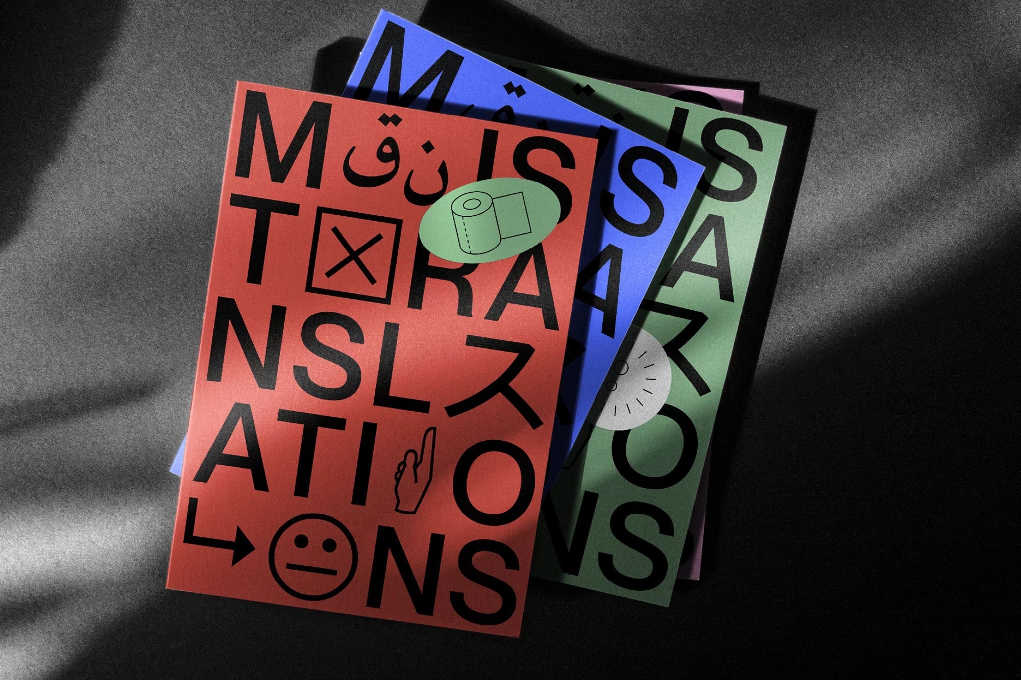
Re’s identity for the project playfully engages with the concept of mistranslation by distorting the universal language of symbolism. The Mistranslations wordmark is intentionally hard to read and confusing, with mismatched symbols, letterforms and stickers breaking up its characters.

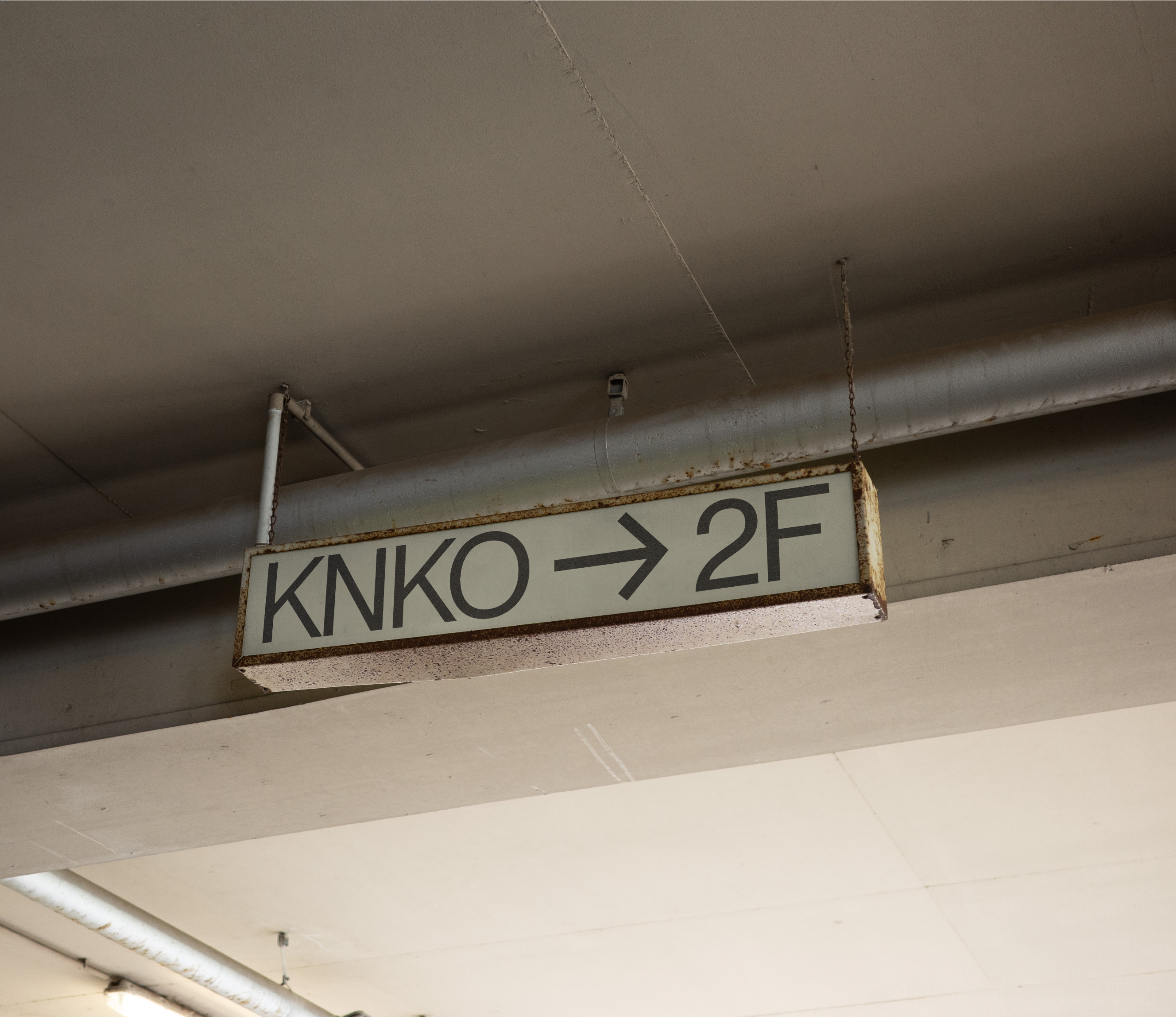
Further applications of the identity, such as posters, throw even more confusion into the mix; utilising maze-like symbols and instructions in busy arrangements. By creating this confusion, the identity bridges the gap between the linguistically diverse people that suffered from the messaging blunders and those who did not encounter any problems with accessing official health information.


All images © of their respective owners.
Content taken from The Brand Identity


