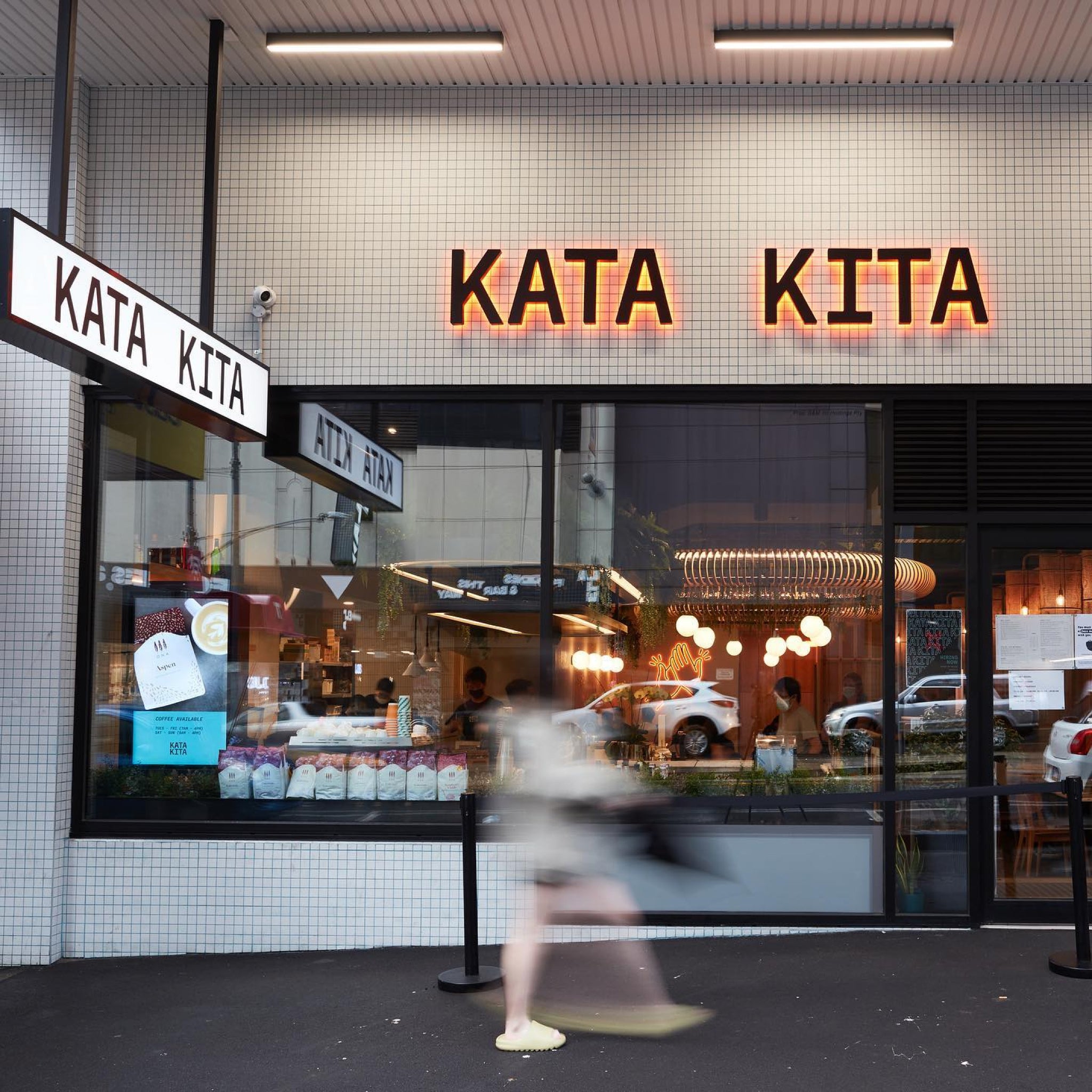
Kata Kita , meaning “We Say” is a new Indonesian fusion eatery in the heart of Melbourne.
The restaurant brings a modern take on traditional dishes with a side of play. One of the goals we were tasked with was to help people better understand Indonesian culture and cuisine.


Aside from visual devices like our twist on a traditional Javanese Batik pattern that features on the cups, we deployed language, playful phrases used throughout the brand to engage diners with interactive wordplay.


Familiarising people with Indonesian culture to connect with food over dinner banter. Texture was also explored through emboss, papers and fabric.


All images © of their respective owners.
Content taken from Studio Sly


