
HelloFresh is the world’s leading meal kit company. Lots of emerging niche food box brands mean the market has become crowded.
Different teams across the world were having to make decisions so the brand needed unifying. HelloFresh needed a clear, differentiating angle and a strong brand presence.
We visited their warehouses and teams, getting into their everyday processes to understand what the new brand needed to do. From printing constraints, to the need for a universal language. HelloFresh needed an inventive brand that fit everybody’s life, both internally and externally: every factory, every lifestyle, every kitchen, every meal.


First stop was unifying the brand’s hero elements to work together harmoniously. Our new lime logo still has all the recognisable qualities of its predecessor (shape, size, colour, angle) but has been simplified to work anywhere – big or small, online or in print, static or rolling across the screen.

Inspired by the utensils in the kitchen, we developed five cooking gestures that gives HelloFresh a fun and distinctive homemade feeling. We use them on packaging and within our illustrations.


We’ve introduced a flexible layout system that brings our elements together as a shifting grid. Slotting together perfectly the same way a meal comes together on your plate.
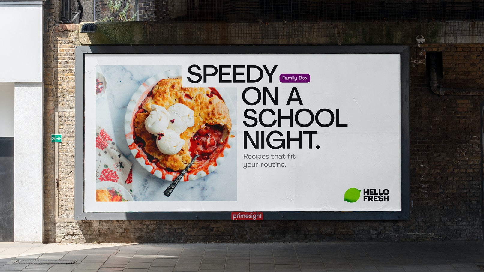
Our messaging celebrates the achievement of home cooking; framing it as a doable challenge that doesn’t complicate your week. Paired with photography that shows real kitchens instead of perfect studio meals, HelloFresh celebrates everyone’s dinnertime.

We’ve defined one vibrant and celebratory set of colours that are AA for digital but great for packaging too. Our icons and illustrations are now part of the same family, becoming one consistent universal language.
To help customers navigate the product and make better choices to suit their diets, we made a lively set of illustrations, tags and stickers. Used in both communications and packaging, this extra design element lets us combine dietary information, food quality and box type in a fun clear way.

HelloFresh now has a distinct new brand and toolkit any team, anywhere, can run with. We can’t wait to see more people coming together to cook.
All images & texts © of their respective owners.
Content taken from Design Studio


