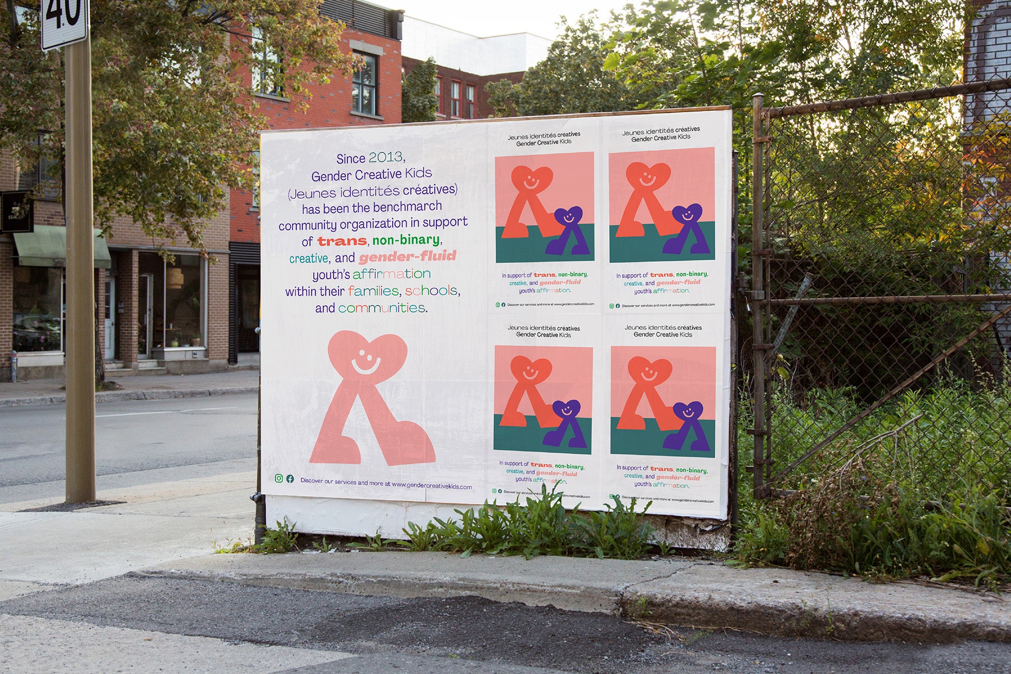
Since 2013, Young Creative Identities Canada has been a community organization that supports the affirmation of trans, non-binary, creative and gender-fluid youth within their families, schools and communities.
In 2019, the board of directors of the nonprofit invited Wedge to join as an official partner to develop their visual identity. The new image allowed them to better communicate their issues and positioned them as an official organization on the world stage.


It is values such as human dignity, inclusiveness, community, empathy and joy that have guided this project, in addition to being informed by a series of educational workshops conducted especially for our team.

The design choices are intentional, they go beyond aesthetics. For example, white space is integrated as a key color. It is in this undefined space that everyone can freely find and develop their identity. An upbeat, fluid and flexible color palette complements the brand, a design intention endorsed by the children of the organization.


An iconic figure has been created as the official symbol of the organization. Inspired by the symbol of the heart, the most sincere part in each of us. An icon who stands tall and confident, who walks forward with an optimistic gaze.

This partnership and privilege that Wedge has had is a way to use our expertise in design and communications to support a community that represents our colleagues, friends and loved ones.
All images & texts © of their respective owners.
Content taken from Wedge


