AJA drinks is a line of four scientifically designed drinks that provide health benefits for body and mind.
The base concept of AJA is a smart mix of important vitamins and minerals enhanced with natural health boosters from Ayurveda medicine. These include super cleaner Moringa, passion flower which is famous for stress and anxiety relieve, and Ashwaghanda, the "king of Ayurvedic medicinal herbs".


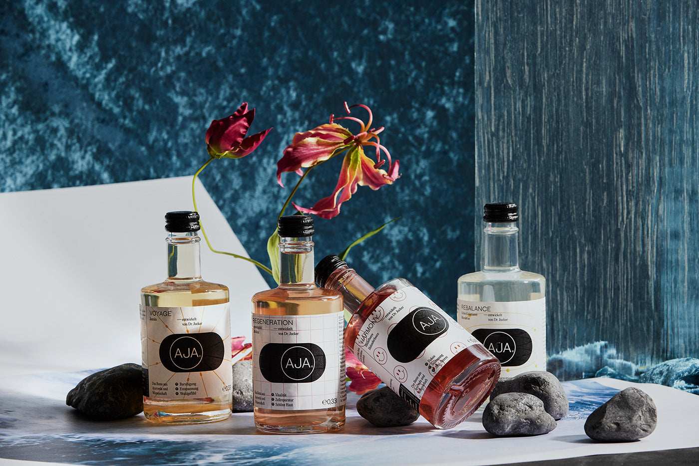
Vienna and Tokyo-based branding and strategy studio KR8 have crafted the scientific identity for AJA, a drinks company dedicated to mentally and physically healthy beverages – packed with vitamins, minerals and organic health supplements. Launching with a range of four drinks, each with a specific purpose such as digestion or metabolism, AJA has a lot to offer, with enough science to back it up. “In late 2019, doctor and scientist Anca Jucker approached us with the idea,” KR8’s Florian Kowatz tells us, “after a quick research, we found that this could be a very interesting market niche on a heavily saturated market,” he adds, “and a nice challenge for us.”


This device is then used to inform the bottle’s label design, whereby the logomark becomes the core of a layering system, crafting clusters of colours, function-indicating patterns and information. “To create a contrast to the scientific black and white world,” Kowatz notes, “we chose vibrant block colours that complement the colour of the drinks themselves,” adding to the systemised eclecticism of the visual language. Speaking on the subject, Kowatz explains, “we wanted to have a take on old apothecary design combined with a modern twist,” opting for Pangram Pangram’s Editorial New and Typefaces of The Temporary State’s Steinbeck to translate as much – typographically mixing traditional aesthetics with a contemporary edge.


“We created one disruptive moment in the brand,” Kowatz notes, adding a non-scientific smiley face to AJA’s ‘Harmony’ drink. “Even in our initial presentation, the client asked us why this design was so leisurely,” he recalls, asking if they knew of any medicinal products that made them happy and featured smiles. “The answer was MDMA,” Kowatz concludes, “AJA’s Harmony became our eye catcher that actually carries the message that those drinks ease your day with natural ingredients.”


All images & texts © of their respective owners.
Content taken from KR8 bureau