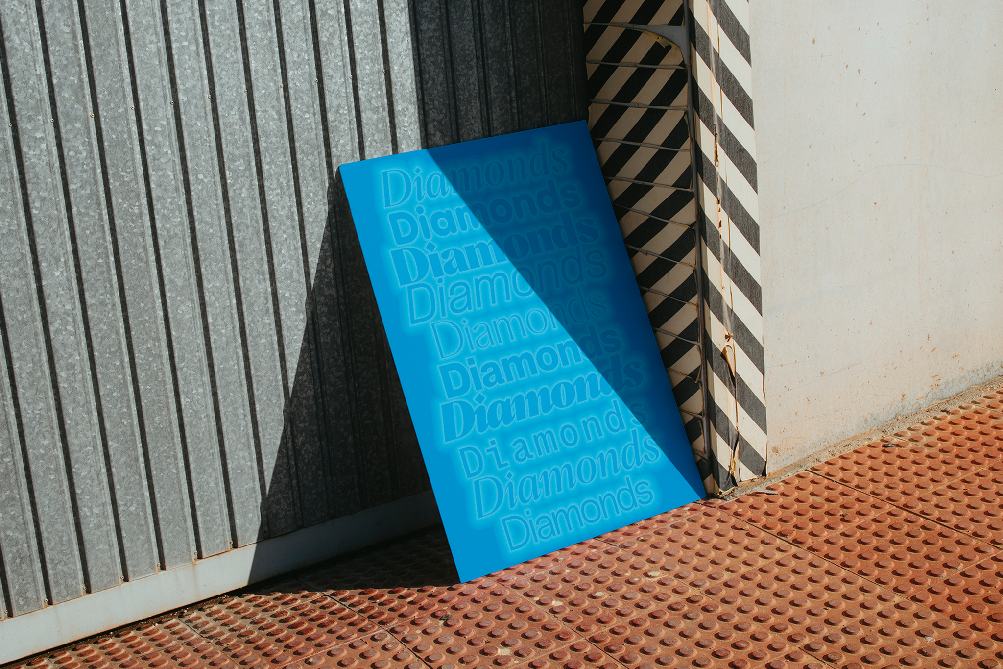
Choosing the right typeface is half the battle of any design project. Finding the right font to convey your message, and the mood you want to set, unveils a world of possibilities, questions and exploration.
A well-paired typeface can take your work not only to the next level, but also to new creative worlds you haven’t yet explored – not held back by your own fallback typeface choices. If you’re in need of typeface to help you take that small step outside your comfort zone (or just seeking something new), look no further than Hatton, Pangram Pangram’s innately collaborative, ultimately timeless serif, befitted with both glorious italics and robust constructive lines, as well as an in-built legacy – developed in homage to London’s Hatton Garden. A site of elegance, versatile and, undoubtable, style – akin to the typeface family itself.
After choosing Hatton (great job, nice choice 😉), the next step is selecting its partner font – a typeface destined to simultaneously complement Hatton’s graceful forms and build on the mood it sets, taking the serif into an entirely different direction. A bit of an overwhelming choice to be fair, given the endless amounts of fonts easily accessible to everyone everywhere, but don’t worry, that’s why we are here to help.
So, let’s dive into a world of typographic exploration and discover the best type pairings that complement Hatton’s charm and heritage, adding new dimensions to the typeface and your designs to boot. From playful rounded sans-serifs to elegant Grotesque fonts, we’ll explore a range of typefaces that harmonise beautifully with Hatton.
Hatton and Pangram Sans Rounded
As Pangram Sans more whimsical sibling, Pangram Sans Rounded retains its geometric workhorse status, with an impressive 144 styles, whilst adding a dash/a splash/a dollop of warm, welcoming playfulness – a feature all the more prevalent in its bolder weights. When paired with Hatton, an embracing, delightful contrast shines through, with Hatton’s timeless elegance bouncing off the joyful charm of PSR’s soft sans-serif forms, creating not only an engaging and visually striking composition, but a happy vibe that’s hard to argue with.

Hatton and Neue Montreal
Neue Montreal is Pangram Pangram’s flagship, versatile Grotesque font, and for very very good reason. Offering 14 weights (seven uprights and seven italics) with Cyrillic support – and a construction optimised for text and display spaces – this typeface is an unrivalled, pragmatic champion font, drawing inspiration from its namesake city and the location’s legacy in iconic design. Pairing Hatton with Neue Montreal brings this trans-Atlantic timelessness together, with Hatton’s British elegance combining with Neue Montreal’s classically-inspired, contemporary character to create a dynamic and adaptable typographic duo.

Hatton and Air Mono
Air Mono is the harmonious collision of brutalism, minimalism, and aerospace design, offering any printed or digital space a typographic exploration that’s both aesthetically striking and undeniably intriguing. Through this delicate, purposeful investigation of simple form, Air Mono (alongside its non-monospaced counterpart), offers an extensively wide range of weights, including a variable version, and a vast character map, encouraging experimentation and customisation. Sat alongside Hatton, Air Mono provides the ultimate conceptual and visual juxtaposition, resulting in a pairing that pushes font couplings into exciting, experimental spaces, whilst capturing the intrigue and imagination of charismatically colliding contexts. A fresh, distinctive addition to your typographic landscape.

Hatton and Formula
Formula is a complete and versatile typeface that marries a bold, F1-ready look with the flexibility of a Grotesque – and a really handsome one at that. With styles ranging from condensed to extended and a comprehensive set of weights from thin to black, it’s certaintly a typeface that can make a powerful statement. Pairing Hatton with Formula, especially its more extreme widths, adds a distinctive contrast between the timeless charm of Hatton’s plunging forms and the bold, racy aesthetic of the sans serif, able to be dialled up and down for styles more reserved and audacious when needed.

Hatton and Radio Grotesk
Radio Grotesk injects a much-needed contemporary character into a classic Grotesk style. With established majuscules and sophisticated minuscules, this typeface is effortlessly adaptable to any context, befitted with a handy 16-style set, with 742 glyphs each, alongside italics and Cyrillic support. Above all these features, however, Radio Grotesk is proudly and profoundly modern. As such, when paired with Hatton, the resulting collision of 21st Century forms and 19-20th Century shapes makes more a riveting, unexpected friendship, bringing a contemporary twist to a timeless classic.
Whether you opt for the playful charm of Pangram Sans Rounded, the modern versatility of Neue Montreal, the experimentalism of Air Mono, the boldness of Formula, or the contemporary touch of Radio Grotesk, the possibilities for typographic creativity are endless when you pair Hatton with these complimentary typefaces. Try them out!


