Budapest-based design studio CM.SUPPLY is forging a unique path in the creative industry with its approach guided by a forward-thinking commitment to both anticipating and navigating possible design futures.

Mátyás Czél, Founder and Creative Director, describes their practice as “specialising in the intersections of identity design, interface design, and interaction design.” It is in this crossover that good stuff happens – from tools to typography, we spoke to CM.SUPPLY about their anti-standardisation outlook and innate drive to forge new futures for their clients, and eventually, themselves.
In a world where quickly adapting to the changing needs of clients is crucial, CM.SUPPLY aims to stand out by “exploring alternative design futures.” Czél emphasises the importance of challenging visual standards that we often just accept as right, not just going with the flow and instead forging their path within their studio. “Not everything should be standardised,” he says, highlighting a mindset that values genuinely interesting process and outcome over an out-of-the-box-already-working approach. Due to this, the studio values the use of data for its way of unpacking insights into their creative process, rather than just as raw info.
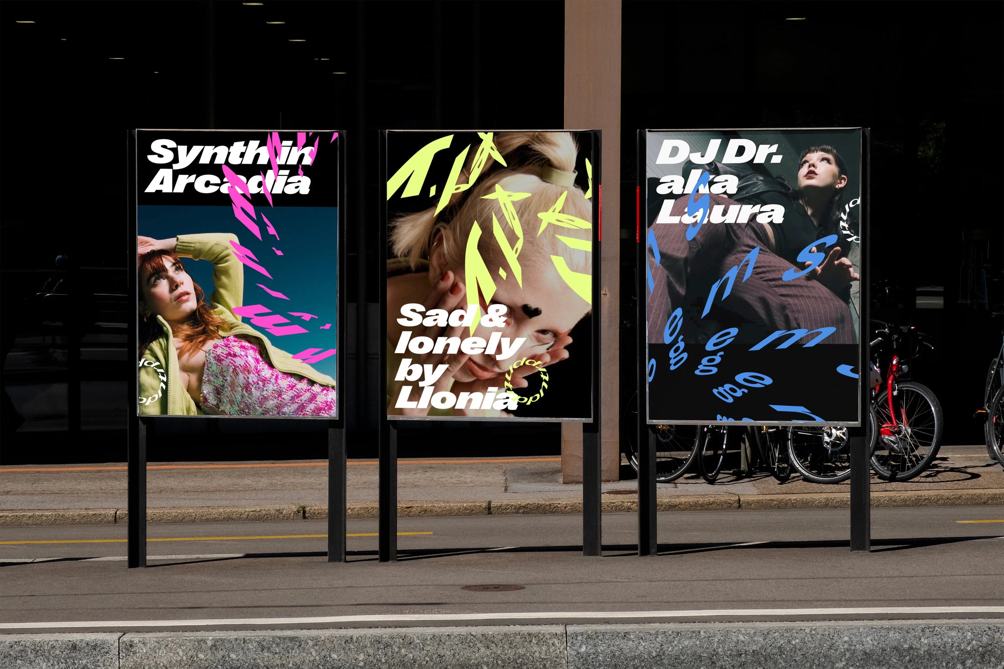
One notable project that exemplifies CM.SUPPLY's innovative approach is Trppn, a new decentralised community platform for the music scene. The concept behind the visual identity was to give the app a fresh update inspired by underground club culture, leaning into the fluidity and flexibility of these places, instead of imposing strict rules. The studio “made a fun tool for anyone to play with the trppn look”, subverting the idea of a brand as a strict set of rules and instead recasting it as a truly interactive, community led playground.
Of course, as with any brand, typography is super important, and for this one Right Grotesk was certaintly the right choice! As Natália Tímea Szabó, designer at CM.SUPPLY, details, “Right Grotesk creates a strong trippy vibe, enhanced by our generator’s distortion, but thanks to the versatility of the typeface it also works very well as a text font in the app and other interfaces.” This flexibility is something that CM.SUPPLY clearly keeps at the forefront of their minds when designing work across motion, brand and interface.
Looking ahead, the studio wants to partly break away from the traditional dependency on client work. Czél envisions a future where designers play a crucial role in entrepreneurship and business. “There’s a genuine opportunity to create products and services independently,” he notes, determined to carve out more time and space for their own creative pursuits.
CM.SUPPLY’s commitment to a forward-thinking, exploration of alternative design futures, and the ability to blend their knowledge and independent creative spirit set them apart. As they continue to challenge norms and embrace new possibilities, the future looks promising for this Budapest-based design studio.
If you’d like to try out the fonts used in CM.SUPPLY’s project, check out Right Grotesk, free-to-try at Pangram Pangram today!


