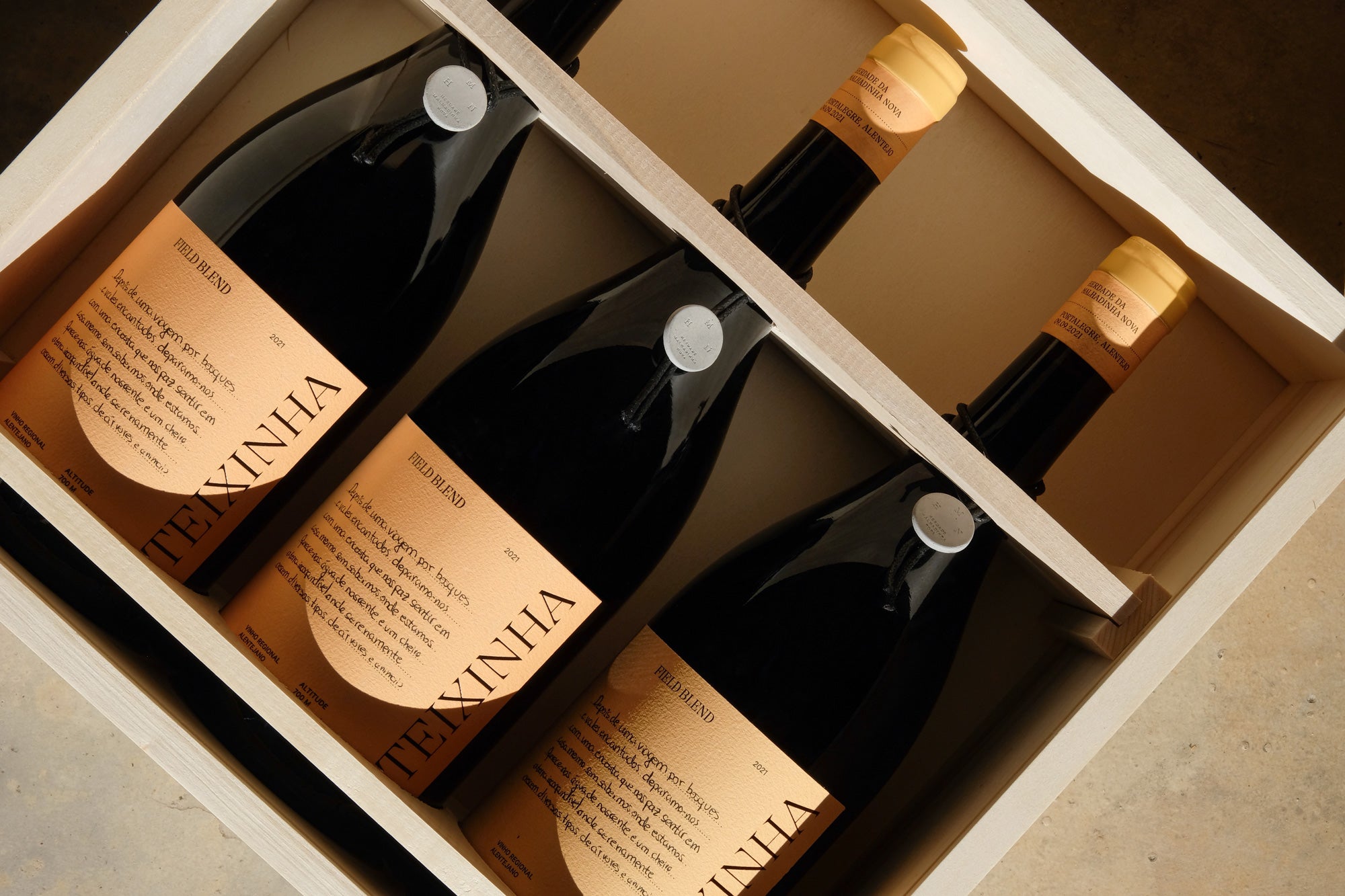
Words that give voice to memories, expressing Teixinha's uniqueness.
It was in the heart of the Serra de São Mamede Natural Park, at an altitude of 700 meters, amidst cherry trees, cork oaks, and centuries-old chestnut trees, that Herdade da Malhadinha Nova decided to continue its story. Teixinha emerges in a place where the greens appear pristine, the mysterious fog embraces centuries-old chestnut trees, and the ancient ruin, once a chestnut dryer, stands out in the space.


The challenge was the creation of a new identity for Teixinha — the new Malhadinha sub-brand, while maintaining a conceptual link to the work that has been developed by them over time. Considering that since 2003, it’s the new generation of the family that leaves their mark on Malhadinha wines through creative illustrations; we determined that the link to be maintained should be to continue this tradition, presenting them with a new challenge: through writing, to construct a narrative of memories about what makes Teixinha special to them.


The concept will also extend to visitors (when the tasting room opens its doors) who will be able to leave their messages and experiences on blank labels, fostering interaction between them and the brand. The colours that envelop each wine reflect the predominant tones present in the space. The typography, with a classical foundation, takes on a contemporary aesthetic through its details and endings.


Considering that the wine will be stored in concrete barrels, we crafted a medal from the same material, with the inscription of Herdade da Malhadinha Nova, in order to reinforce the main brand of this product range. From the labels to the boxes, all materials and finishes were selected with the utmost precision to ensure the positioning of the products and to uphold the sustainable responsibility characteristic of HMN.


All images © of their respective owners.
Content taken from 327 creative studio

