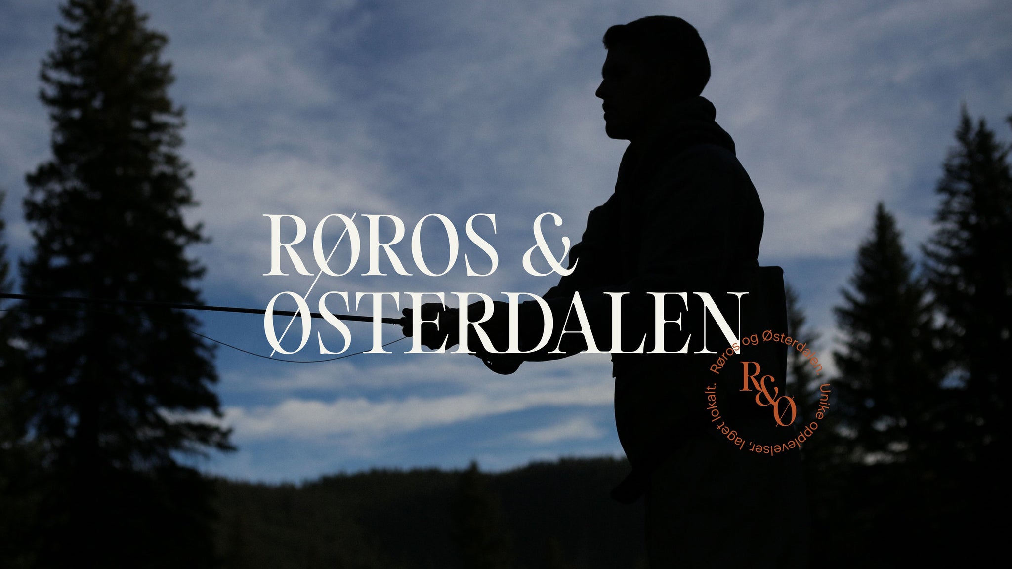
As part of a new organisational strategy, post Covid19 and in alignment to the national strategy, the travel and tourism company ‘Destination Røros’ became ‘Visit Røros og Østerdalen’. Growing from the renowned UNESCO region of Røros to include the communities of Østerdalen. In doing so, changing from a membership organisation to shared ownership across municipalities and businesses of central and eastern Norway.
Project
The branding process involved the different cultures and communities, and organisations from local municipalities to small independent businesses. Resulting in a new regional destination on the national stage, platforming experiences for self-determining travellers; exploring within their region, to domestic travelling and international visitors. Our typographic palette based around a hero font in various styles accentuates the connection of the region through stylistic swashes and ligatures. The composition and application balancing old world charm with a modern vision. The rounded, imperfect and organic forms of the brand typeface is expanded into a style of illustrated icons that visualise the symbols of the region, touching on themes of nature, culture, history and adventure - to truly reflect a region full of opportunities to discover.

Challenge
The process of rebranding the organisation started with a new position for destination branding in Norway. Combining the strong and established town and regional brand of Røros, with the less well known travel designation of Østerdalen. There were no blueprints or predefined destination brands to follow, which was the beauty of the challenge. Necessitating a brand platform built from the collaboration of communities across municipality borders and businesses. Central to the branding process has been the diverse visitor groups and their shifting preferences and priorities. Learning from the effects of the pandemic on lifestyles, and the essential responsibilities and value of sustainable travel. Getting innovation insights from international destinations from Salla in Finland to Jeju-Do in South Korea. As well as building on our experiences at Nonspace with destination brands Visit Bergen & Visit Trondheim and a growing body of insight from the travel, tourism and cultural sectors. A key component to the brand platform was putting into practice the sector’s National Tourism Strategy 2030 ‘Big impact, small footprint’ & Innovation Norway’s strategy on ‘Sustainable Destinations’. Combined with national statics, transport infrastructure and methods of travel, hotel stays, cultural calendars and more, we mapped the sustainable position needed to be established by the brand platform.

From the start of the process, and throughout, members and owners across the regions were invited to take part and contribute insight and vision. This involved a survey across the community to capture key insights of businesses, community dynamics, culture and visitor experiences. As well as workshoping with key stakeholders from the municipalities to hoteliers, cultural festivals and business owners. With regular updates with the organisation's marketing advisory board and board of directors we applied the key insights and direction to the ongoing work of the organisation. Including weekly updates by the Managing Director to the whole community of owners throughout the regions, sharing progress and insights.


Solution
The essential first landing ground for the solution was to create a shared story. Uniting the areas of Røros and Østerdalen, down through the different types of businesses and communities of the regions. This acted as a new cultural platform for ownership, cooperation and innovation for all members. A shared idea for both ambition and the collective pride to meet visitors; from locals to international visitors. With this story established the new visual culture of Røros & Østerdalen was developed. The visual profile seeks to capture the traits of the region and reflect the feeling of discovering an intriguing area of Norway. The rich cultural and mining history is balanced with a reflection of the wide spanning landscapes and organic qualities of nature that define the region as a whole. The wordmark based logo brings together the town of Røros with the region of Østerdalen, to symbolically hint at a new touring route to explore and discover - while strategically representing the shift in organisational structure and future vision of greater collaboration.

The visual world is built around several key ingredients that come together to capture the essence and energy of the region. A colour palette that is steeped in cultural, heritage and geographical references, sets a tone for a region that is largely defined equally by what is and isn’t found there - quaint attractions and an immense sense of scale and wilderness. The colours bring an earthy and warming aesthetic to an area that is known for bitter cold winters and warming hospitality.


Our typographic palette based around a hero font in various styles accentuates the connection of the region through stylistic swashes and ligatures. The composition and application balancing old world charm with a modern vision. The rounded, imperfect and organic forms of the brand typeface is expanded into a style of illustrated icons that visualise the symbols of the region, touching on themes of nature, culture, history and adventure - to truly reflect a region full of opportunities to discover.


All images © of their respective owners.
Content taken from NONSPACE


