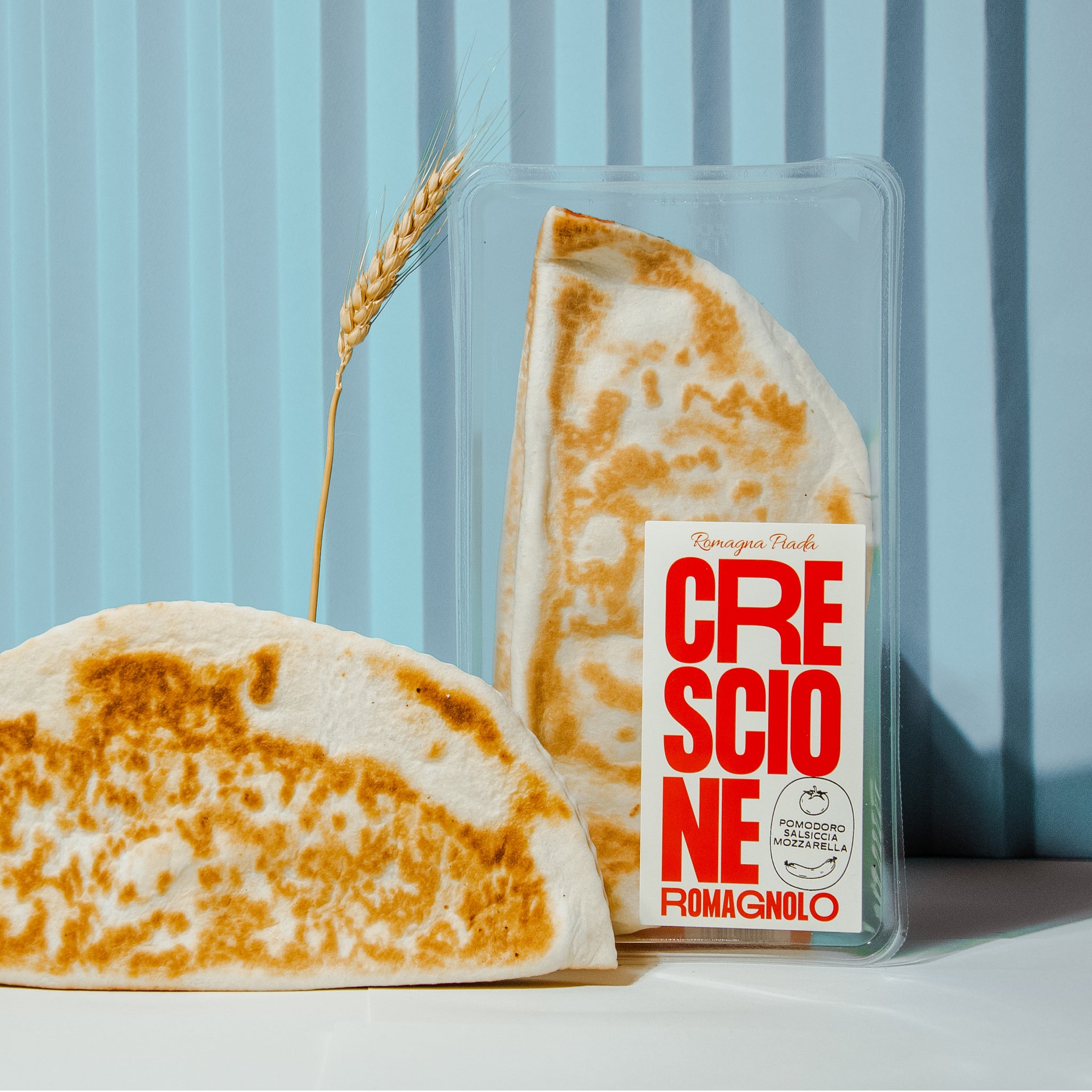
Crackers packaging restyling for Romagna Piada. A versatile and bold typography with hand-drawn illustrations, underline the simplicity of the ingredients and the traditionality of the territory. Shapes and colors that make you fall in love… with Romagna.


All images © of their respective owners.
Content taken from Cobra Studio


