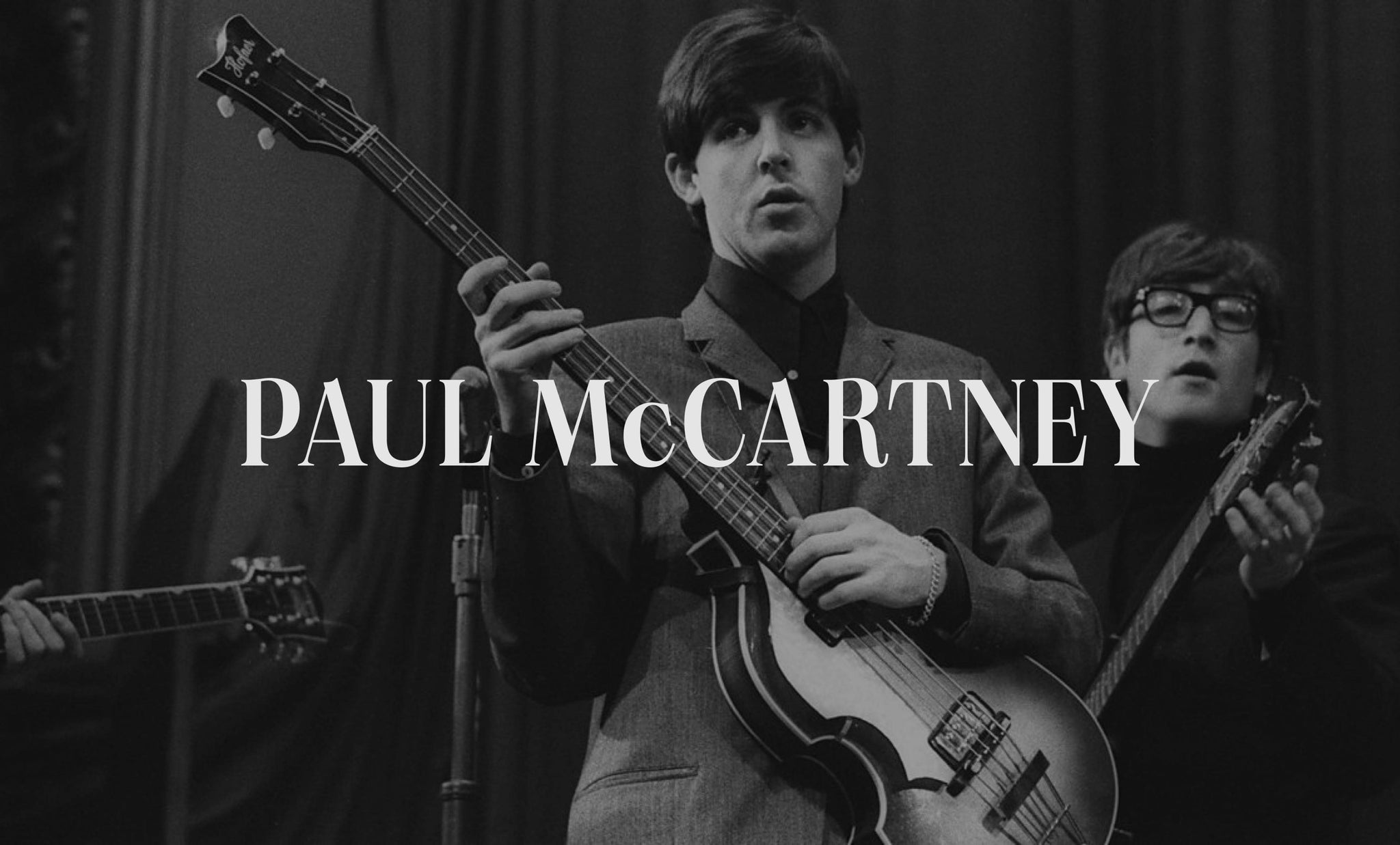
Refreshing a superstar's digital presence and telling a lifetime of stories
Paul McCartney’s previous site was built over a decade ago, making content difficult to manage and the design was starting to feel dated. Our task was to reimagine all aspects of the site from his digital brand identity, through to new site structure, design, technology solutions, and build.

The site acts as the source of truth for everything Paul has achieved in his career, and includes a lifetime of rich media. Lots of media. First up we redesigned the website’s digital brand identity. Paul’s instruction was for the brand to be “dignified, but not corporate; colourful, but classy; a bit rock ‘n’ roll with extra soul”.


The new brand palette lifted inspiration from Paul’s ‘magic piano’. The art direction and visual language across the site borrowed his hand drawn sketches and doodles; these were peppered at key moments across the site. We kept the Typography choices classic yet modern, with a little rock ‘n’ roll flare to compliment the content.Working with the digital and archive teams at MPL, we carefully curated the media for website. Using scans of Paul’s writing we created a numerical typeface and called it ‘Shake a Hand’, named after one of his tracks. Full bleed imagery and videos were applied to make the most of the rich media available to us.

PaulMcCartney.com began its life as a blog but eventually grew out of control. To design a unified and clear user experience we overhauled how content types were grouped across the site, whilst making the experience more exploratory and celebratory of content. We created a more holistic experience where different parts of the site are linked, giving the site a narrative feel whilst you’re embarking on a journey of discovery.


A fresh start meant that everything from a full discography, paintings, archive photography, tour information and blog posts needed to be migrated from the old site to new – that’s 3,901 pieces to be precise. Milestones and memories.


Working up several concepts we landed on the perfect execution for a new feature – an explorative timeline. The timeline houses Paul’s every move since the 70s – from gigs and music releases, to Paul’s extensive career work, his knighthood and his books – detailing his milestone achievements day by day, year by year. We built a CMS that enables any content type posted in the site to also automatically populate within the timeline.

Paul’s back catalogue of releases also features in the site. We gave every piece its own HEX code to give each of the releases its own unique vibe, and take the user on a journey of discovery through supporting information and media. And now for the nitty-gritty bit. It was important to us all, Paul, and his team, that the site was eco-friendly. We reduced the carbon emissions from 811kg to 119kg of CO2 per 10k page visits. To make the site as accessible as possible for its wide range of users, we implemented AccessiBe – an automated accessibility solution for ADA & WCAG compliance.


A large part of building the site was upgrading and migrating the site content from Drupal 7 which is coming to the end of its life in November 2022. Instead of upgrading to Drupal 9, we decided to migrate to GraphCMS.
Having a site that stood the test of time in an ever-changing tech landscape was important to us and MPL. Using a headless CMS meant the tech stack could evolve over time, and the same CMS can serve content up to lots of places at once, for example apps and digital displays, as well as on the site.


In addition, GraphCMS uses GraphQL. This allowed us to be very selective in the content that is returned to the site. This was another consideration in keeping data transactions lightweight and improving the green credentials of the site.

All images © of their respective owners.
Content taken from Neverbland


