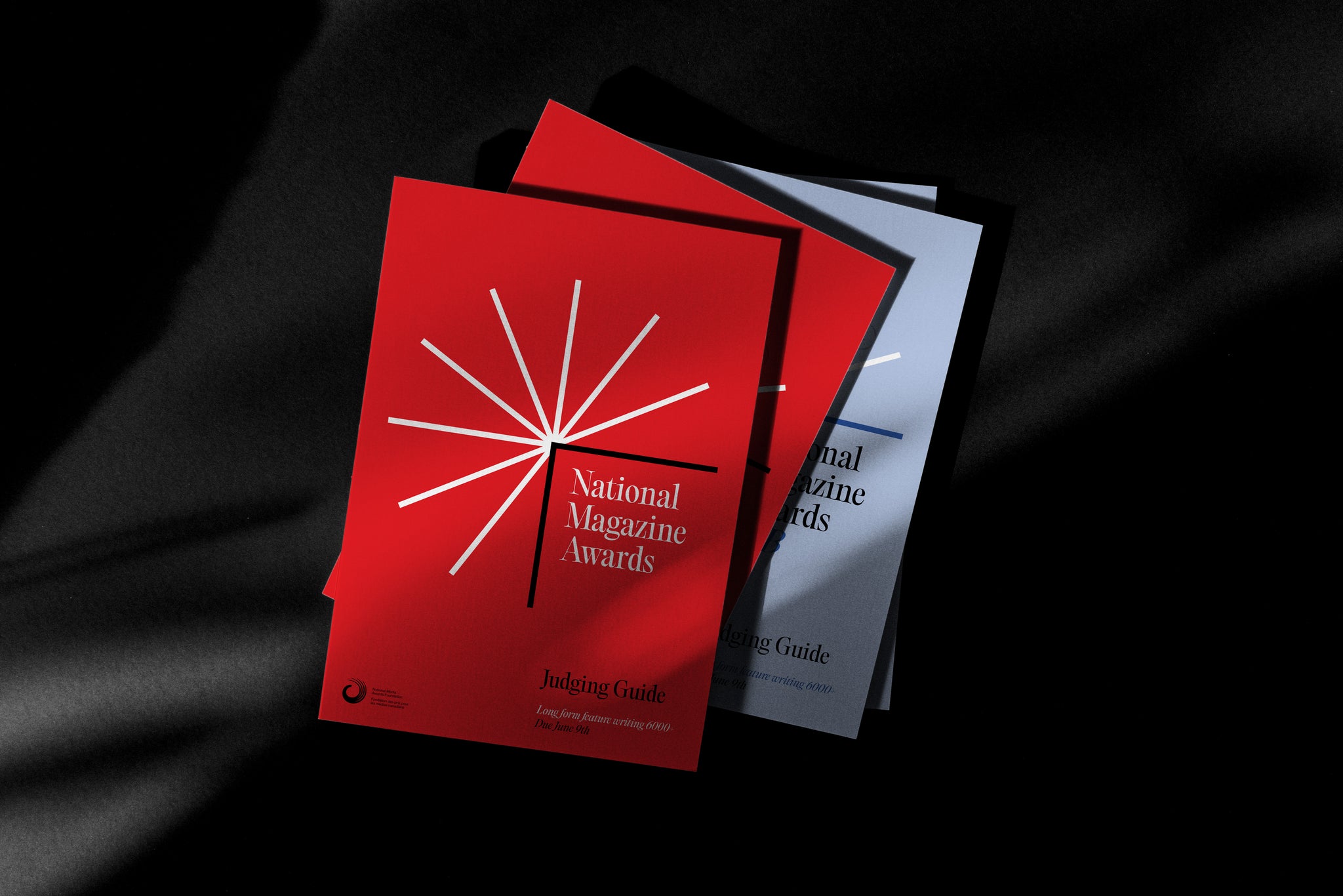
An identity for the 2024 NMA’s built around the asterisk: a mark that, like the awards, denotes special significance.
The National Magazine Awards (coupled with the B2B and digital publishing offshoots) represents one of Canada's most prestigious awards in the fields of journalism, and editorial design. The National Media Awards Foundation was interested in elevating the look and feel of the NMA’s to encourage more engagement by potential entrants, judges, and participants in the Foundation’s programming.


Because the National Magazine Awards is the most significant way people engage with the Foundation, its look and feel is an opportunity to help define the foundation as something just as design-savvy as the work it awards. “Your vibrant designs have not only captured the essence of our foundation but also significantly elevated our brand presence.” - Barbara Gould, Executive Director


We looked to typography to create our visual identity, focusing on a single symbol that is a marker of special significance: the asterisk. Together with a typeface from PangramPangram, the direction for the 2024 NMA's works to give personality and star-power* to the asterisk while keeping one referential foot in the world of typesetting and print.


We delivered two libraries (NMA+B2B) of templates and assets in French and English that kept every touch point cohesive and considered. *A marker of special significance. “The coherent visual identity across various materials is sure to receive widespread acclaim.” - Barbara Gould, Executive Director


All images © of their respective owners.
Content taken from Made by Emblem


