Celebrating the fifty year anniversary of Picasso’s donation of hundreds of works to the city of Barcelona in 1971, Picasso. Els Quaderns is an exhibition running from December 2020 – April 2021 at the Museu Picasso de Barcelona. Exploring the life and works of the artist and commemorating the extraordinary donation to the city, the exhibition centres around a series of early Picasso sketchbooks.
In our opinion, the stunning graphic communications and materials around the exhibition – emerging as a project between Barcelona-based studios and long-term collaborators Ara Estudio and Todojunto – showcases some of the most considered typographic work for the cultural sector we’ve seen for a while. With both studios focussing primarily on exhibition and editorial design (and not to mention, the fact that they’re long term collaborators), it’s hardly surprising this project is as powerful as it is.
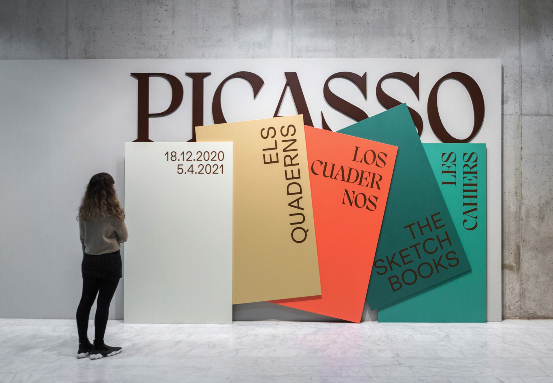
Following a strong typographic lead, the colour palettes create a subtle nod to the colours of Picasso’s early sketchbook pages – their fading tones as they age slowly over time. Discussing the overall aesthetic, the designers say, ‘We wanted something modular that suggested the notebooks in a very minimal way, and that allowed flexibility when adapting the graphics to the different media. In addition, these shapes simulate pages and notebooks that overlap the word Picasso, their creator, giving them prominence.’


‘One of the main ideas for the graphics was above our work desks, looking to our sketchbooks, books and daily papers overlapped in different layers,’ designers add, ‘so we created a minimal solution to synthesise all these ideas: shapes, colour and a bold type.’
Carefully selecting Pangram Pangram’s Migra for the headlines paired with Extraset’s Klarheit Grotesk, the designers’ typographic approach is daring and bold – striking but friendly. ‘We were clear that, within the seriousness of working on an exhibition for a museum with such importance, we wanted to use an apparently classic typeface, but also one that would break with this idea and have contemporary touches. So Migra was ideal for that, and it matched very well with Klarheit,’ they say.


‘For us, typography is one of the most important parts in a graphic. Specially in exhibition design, where you can use it in bigger sizes and, because it’s temporary, you can take some risks using special fonts…The main one in ‘Picasso. Els Quaderns’ is a perfect mix between classic and modern type, so it can be used in a modern graphic composition, and connect with all kind of public; young and older. Also, Migra has a lot of presence, and it has a big impact when it was used in giant sizes.’

All images © of their respective owners.
Content taken from Ara Estudio