We design open spaces.
” True to this motto, Die Planergruppe (formerly “Planergruppe Oberhausen”) has made it its mission to make (urban) landscapes tangible and usable for around 50 years.


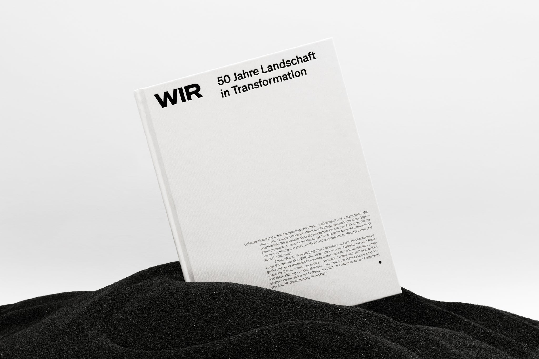
The publication “WIR. 50 Jahre Landschaft in Transformation”, which was published by “Deutscher Architektur Verlag”, builds on this system. The element of the bar is also continued and transferred to the typographic layout area in various ways - for example through the arrangement of text elements or the use of indents and headlines.


The project is characterised by three typefaces from the “Söhne Collection” (Klim Type Foundry) and two typefaces from the “PP Writer” (Pangram Pangram Foundry). While the branding of the planner group has been characterised by the Söhne character from the very beginning (“Söhne is the memory of Akzidenz-Grotesk framed through the reality of Helvetica.”), it is complemented within the publication by the Writer serif font. This is always used in combination with personal text contributions and quotations in order to emphasise the interplay of information and subjective views and narratives.


All images © of their respective owners.
Content taken from Brückner + Brückner


