Haskell Cinema’s tagline, ‘The only cinema in the USA without a screen,’ is actually a cheeky joke.
The fact is that inside the cinema, which sits at the edge between the USA and Canada, the projector lies on the American side, with the screen on the Canadian end. “The Haskell Library and Opera House was built in 1904, straddling the border between Canada and the United States, sitting between the Canadian town of Stanstead and the American town of Derby Line.
It was commissioned by Canadian Martha Stewart Haskell as a tribute to her late husband, American Carlos Haskell,” says Elisa Pinton, Project Manager at Harrison Fun, the design studio that crafted the cinema’s identity.

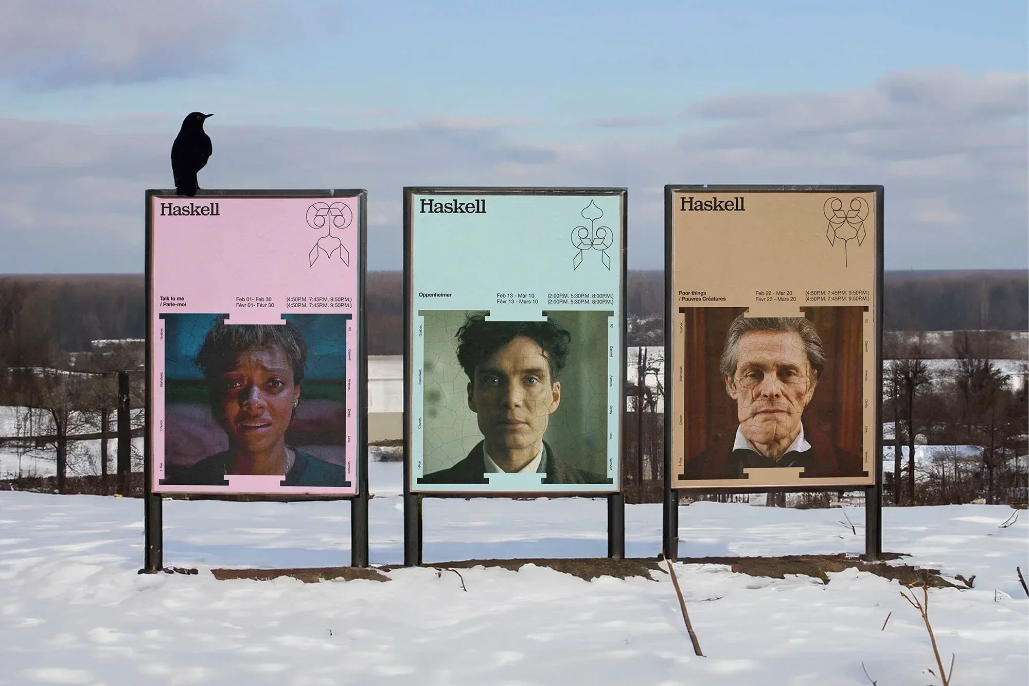
Haskell has two doors – one leading to the opera and one to the library – and this provided creative fodder for the studio. The shape of the two doors also was a point of inspiration, leading the team to create a moving, shifting ‘H’ icon – taken directly from the door shapes – as the identity’s hero emblem. “We decided to create the identity around the ‘H,’ so we made it flexible and turned it into a medium to carry information or photos.
As with the logo, the ‘H’ is the main element too; it stands out and it was logical to continue along this path and use this symbolic ‘H’ on different elements,” Creative Director Francis Desrosiers tells us. Moving through different shapes and proportions, the ‘H’ becomes the perfect vehicle for imagery and information, grounding the look in its agile flexibility.
To nod to the building’s history, the team decided to envelop the ‘H’ with floral ornamentation, a hat tip to stained glass windows, book lettering, and decorative architectural aspects; “in other words, the whole historical aspect of the building,” says Desrosiers. The wordmark, set in the slab serif Sebenta from Feliciano Type, brings a certain old-world charm to the identity, while the ‘H,’ loud and proud with its bracketed serifs, sits confidently across applications – from posters to popcorn bags.

Elsewhere, the team wanted a contemporary edge to offset the institutional look of Sebenta, opting for PP Editorial Neue and Helvetica Neue. “To ensure we were respectful of the local community and the building’s heritage, we opted for a design approach that combined historical references with contemporary typography,” explains Designer & Art Director Diego Aguilar Villalobos. “This allowed us to create an identity that resonated with both the past and the future. For example, the ornaments evoke the past, while the flexibility of the ‘H’ monogram allows us to adapt to current trends.”

All images © of their respective owners.
Content taken from Harrison Fun


