Beyond being a co-working space, Casa Les Punxes —part of Cloudworks— is interested in respecting Barcelona’s cultural heritage while breathing new life into an iconic building with a dynamic identity. Casa de les Punxes offers a broad program of cultural activities and opportunities for personal wellbeing.
New generations and global changes have influenced the perception of work, eliminating the boundary between office and home. As a consequence, a new holistic view of daily life, routine, leisure and work is born. Several factors are influencing this paradigm shift around work, so the concept of the office —both digital and physical—. From the identity to the interior design —made in collaboration with Circular Studio.— we needed to undergo a reconfiguration.


Starting from the logo proposal for Casa Les Punxes, we looked for a way to graphically introduce a wink to the modernist building, choosing a typography with pointed terminations and a vertical character structure. A secondary monospaced typeface was chosen to give contrast and balance. The color palette draws from the original colours of the lobby and the stained glass on the main floor of the building and roof details.


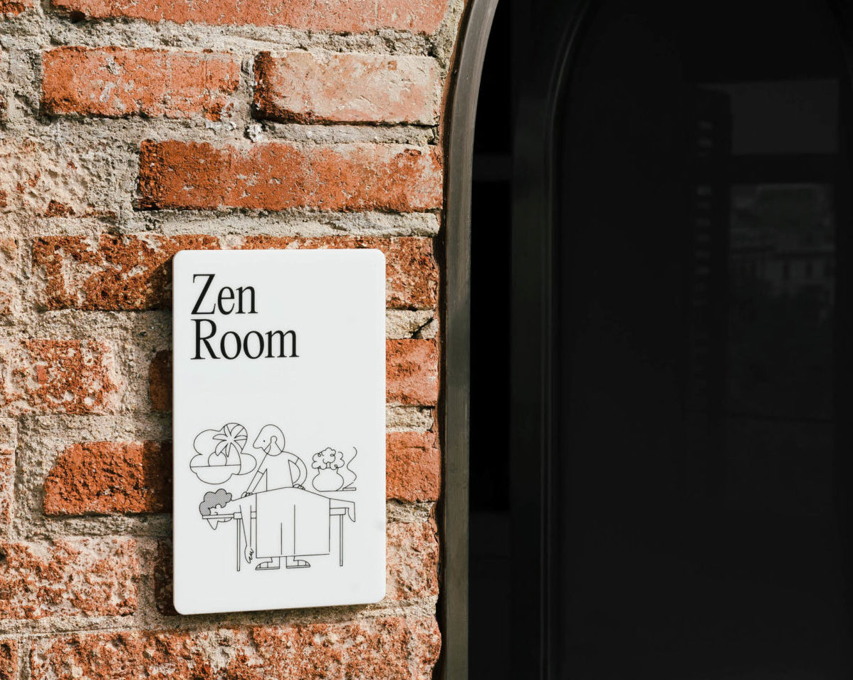
From the illustrations -in collaboration with Josep Puy-, we wanted to create a human and dynamic language, with a more gestural stroke that brings warmth to the identity and the space itself. Using less descriptive and more abstract illustrations, which represent each space of the building in a less literal way, breaking with rigidity.


All images © of their respective owners.
Content taken from Folch Studios


