How Wes Anderson inspired U.I.WD.’s vibrant rebrand of bi-coastal production company Caravan Club
Whilst their name might be misleading, Caravan Club is a bi-coastal photography and motion production company based in Los Angeles and New York. With the intention to expand their reach beyond their current clients, they approached creative direction and design studio U.I.WD. to create a fun identity that could showcase their process and the magical flow involved in creating images. In addition to a logo, design system and print collateral, this included a new website – created with the help of digital design studio Twoo – that highlights Caravan Club’s production process, behind-the-scenes moments, and crew credits for each of their projects.

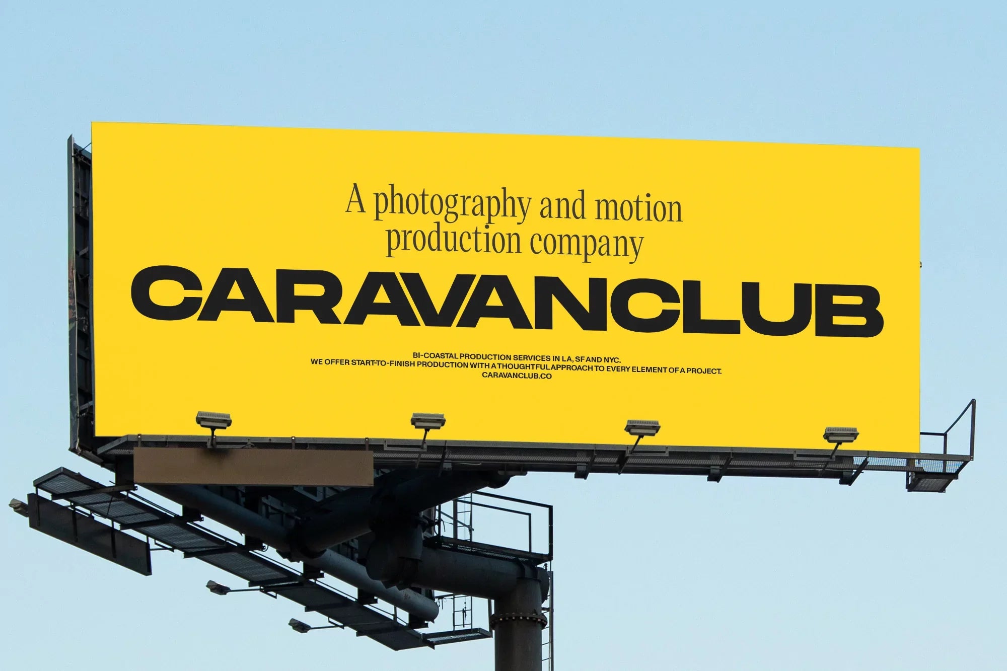
A bold sunshine yellow delivers immediate impact thanks to its usage as the brand’s leading colour. The idea came from the client’s love of Wes Anderson films. “Upon analysing frames from his films,” Founder & Creative Director Bruno Tatsumi explains, “we noticed the presence of yellow accents in most of them. We then suggested it as the corporate colour to align with the client’s vision and incorporate the essence of Wes Anderson’s cinematic style.”


The type pairing of Monument Extended Bold and Victor Narrow – designed by Mat Desjardins and Christian Jánsky, respectively – provides contrast whilst adding richness to the overall brand communication. Monument Extended offers heavy and strong characteristics, balanced out with the classical qualities of the serif. “By combining these two typefaces with opposite styles,” Tatsumi tells us, “we tried to achieve a visually dynamic and balanced typography system.”
When creating the visual language, it was essential to complement and enhance the imagery, without distracting from it. For this reason, U.I.WD. carefully curated compositions and colours that align with the visuals. “When showcasing images from a specific artist,” Tatsumi notes, “we opted for a white background to highlight the photographs. However, in corporate communications, the yellow colour was used to add playfulness and vibrant elements into the identity without overshadowing the photography itself.”
All images © of their respective owners.
Content taken from U.I.WD.
