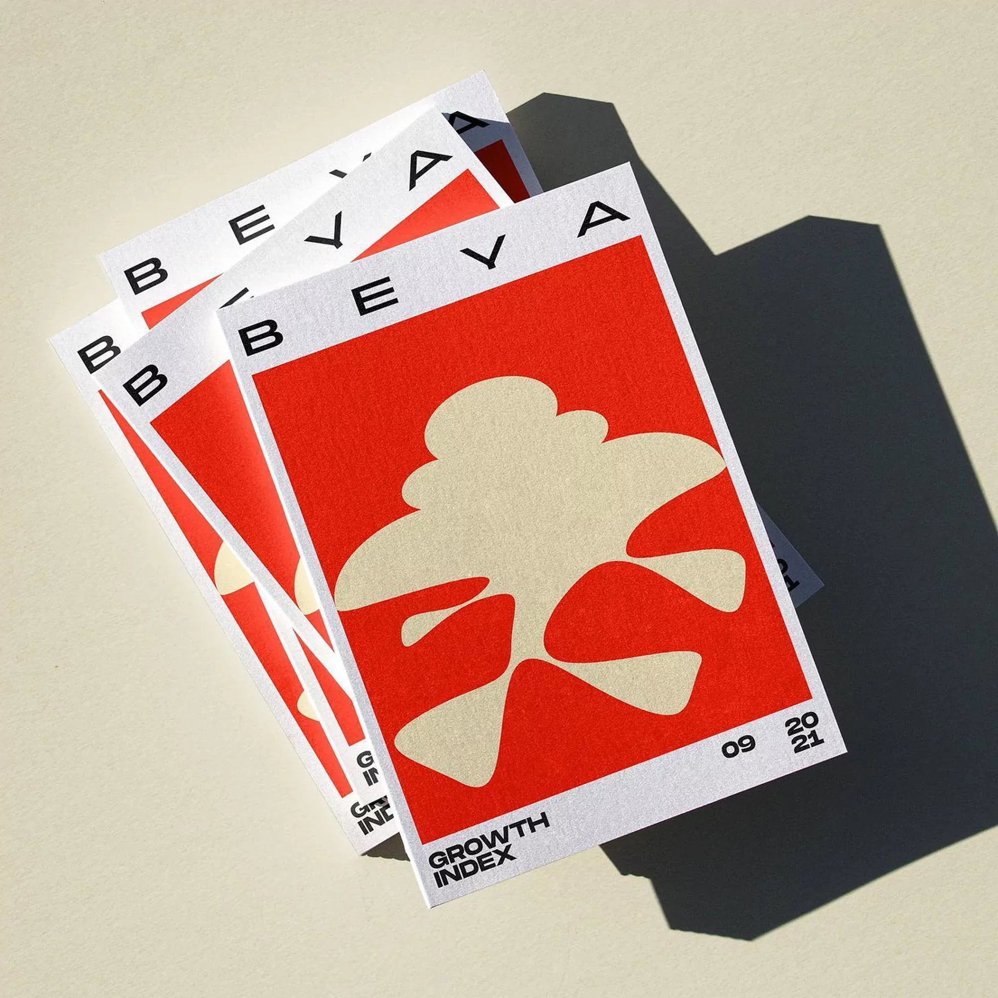
KR8 introduce a Rorschach test-like pattern system across BEYA’s fluid, flexible identity system
“The shaping system we developed operates similarly to Gestalt psychology,” Vienna and Tokyo-based studio KR8’s Managing & Creative Director Florian Kowatz tells us, detailing the shape-combining system behind their modular brand for BEYA. “It is versatile and allows for the expression of emotions,” Kowatz continues, allowing the communications consultancy to convey its brand messages and capabilities through affective, creative visualisation.


“We created this system after collaborative workshops with BEYA,” he recalls, using the time and space to gain greater insight into how the company operates. “By abstracting and incorporating their work process into the design, “ Kowatz explains, “these shapes have now become an active coaching tool during their client sessions,” living up to the fluidity and meaning behind the company’s initialised name: Be Everything You Are.


Using 30 modular forms to shape BEYA’s own Rorschach test-like illustrative patterns, KR8 harnessed the tension between strict systems and variability to lead the brand’s visual output, responding to the agile nature of the consultancy’s practice and their adaptability. “We created this system after collaborative workshops with BEYA,” he recalls, using the time and space to gain greater insight into how the company operates. “By abstracting and incorporating their work process into the design, “ Kowatz explains, “these shapes have now become an active coaching tool during their client sessions,” living up to the fluidity and meaning behind the company’s initialised name: Be Everything You Are.

Using 30 modular forms to shape BEYA’s own Rorschach test-like illustrative patterns, KR8 harnessed the tension between strict systems and variability to lead the brand’s visual output, responding to the agile nature of the consultancy’s practice and their adaptability.

“Our intention was to break away from the conventional use of greens, greys and blues,” Kowatz recalls, noting the common use of these hues in consultancy firms. “We aimed for a high-contrast palette,” he continues, “because our illustrations could be perceived from different perspectives,” allowing BEYA to alter the meaning of forms through them appearing positive or negative. “The colour red symbolises action, while the cream yellow represents something sweet and empathetic,” Kowatz concludes, “additionally, we opted for black and white to ensure a clear division between information and visuals.”


All images © of their respective owners.
Content taken from KR8 bureau

