Access is a new yoga and movement studio bringing a fresh perspective to New York City’s wellness space.
Our identity system for Access Yoga took shape around a single, transformative insight that emerged in our kickoff conversation; that within a sea of studios in New York City pushing dogmatic methodologies, Access believes that there is no “right” way to do yoga.

As a new studio and movement space entering a fiercely competitive market, Access envisions becoming a much-needed “third space” for its students — a haven outside of home and work that fosters community and deepens a sense of purpose in people’s lives. The team welcomes all skill levels and encourages joy, creativity, individuality, and intuitive self-expression as essential aspects of their practice.


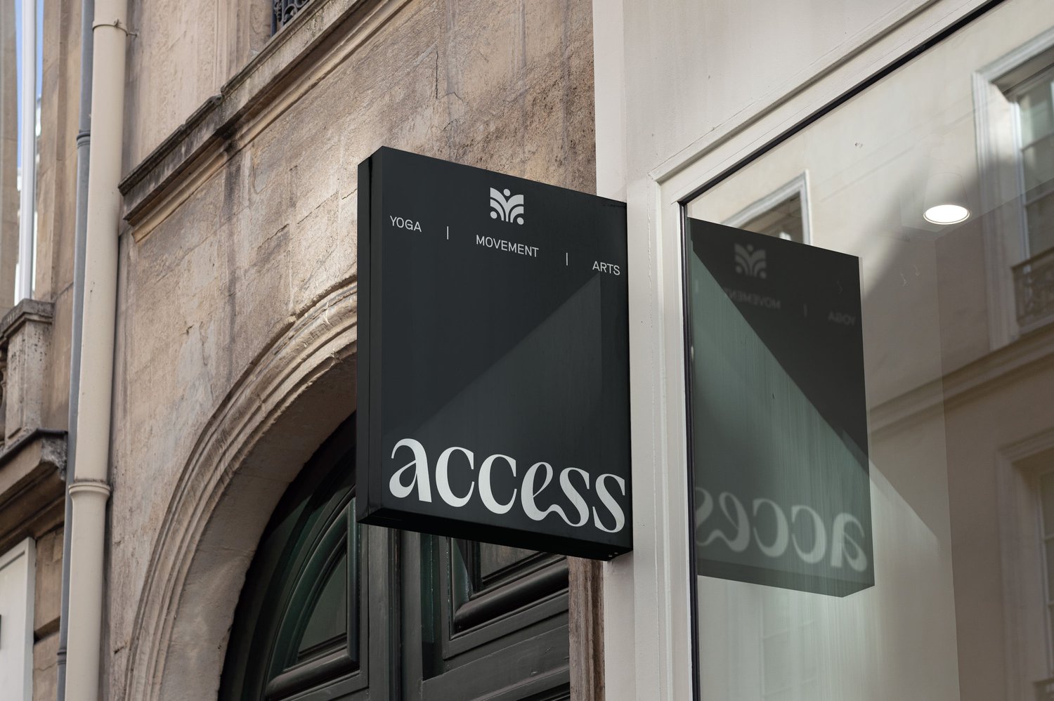
These same attributes shaped every aspect of the identity system. The brand symbol, which behaves as a submark, conveys the notion of personal growth within the context of this “third space.” Meanwhile, the logotype’s friendly letterforms convey the studio’s inherently approachable attitude, with an unexpected ligature between the “e” and “s” nodding to intuitive movement and flow state.

Our Discovery research revealed that of the studio’s competitors, those who favor contemporary design only target “premium” clientèle, whereas those who position themselves as an approachable option favor either boho aesthetics or overly irreverent brand voices.


We aimed to introduce an entirely new and distinctive flavor into the mix: a brand that is contemporary but unpretentious, easygoing but mature. The type system helps us to strike this balance, with headlines set in the elegant and expressive Self Modern (Bretagne Type Foundry) and body copy set in the clean and friendly Riposte (Good Type Foundry). Amber serves as a highly ownable primary brand color that is at once energetic and deeply soothing.Whereas competitors aim to convey prestige by leveraging the social capital of celebrity influencers, Access’s communications strategy builds rapport through direct but down-to-Earth phrasing that busy New Yorkers can digest at a glance.


We drafted language to express the studio’s core philosophy as a long form manifesto that can easily be modified to suit various lengths and applications, as well as marketing copy to showcase the studio’s relaxed tone of voice. Modular phrases can act as stand-alone brand lines (”The move how you like kind of yoga studio.”) or be combined as clauses in a longer sequence (”The wear what you want, move how you like, everyone’s welcome here kind of yoga studio.”).


The result is an extremely simple but robust verbal strategy that can meet audiences right where they are, with laid-back language that tempers the more elegant aspects of the visual identity. Access Yoga’s graphic direction extricates basic shapes from asanas to create new and somewhat naive forms, emphasizing imperfection and individuality as essential aspects of the practice. Both familiar and abstract, the forms reinforce the notion of accessibility by distilling movements into their most uncomplicated expressions. The graphic set can continue to expand with the studio’s needs over time, limited only by the number of existing asanas.


All images © of their respective owners.
Content taken from Mammmal
