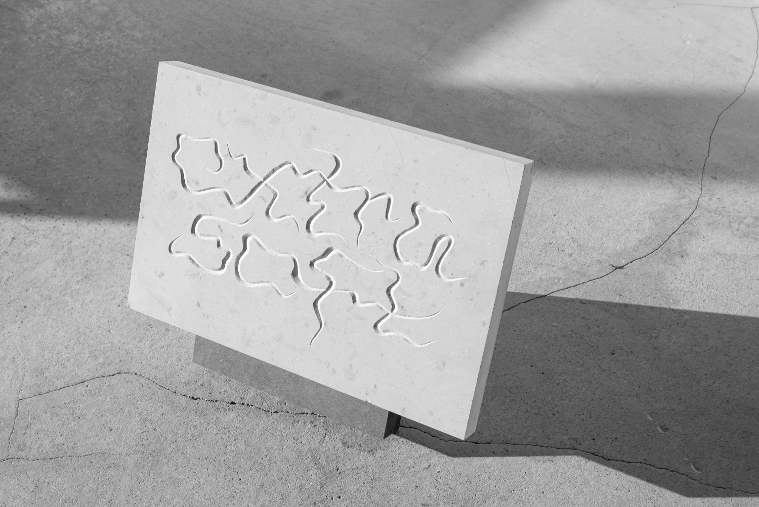
Lausanne-based creative Laura Csocsán is an artistic force to be reckoned with, dancing at the intersection between graphic and type design; exploring both with an aesthetic tenacity and rich conceptual founding.
“The practice I have is still a very malleable one centred around learning, improving and discovering,” Laura tells us, acutely aware of her process and its flexibility, in part, due to her current rigorous academic study. “As I’m finishing my master’s studies in écal type design by the summer,” she explains, “it really has been two years of observing, noticing, practising and entering uncharted territories specific within type design,” manifesting in a bonafide rollercoaster ride of challenges to and revelations about her processes. “However, I hope to have the same uncertainties with all the upcoming projects that will define and reform my work,” Laura remarks, continuing to experiment at the borders of type and graphic design. “As I think curiosity is the base pillar of what keeps me interested in my practice and lets me experiment,” she adds.
This creative and conceptual curiosity of Laura’s has led her to craft remarkable forward-thinking, and profound work, including, as Laura herself lists, “experimental letterings to full typefaces and typeface customisations, photo-heavy editorial projects to type-based designs, identities to small objects.” With this in mind, she truly seems to be the exception (and professional objection) to the notion ‘Jack of all trades, master of none.’ In fact, Laura tackles each one of her creative explorations with the same meticulousness, gravity and intention. “What interests me is to be able to have control over this aspect of my work,” Laura explains, “to create a typeface or lettering specifically meant to be used for a project,” driven by the integral part type plays in projects. “However,” she caveats, “I also really enjoy seeing retail typefaces being used by other designers for so many different things,” noting “it’s quite the opposite situation, but I’m very happy to witness the afterlife of my own creations.”
Kindly disclosing the processes behind her work and the lessons she’s learnt during her time in the industry; we’ve continued our conversation with Laura to discuss the practicalities that go into designing letterforms. From workflow and personal motivations to finalisations and the biggest mistakes to avoid, Laura has granted us all access to peek behind the curtain of the prolific creative’s powerful practice.
Where do you start when designing a typeface? It seems like it could feel really daunting! How do you get that first mark down?
Depending on the kind of typeface one intends to draw, there are different kinds of approaches or starting points. In the beginning, it is important to pin it down, whether that starting point is research, experimenting or even starting with fresh hand drawings or any of this combined. This is already something personal, but the constant in the process is then drawing a few base characters and then testing them out, adjusting, testing again and meanwhile moving on to new characters to draw, testing again… I certainly felt it can be daunting sometimes, but I would say most of the time it rather feels tedious if anything. However, after finding an idea and settling on an approach, it is more of a process one can very easily immerse themselves in and it occupies the mind in almost a meditative way.


On a practical note, what does your workflow look like? What programmes do you design type in and how greatly does this affect the process and outcome?
I’m sure the kind of software we use not only affects the process and outcome but even the ideas we might have. Just the default settings of a program, the interface, access to tutorials or plugins, how customisable the software and therefore our process is, to the philosophy behind the software all influence us. Because of its simplicity and straightforwardness, I started out using Glyphs and I developed a fluid and fast workflow there which is hard for me to replicate in Robofont for example. It’s my goal to train myself in other programs such as Roborfont or FontLab as well, however, for the moment I have always found myself in a time crunch which didn’t allow for this change. I’m sure it would have an effect on the aesthetic of my work as well.

What motivates you during the process of designing a typeface? Does this change along the way?
It’s interesting because on some level, imagining finishing the project motivates me – setting the goals and doing all of the steps to complete to arrive at the envisioned results. But the main motivation is always the excitement of working on something new, learning something new and having all these questions in my head which keep me occupied and let me focus fully on the process as I go along. As the projects are all different, in a way the motivation is changing as well, but the logic of it stays.


Once you’ve found your inspiration and what you envision the typeface being, could you explain how you go about developing and finalising a typeface to be ready to be used by other people?
After finding inspiration or an idea, even after the first sketches, there is still a lot of trial and error involved. Drawing letters can be fast, but figuring out and fixing details is always a slow process as one needs a fresh eye and different circumstances to test the typeface, so there is a lot of going back and forth and redrawing, meaning countless interactions for most letters in the end. Arriving at a steady point with the drawings of letters allows the process to move on to other characters in the set, such as symbols or fractions, basically all of the less frequently used components of a typeface, which are still necessary. Personally, I try to integrate diacritics and special characters from the beginning of the drawing stage, as they can also change a lot during the process and need to be considered as a coherent part. Spacing needs to be taken care of too continuously from the beginning but needs a final check with all of the characters as well. Then there is still kerning and mastering, as well as testing in different environments.


A typeface can have so many features, from ligatures to variability. Do you ever consider a typeface as complete? Or are you always thinking about ways you could rework them in the future?
There is always this wave of impatience on what to do next, weights and variations, expanding the character set, even more, redrawing details or drawing different scripts and so on. For me, it’s very hard to consider a typeface complete, but I have learnt to stop at certain milestones. There is always time to continue the work, but it’s also important to set an initial goal one can complete, which is functional for the intent and as a typeface, makes sense for the concept, and then maybe in the future move on to other goals or to rework.

What’s your biggest tip for someone that wants to design a typeface?
I do think starting out in type design requires a lot of invested energy and time, for this, it’s important to be prepared and take the time, as well as being endlessly patient. Taking a deep dive into it from the beginning is absolutely worth it, but maybe doesn’t come with the most gratifying start and instant results. However, I would suggest starting with a relatively easier task, like a display or experimental typeface, while still getting to learn basic rules and practice them before moving on.


What’s one thing to avoid when designing type?
I don’t think I like to advise on what to avoid as it all depends on context, but I would say stuck mannerisms and artificiality – for me, this is true for all visual work.


What’s one thing you wish you knew when you first started out?
Testing strings (different strings of letters) – are the most useful! I had trouble creating them at the beginning of my studies or even understanding how they work or what to look at, but now I can say I’m able to make use of them and learned how to rely on them. They are absolutely the pillar in the process and I wish I had this workflow integrated way sooner.


