
Whether you’re a designer who can list every typeface you’ve ever downloaded off the top of your head, or you’re just starting out and don’t know your serifs from your sans, we’ve got you sorted. Maybe you’re looking for an alternative to Neue Haas Grotesk that you can rely on time and time again, or maybe you’re hoping to find a typeface that has a lot to say for itself. Whoever you are, and whatever you’re looking for, we know one thing for sure — everyone needs good Sans Serifs in their toolkit. We’ve curated 10 contemporary Sans Serifs for you to discover below.
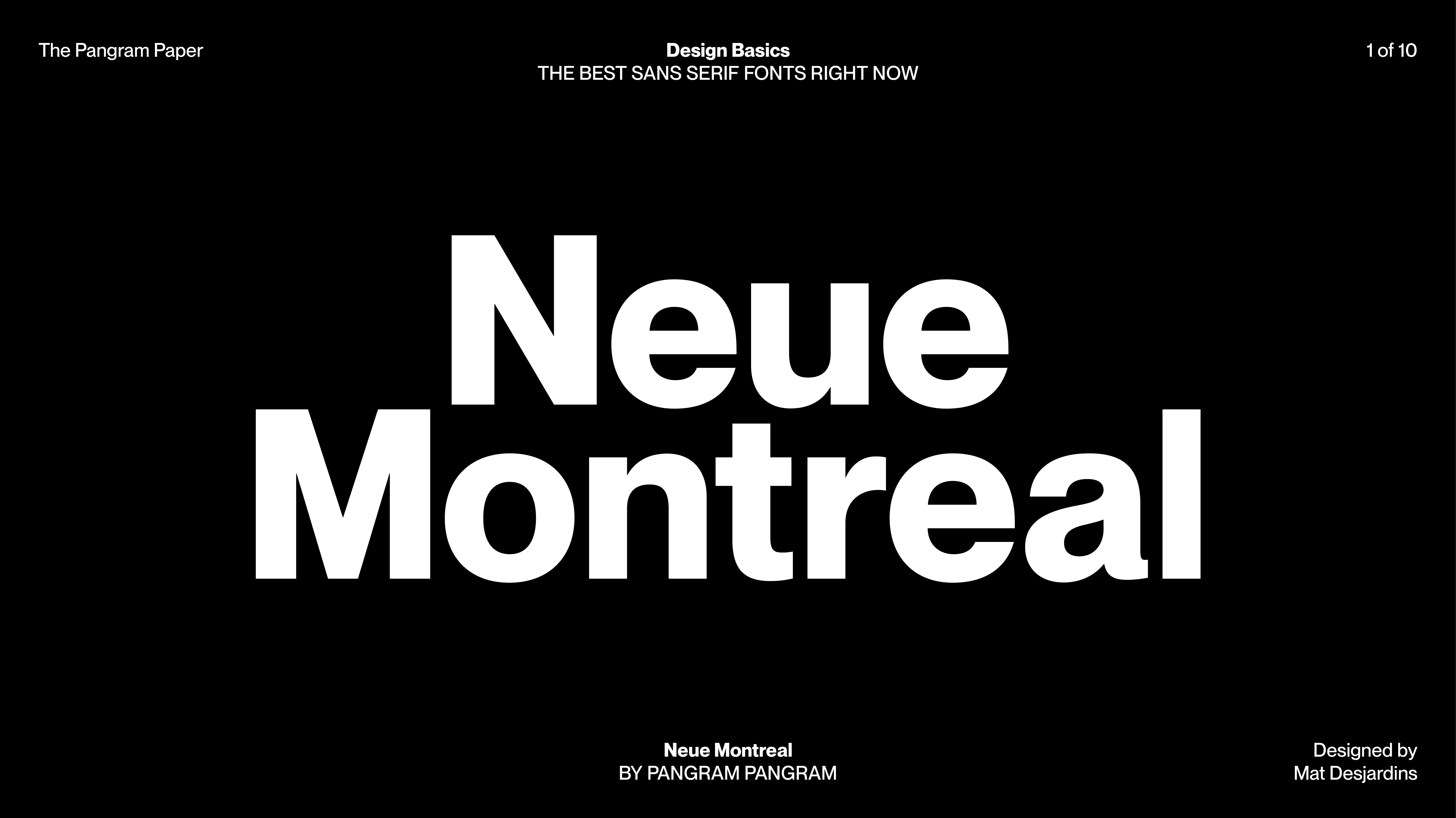
NEUE MONTREAL by Pangram Pangram
Say goodbye to Neue Haas Grotesk, and hello to Neue Montreal. A versatile, yet timeless grotesque, it’s a workhorse that will never let you down.

MARTIN by Vocal Type
Inspired by remains of 1968’s Memphis Sanitation Strike, Vocal Type’s powerful typeface Martin embodies non-violence – championing how impactful the combination of history, heritage, modernity and context can be in design and beyond.


RÄDER by Pangram Pangram
If you want personality, Räder’s for you. Having found its inspiration in road signage, whichever direction you need to be going, Räder will show you the way.


SOCIAL by Dinamo
With a mega family the size of Social’s, you’ll never be lost for choice when it comes to weight and scale. Designed with character and connection in mind, the friendly construction of this smooth grotesque welcomes you to the family, crafted with the intention to bring people together.


SUPPLY SANS by Pangram Pangram
Are you looking for a mono… but you don’t actually want a mono? Get building with Supply Sans, whose architectural origins have crafted a typeface as striking and structural as its industrial design influence.


BRUT GROTESQUE by Bureau Brut
Inspired by its overtly-utilitarian predecessors, the likes of Helvetica and Arial, Brut Grotesque challenges the idea that efficiency and neutrality are ugly words. Leaning into the extensive glyph sets, technical expertise and accessibility of classic and neo-grotesque, this sans seeks to never be the wrong choice.


PANGRAM SANS ROUNDED by Pangram Pangram
You really can’t get much friendlier than Pangram Sans Rounded. With the cutest smiley-face glyph going, this fun, friendly and approachable typeface can feel at home in anything from the edgiest gig poster, to the coolest primary school pamphlet you’ve ever seen.


DAVID by A is For
Finding its origins in the sample lettering of a 1969 publication by David Gates, A is For’s David plays into the beauty of simple forms – crafted with wide proportions and squarish counters – perfectly optimised for the contemporary context of its inspiration.


NEUE MACHINA by Pangram Pangram
Robot vibes and sci-fi features; Neue Machina’s unique combination of classic editorial-inspired ink traps and somewhat-monospace somewhat-geometric construction makes for striking typeface. Fit for space, screen, robots or reprints.


TIMMONS NY by Matt Willey for Buy Fonts Save Lives
Super compact, all-caps, and fit for purpose, this editorial-inspired wonderful comes from the mind of Matt Willey, and was finessed with the support of Diana Oveze. With 100% of their typeface proceeds going to Cancer Research UK and Macmillan Cancer Support, it’s safe to say Timmons NY is as good as it looks.


