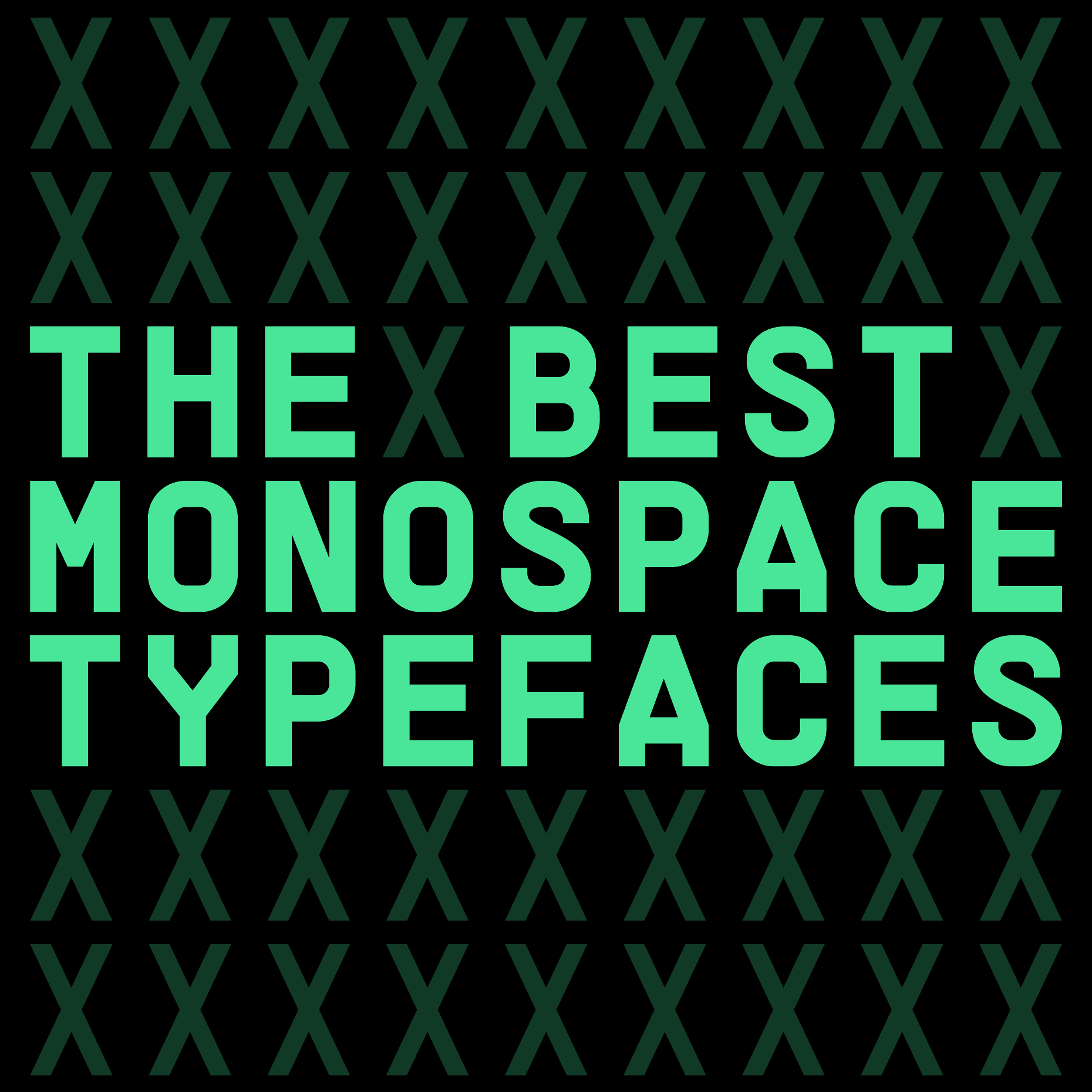
Monospace typefaces have been around for a while now, it’s fair to say, having been used since the early days of physical, printed typography.
It’s also fair to say that technology has developed quite a way since their invention, and the monospace scene continues to produce some of the most forward-thinking, appealing and exciting fonts around. Defining the genre, monospace typefaces take their name from the defining parameter that each character of the font’s glyph set fills an equal horizontal space, creating an ordered, accessible clear-cut layout. Beyond this, at the foundation of monospaced typefaces is its rich history that dramatically differs in context, typically the standard for both analogue typewriters and default computer coding alike.
For us, the beauty of monospaced typefaces is how creatives have embraced and subverted this legacy, as well as the breadth of the genre itself, encapsulating sans serifs, serifs, displays and blackletters (and almost everything in between). As such, they offer a wide variety of styles, vibes and aesthetics. Basically, there will always be a mono up your street, whether you’re on the hunt for something more edgy, contemporary and cool or a more classic typewriter feel.
In this article, we’ll look at some of the best monospaces you can use right now, so if you’re looking for something slick, sharp or subversive, we’ve got you covered.
Supply Mono by Pangram Pangram
A fan favourite, Pangram Pangram’s Supply is as capable as it is captivating, offering creatives a workhorse monospace and corresponding sans serif. Taking inspiration from industrial design and architecture, the techy-meets-brutal vibe of Supply is truly distinctive, providing any project with a striking contrast of meticulous, embracing curves and sharp angles and, with it, a unique personality destined to enliven its usage. A Supply that meets any demand.


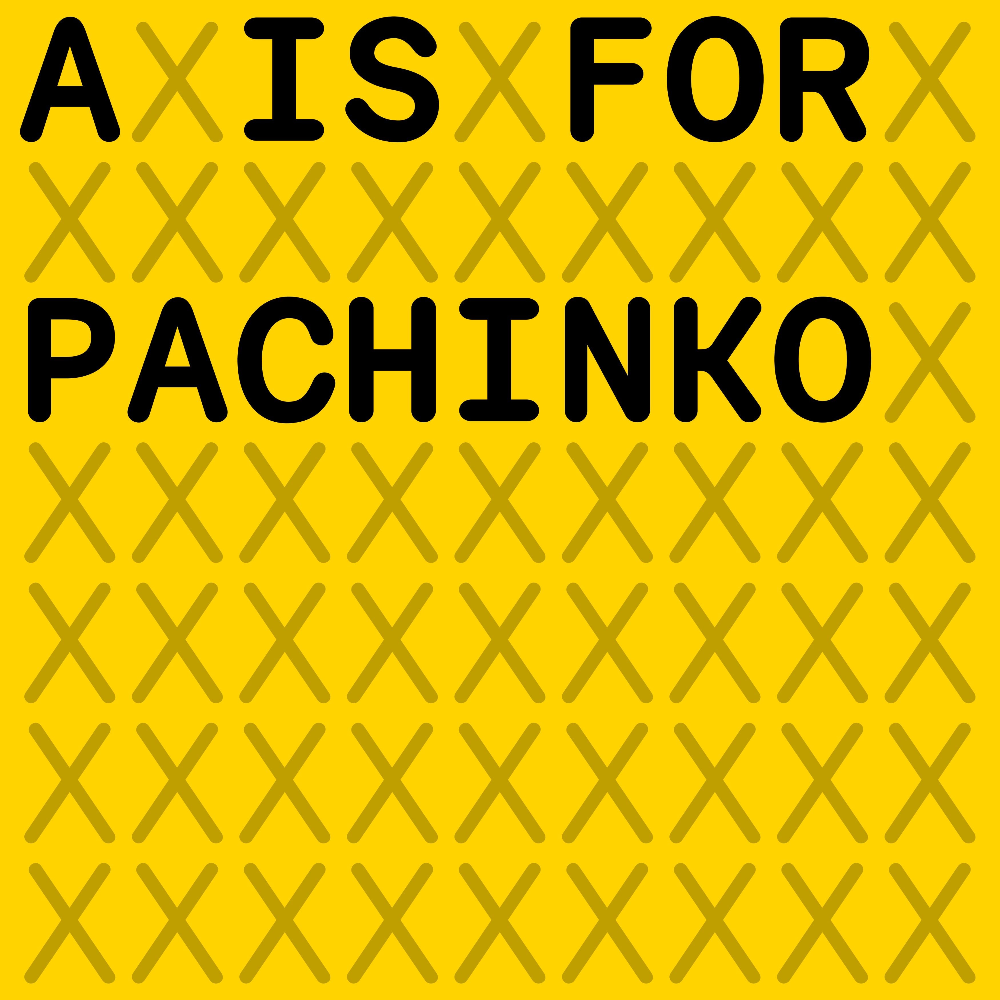
Pachinko by A is For
Available in both mono and proportional styles, A is For’s Pachinko is an exploratory sight to behold, academically and aesthetically delving into the typographic gap between mechanical and human processes – culminating in an expressive, extensive and incredibly satisfying font. Befitted with six styles, it’s perhaps in Pachinko’s italics that the typeface’s innate expression comes to the forefront, having been drawn and traced by hand, appearing undeniably tactile and simultaneously joyful.


Oracle by Dinamo
Dinamo’s latest release Oracle is an elegant, elastic font family, imparting its users with a great deal of typographic flexibility across its six weights and italics. Available in proportional and monospace, Oracle’s Triple style investigates the wonderful silliness that comes from strict structure, breaking the bounding boxes of its characters into thirds to push the resulting letterforms to their extremes. The result? A friendly, funny and atypical monospace, assured to bring some unconventional energy to any creative space.


RM Mono by CoType
RM Mono from CoType is the foundry’s latest monospace, expanding on their popular, utilitarian sans serif, RM Neue. Featuring extensive language support, alternate glyphs, arrows, fractions, numerals, geometric symbols, five weights and fun, slightly oversized punctuation, the hardworking release has quite a prolific and pragmatic catalogue of features. To put it plainly, it also looks absolutely lovely and is a versatile and practical option for designers looking for a fun, functional and exhaustive typeface.


Montiac by SUPERCONTINENTE
SUPERCONTINENTE’s Fabiola Mejía continues to craft some of the most inventive, challenging typefaces around, and their rational serif Montiac is no exception. Founded on an unapologetic, rebellious reimagining of the late 19th-century serif Columbia Antiqua, Montiac exudes a distinctly unique perspective, championing what the foundry describes as ‘tropical alpinism’ across its six-weight family. Quite a riotous take on rationality that is sure to bestow something special to any creative output.


