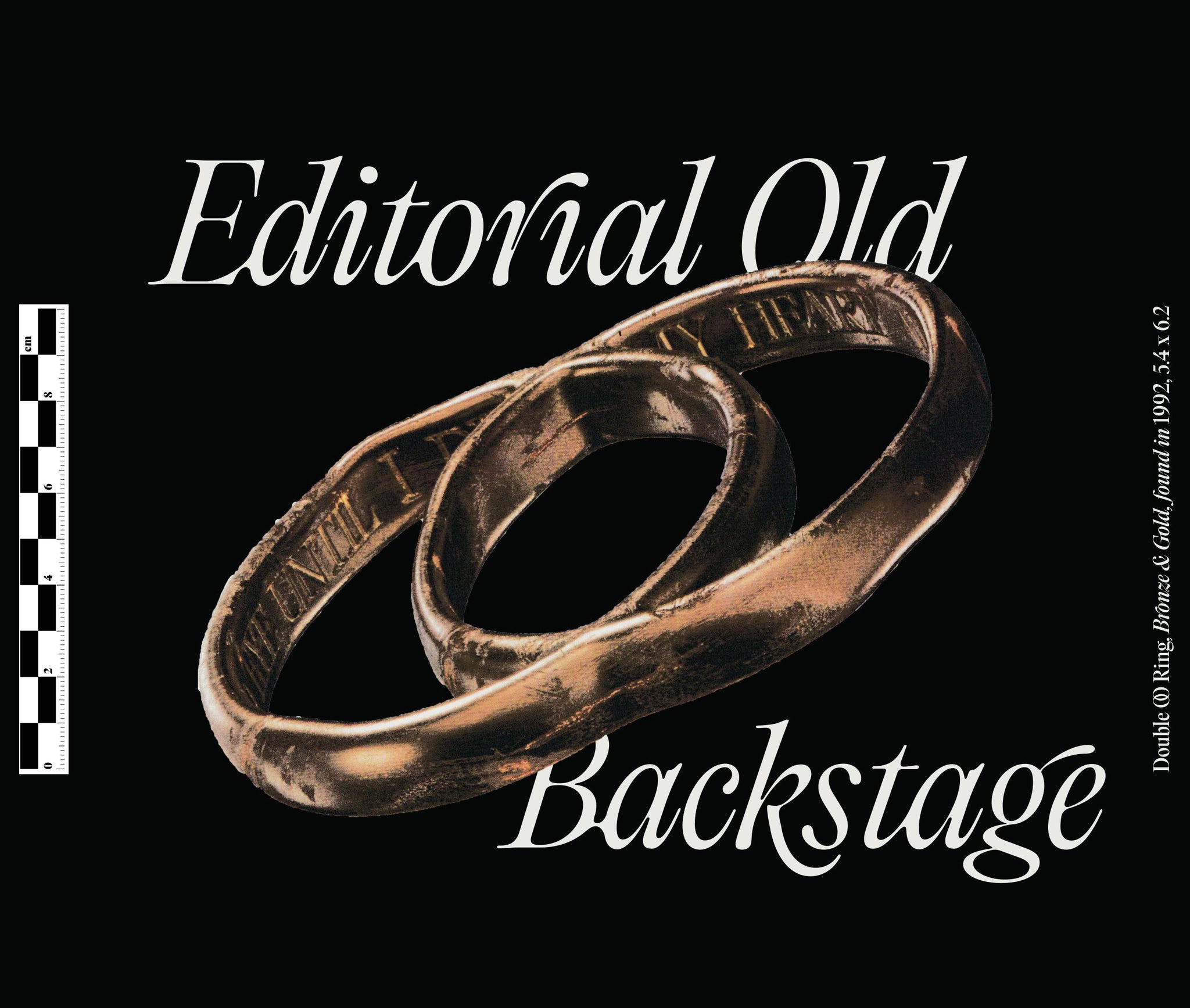
Say hello to Fred Wiltshire!
Continuing our Backstage series, we’ve been chatting with Fred, the uber talented type designer behind Pangram Pangram’s hit new release, Editorial Old. Sharing insights into the development process of this unconventional font, whilst shedding light on the challenges he faced in designing an ‘older’ typeface, we’ve dived into the nitty-gritty behind the ‘eroded’ serif and discuss its aesthetic loveliness.
Let’s get cracking!
Hey Fred! Lovely to be chatting with you! Howʼre you doing? Busy?
Fred: Hi Harry and Alice, lovely chatting again, very busy on my side, how about you?
We're great thanks! So, letʼs chat Editorial Old; itʼs finally out! Itʼs such an exciting offering and quite an unexpected, unconventional release. How did the typeface come about? What kicked off the idea to reimagine Editorial New as something... old?
Fred: I think thereʼs a higher demand for more organic and ornamental typefaces, so I can see the appeal of doing a project like this. But this was all Mat, he came to me with the idea.

What was the practical process like in designing ‘olderʼ letterforms? Did you get to use Editorial Newʼs existing structure as a base, or was it entirely from scratch?
Fred: It started off with manipulating and adding inky features to Editorial New, and then eventually changing key aspects of the initial structure. Trying to find a nice balance between standing out yet relating to Editorial New was the main concern at the start of the project.


What were the greatest challenges in designing the typeface? Were there any big key moments during its development, or an ‘Iʼve got it!ʼ moment?
Fred: The ligatures ended up being the biggest challenge for me, just the vast quantity needed was very time consuming. Ironically they were also the “Iʼve got it” moment, adding a few ligatures in the later stage of concepts really solidified to idea, and I could start seeing its full potential.
What sort of visual references were you looking at to create a more ‘authenticʼ eroded vibe? Was there any distinct era or medium you were drawn to?
Fred: If ever lost, or in need of inspiration I kept on returning to pen and ink, drawing inspiration from any quirks or natural features created on the page. Otherwise, just old books where ink spread was visible.

Editorial Oldʼs design has some truly striking features, from its droopy ligatures to the soft, narrow curves. What was the most fun thing about designing it?
Fred: Although the ligatures were the biggest challenge, it really was a great creative challenge, and I enjoyed coming up with fun and interesting ways of combining letters, thatʼs where I had the most fun and creative fulfilment.


Beyond its aesthetic loveliness, Editorial Old is also a super workhorse serif! How did you go about balancing letterforms that captured the vintage tone of voice but kept a profoundly utilitarian practicality to their usage?
Fred: Having Editorial New as a foundation definitely helped with maintaining a certain practicality to the typeface. I also think Mat and Francesca kept me in line, and steered me away from key features that would have impacted on legibility/readability, like a higher contrast, cartoonish inky serifs etc... it could have been easy for me to over do it.

We canʼt wait to see what creatives get up to using Editorial Old! In the meantime, is there anything fun youʼre working on for Pangram Pangram that we could expect in the future?
Fred: I donʼt think I can say anything on that, but I am working with Pangram Pangram again!
Alright, time for some quick fire Qs! Whatʼs your favourite Editorial Old glyph?
Fred: There’s something very sweet about the F_i ligature, especially in the bold weight.


Do you have a favourite Editorial Old Style?
Fred: I am always a fan of designing and using Black Italic styles, this is no exception.
What was the hardest glyph to finish?
Fred: This sounds odd, but I think the T in the light weight caused me the most pain.
If you could reimagine any other uber-contemporary typeface as something more historical, what would it be and why?
Fred: Creating an old PP Fragment would be an interesting and fun variable challenge. Or just a Cyrillic/Greek Editorial Old, purely for the love of those scripts and the endless potential for ligatures.
In a dream world, what project would you love someone to use Editorial Old for? A dream client, brand or anything else you might like!
Fred: This is perfect for anything that needs to stand out, from book covers to branding. I spot Editorial New all over London, Iʼm sure this will pop up everywhere too, I have no doubt about it.


PP Editorial Old is available to try for free
Commercial licenses are also available, starting at $40.


