For 40 years, laif has stood for photos and reports. For photography that illustrates political events of the day, explains backgrounds, gives business, science and society a face—always right in the middle of current events.
More than 400 photographers work on the visualization of the world. Each of them has a clear position and high standards for their own photography.
In order to convey this attitude more clearly to the outside world, we have developed a new visual identity together with the design studio EchoEcho. It is both a careful redesign, because we remember where we come from. But it's also a bold evolution and rethinking of what already exists, because we're open to the future and eager for what's to come.


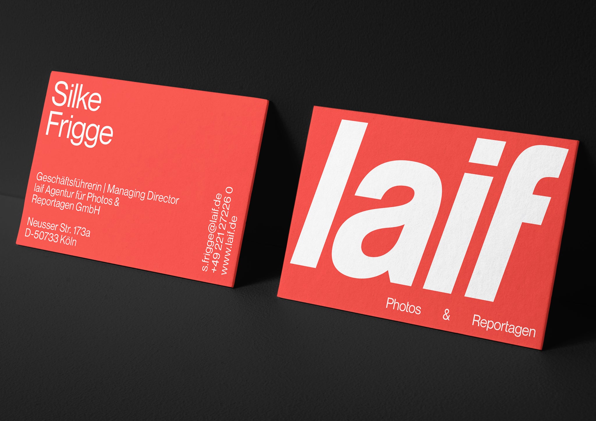
laif comes from the world of high-quality photojournalism. That's why the visual codes of the design are also taken from the language of newspapers and magazines: Our bold and energetic red—borrowed from the headline—now takes on the role of printer's ink and is used exclusively as a font color.
The light gray on which it stands mimics newsprint. The objective typography forms the grid and structure in which the images find their positions—with the photos clearly in the foreground. For this has been laif’s work for 40 years: to give outstanding photographers a stage.


Tobias Handorf, one of the two managing directors of the Cologne design studio EchoEcho, says: "It was clear to us from the beginning that we would not cut the aspect ratios of the images. We understood this to be a varying design element, which, through the typographic environment, results in a very dynamic overall image—different every time. The different formats thus playfully enter into a dialogue with the typeface and also react to the occasions of the medium. From quiet (surrounding the image) to loud (towering over the image)."


This creates a system that foregrounds images and alternates with confidently placed typography to create a field of tension.
This flexible visual system allows us to respond appropriately to the photographic work, placing it either in a striking frame or in a passe-partout that leaves room for the impact of the image itself.
Furthermore, the new typeface not only gives us character, but develops one of its own, as it was specially edited for laif. Based on the typeface "Neue Montreal", the "PP Neue Laif" was developed in collaboration with Pangram Pangram Foundry, and from now on will be the new and exclusive laif corporate typeface.
All images © of their respective owners.
Content taken from Echo Echo Studio