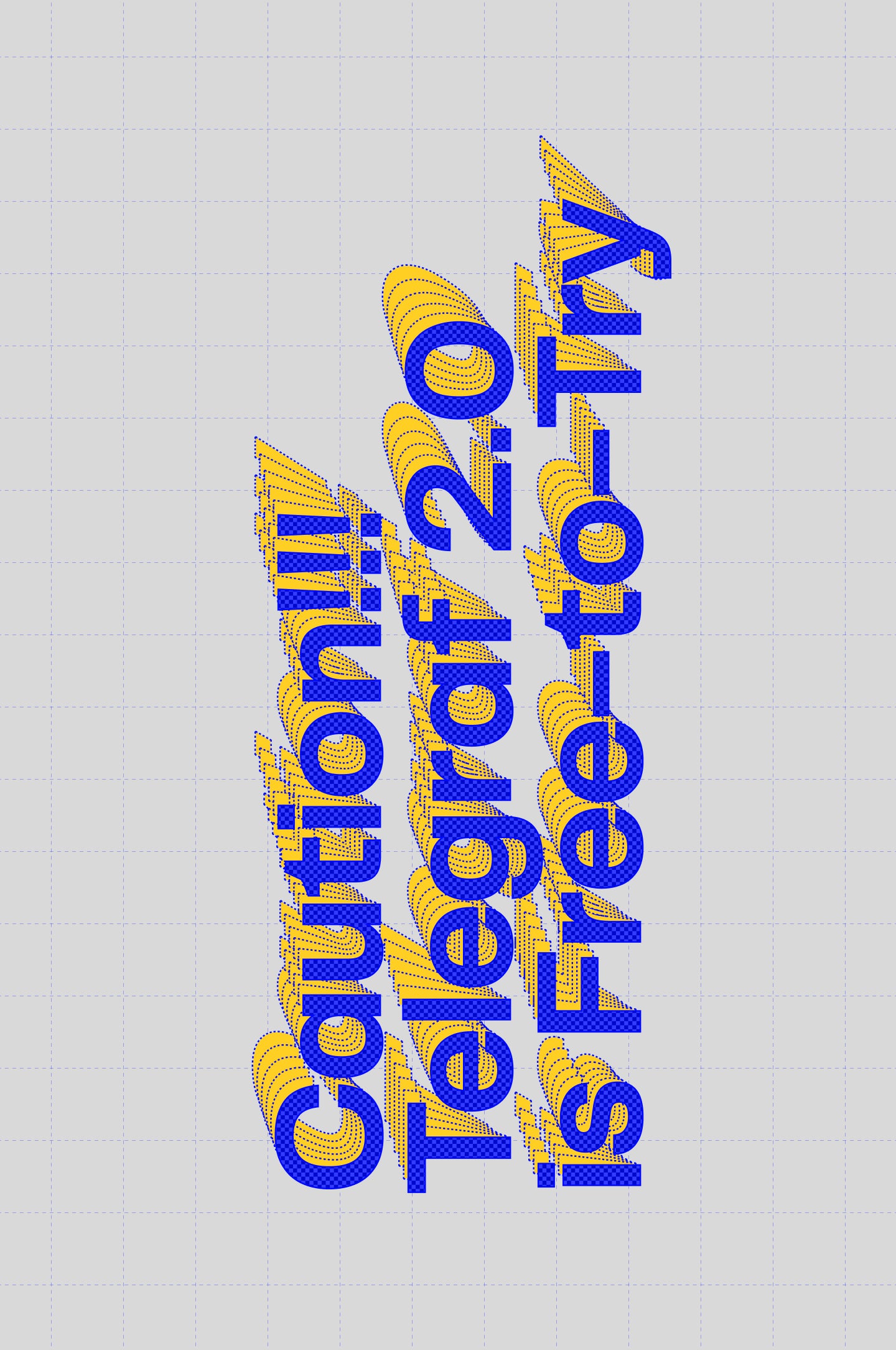
telegraf
Le muscle du milieu du siècle rencontre le minimalisme moderne avec une touche brutaliste.
Essai gratuit
Licenses à partir de $40
Liste de styles telegraf
24 Styles
01234567
{(!@#$?&)}
01234567
{(!@#$?&)}
- Ultralight 200
- Light 300
- Regular 400
- Medium 500
- Semibold 600
- Bold 700
- Ultrabold 800
- Black 900
- Ultralight Slanted 200
- Light Slanted 300
- Regular Slanted 400
- Medium Slanted 500
- Semibold Slanted 600
- Bold Slanted 700
- Ultrabold Slanted 800
- Black Slanted 900
- Ultralight Oblique 200
- Light Oblique 300
- Regular Oblique 400
- Medium Oblique 500
- Semibold Oblique 600
- Bold Oblique 700
- Ultrabold Oblique 800
- Black Oblique 900
telegraf
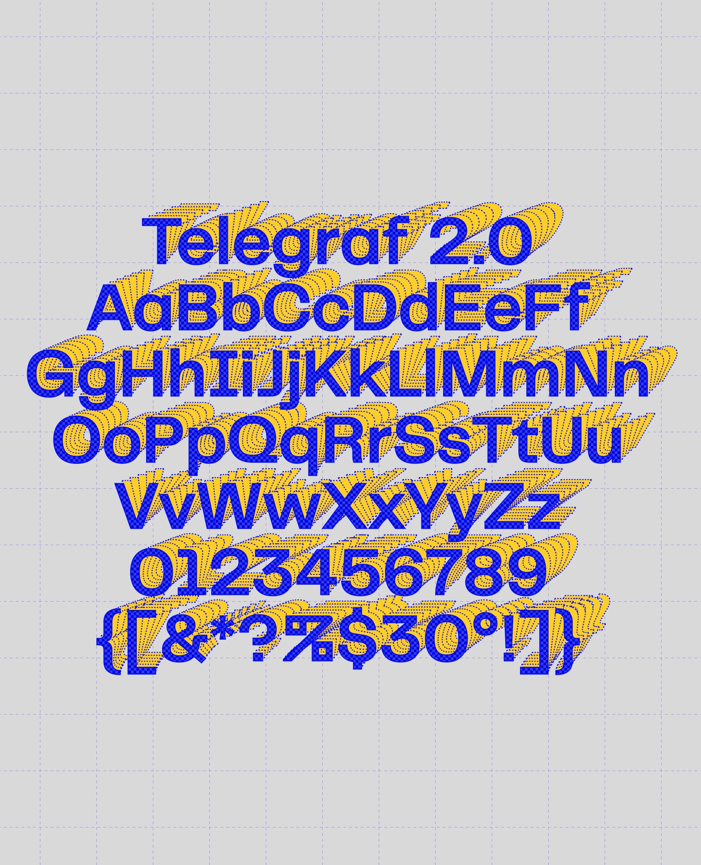
Aperçu de l'ensemble des glyphes
Aperçu de l'ensemble des glyphes
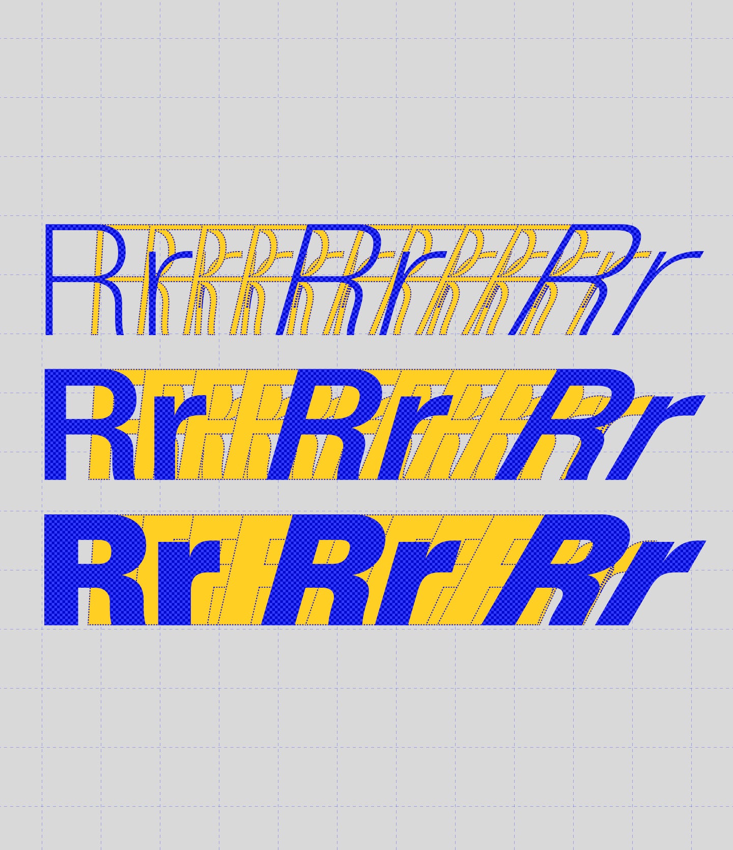
Vue des glyphes
Fonctionnalités de telegraf
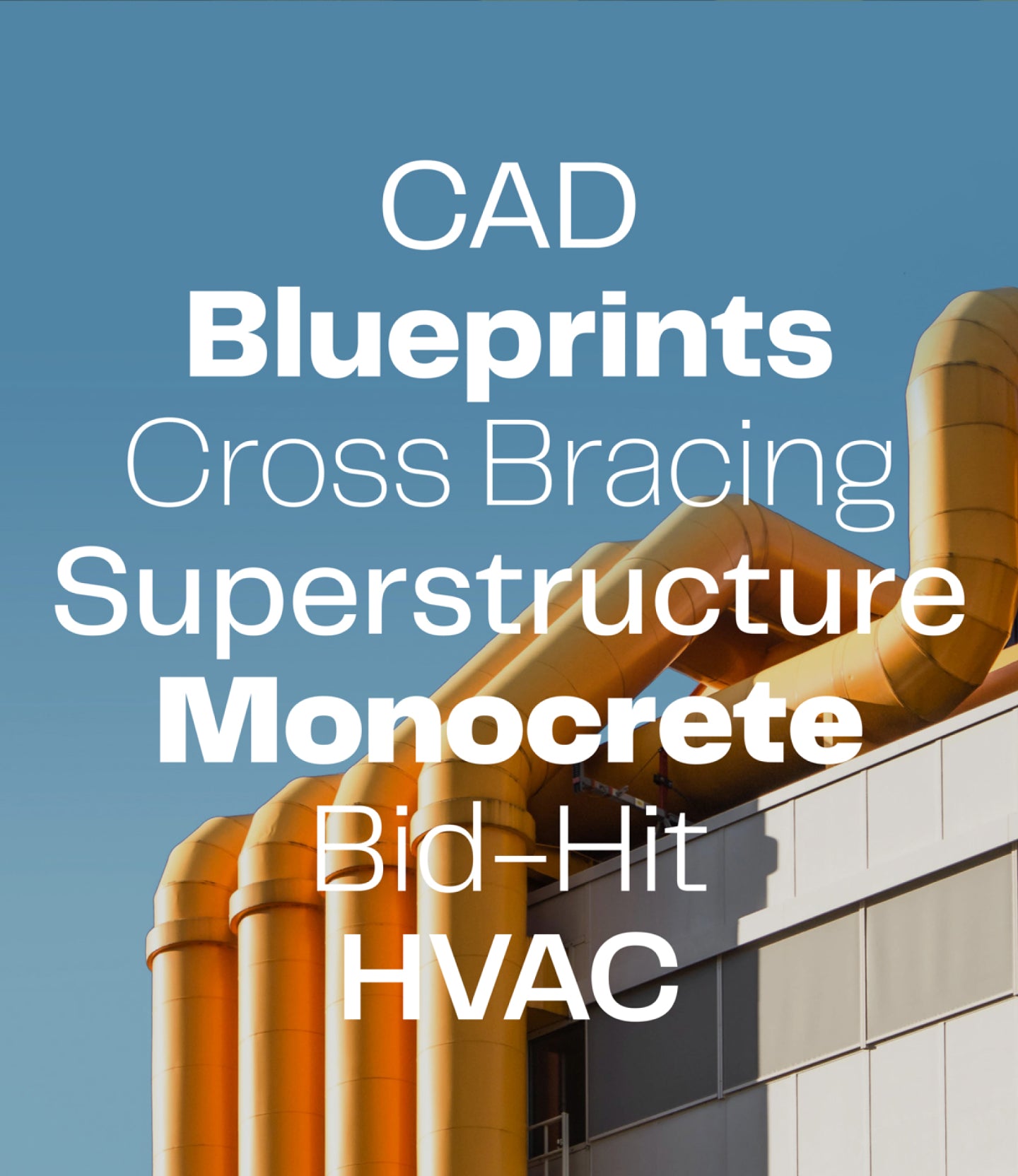
Grotesque avec du cran.
Il se définirait comme un grotesque moderne bien implanté avec une présence puissante et une touche de brutalisme ▲ Convient aussi bien aux projets à grande échelle qu'aux projets indépendants.
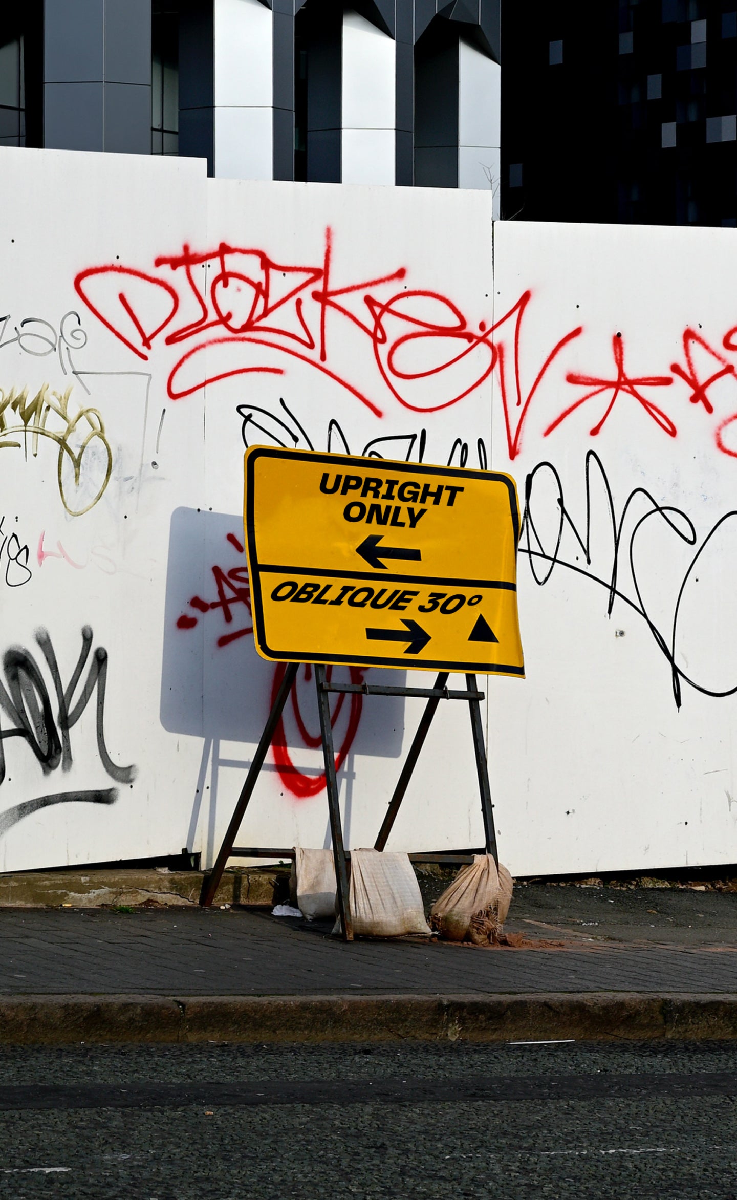
Les modèles inclinés offrent un angle confortable de 15° pour vos contenus éditoriaux ou longs. Nous avons également créé un modèle oblique extrême de 30° pour une approche plus brutale et graphique.
Créateurs
Catégories
- Brutalist
- Grotesk
- Italics
- Variable
Styles
- 24 Styles
24 styles avec 429 glyphes chacun
Version
2.000
Dernière mise à jour : Janvier 2023
Formats disponibles
OTF, TTF, WOFF, WOFF2
Langues supportées
Afrikaans, basque, breton, catalan, croate, tchèque, danois, néerlandais, anglais, estonien, finnois, français, gaélique, allemand, hongrois, islandais, indonésien, irlandais, italien, letton, lituanien, norvégien, polonais, portugais, roumain, sami, serbe, slovaque, slovène, espagnol, swahili, suédois, turc (et plus)
Licences commerciales
Vous ne savez pas quoi choisir ? Ou vous ne trouvez pas la couverture qui vous convient ?
Contactez-nous pour nos licences d'entreprise sur mesure !
Besoin de plus d'informations sur nos licences ?
Notre FAQ contient généralement la plupart des réponses.
Nos Fontes en utilisation
Voir tout
Le gingembre de Dickie
Voir le projet
Le Webster
Voir le projet
The Moraine
Voir le projet
Havelufer Quartier Berlin
Voir le projet
7e anniversaire d'Oods
Voir le projet