Hatton
Fabriqué avec précision. Façonné par l'histoire. Prêt à voler la vedette.
Essai gratuit
Licenses à partir de $40
Liste de styles Hatton
18 Styles
01234567
{(!@#$?&)}
01234567
{(!@#$?&)}
- Thin 100
- Ultralight 200
- Light 300
- Regular 400
- Medium 475
- Semibold 600
- Bold 700
- Ultrabold 800
- Black 900
- Thin Italic 100
- Ultralight Italic 200
- Light Italic 300
- Regular Italic 400
- Medium Italic 475
- Semibold Italic 600
- Bold Italic 700
- Ultrabold Italic 800
- Black Italic 900
Hatton
avec Italique
Aperçu de l'ensemble des glyphes
Aperçu de l'ensemble des glyphes
Vue des glyphes
Fonctionnalités de Hatton
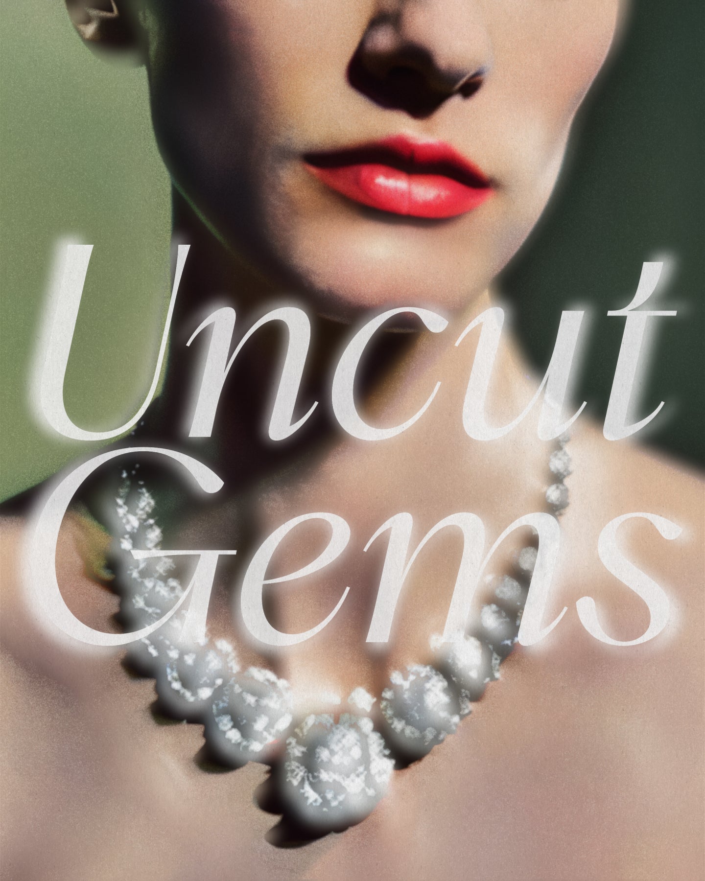
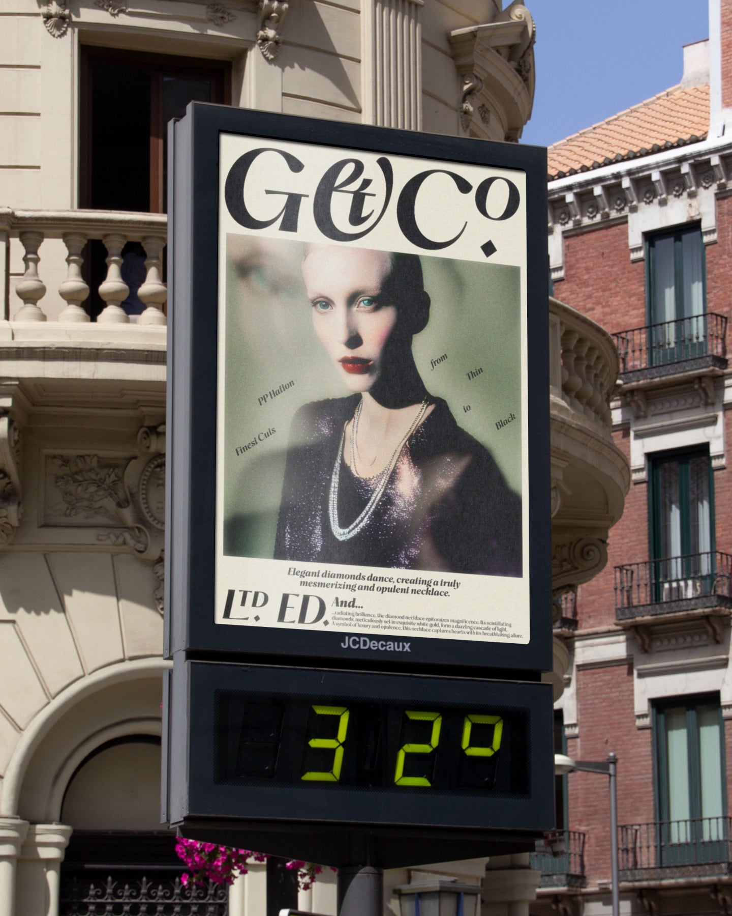
Un bijou d'empattement. Gravé à Londres.
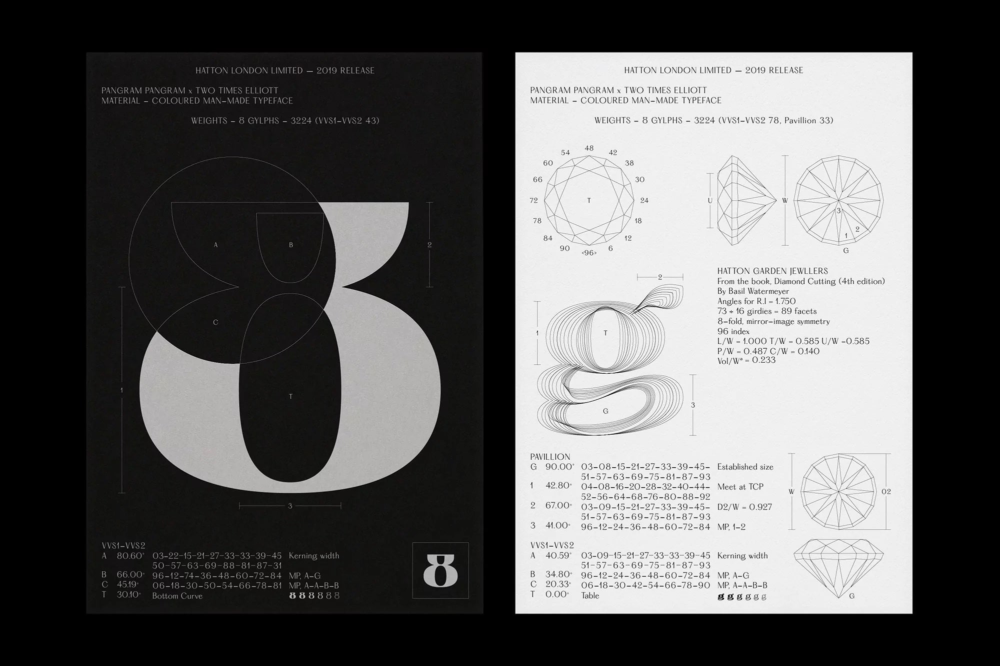
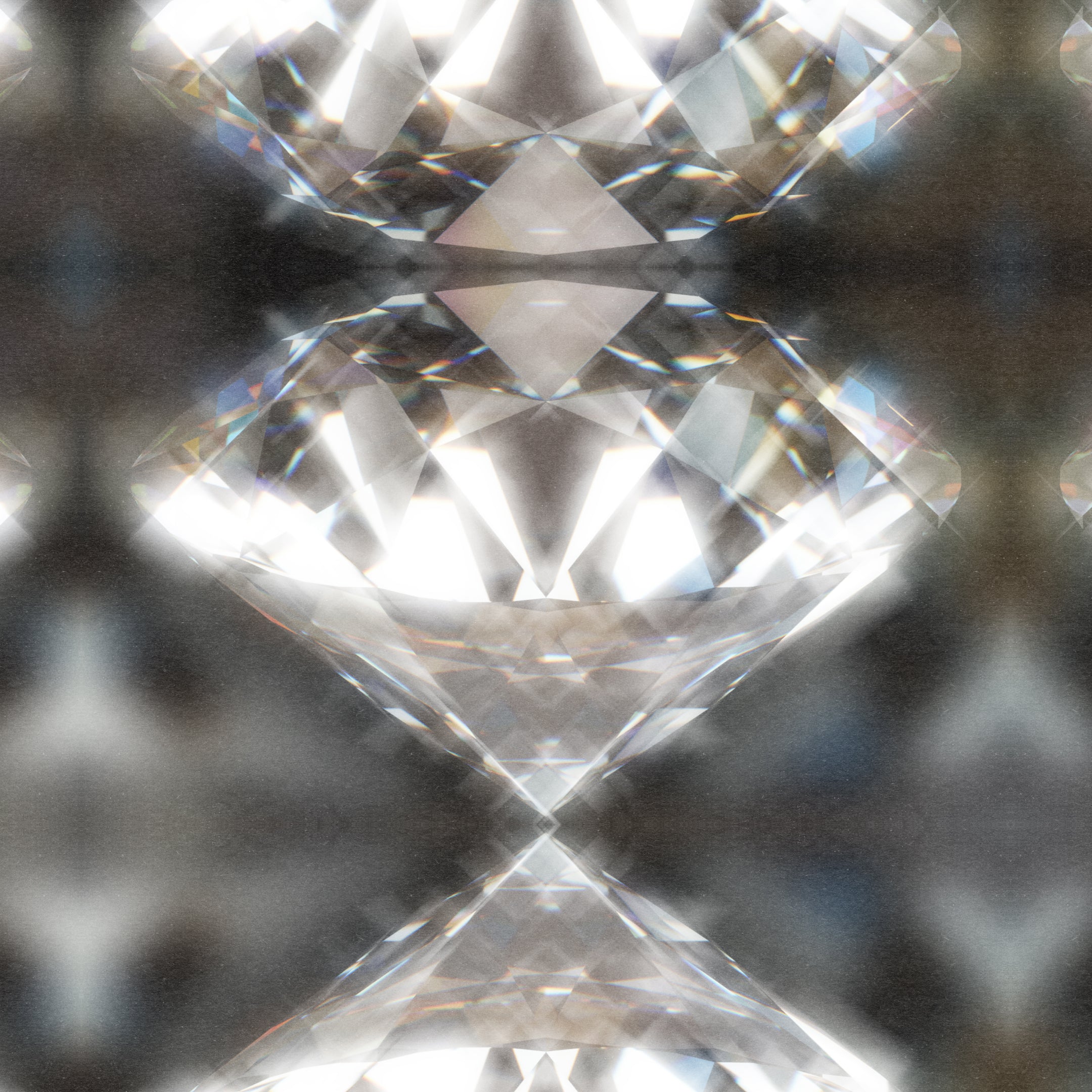
Travaillant ensemble pour distiller le caractère distinctif et les nuances typographiques de la signalisation, des devantures de magasins et des monuments locaux, ainsi que leurs magnifiques imperfections réalisées à la main, le résultat est une police à empattements variables et nacrées, méticuleusement conçue en huit styles prestigieux. Allant de l'Ultralight au Black, Hatton allie raffinement et robustesse dans son esthétique, révélant les particularités du quartier et l'héritage qu'il a laissé.
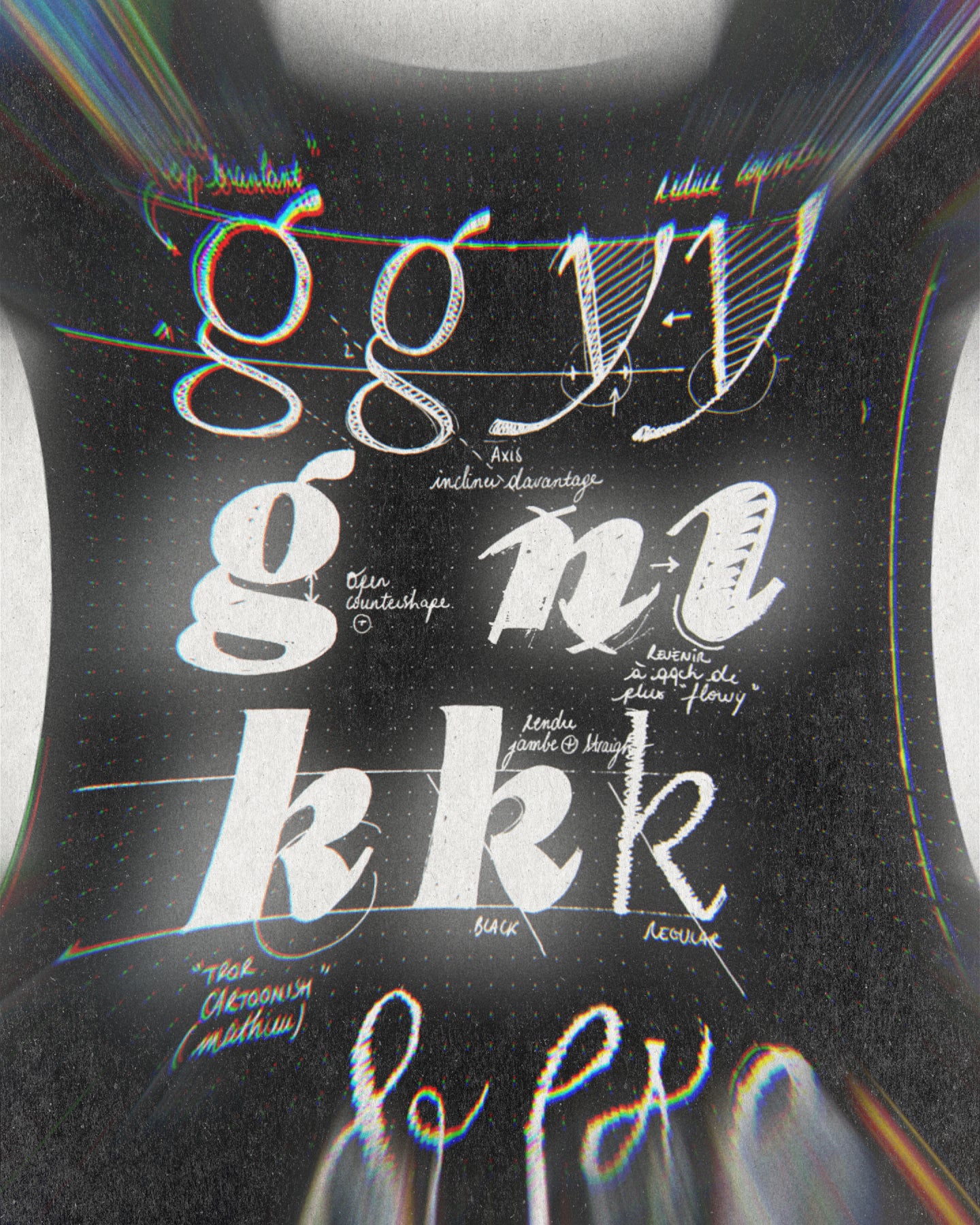
S'appuyant sur l'équipe toujours plus nombreuse de collaborateurs à l'origine du braquage typographique Hatton, la créatrice de caractères Morgane Vantorre, en collaboration avec Pangram Pangram, a conçu la dernière version de cette police humaniste. Aujourd'hui, offrant un meilleur rapport qualité-prix, Hatton est d'une polyvalence enviable, dotée d'italiques authentiques nouvellement créées, qui subliment l'expressivité et la dignité de l'empattement, ainsi que ses courbes récemment affinées. Ses proportions perfectionnées assurent un équilibre harmonieux, notamment dans les graisses les plus foncées, avec un contraste ajusté créant un rythme engageant, complété par une multitude de nouveaux glyphes, prêts à embellir le design de vos rêves.
Créateurs
Collaborateurs
Catégories
- Humanist
- Italics
- Serif
- Variable
Styles
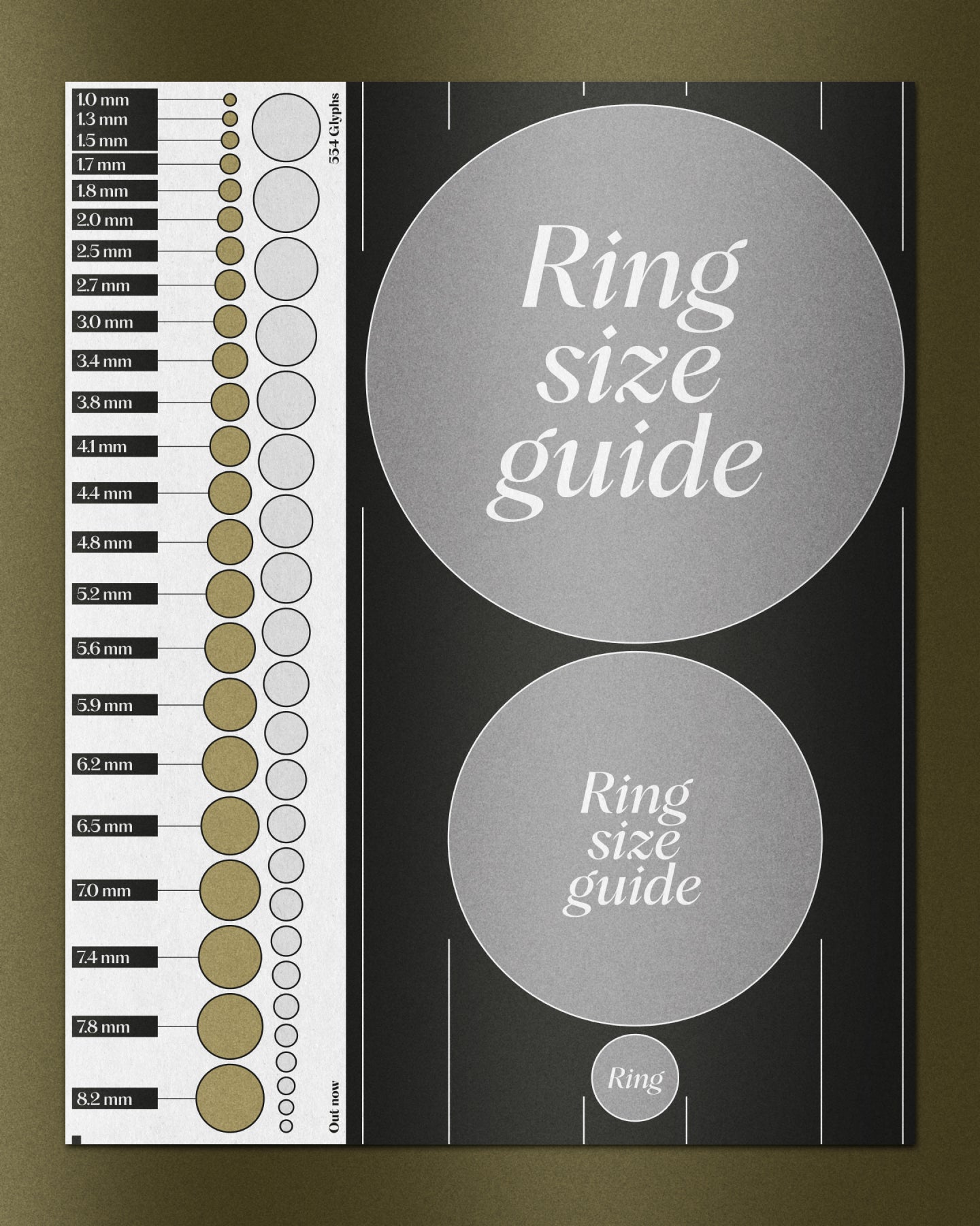
- 18 Styles
18 styles avec 554 glyphes chacun
Version
2.00
Dernière mise à jour : Août 2023
Formats disponibles
OTF, TTF, WOFF, WOFF2
Langues supportées
Afrikaans, basque, breton, catalan, croate, tchèque, danois, néerlandais, anglais, estonien, finnois, français, gaélique, allemand, hongrois, islandais, indonésien, irlandais, italien, letton, lituanien, norvégien, polonais, portugais, roumain, sami, serbe, slovaque, slovène, espagnol, swahili, suédois, turc (et plus)
Licences commerciales
Vous ne savez pas quoi choisir ? Ou vous ne trouvez pas la couverture qui vous convient ?
Contactez-nous pour nos licences d'entreprise sur mesure !
Besoin de plus d'informations sur nos licences ?
Notre FAQ contient généralement la plupart des réponses.